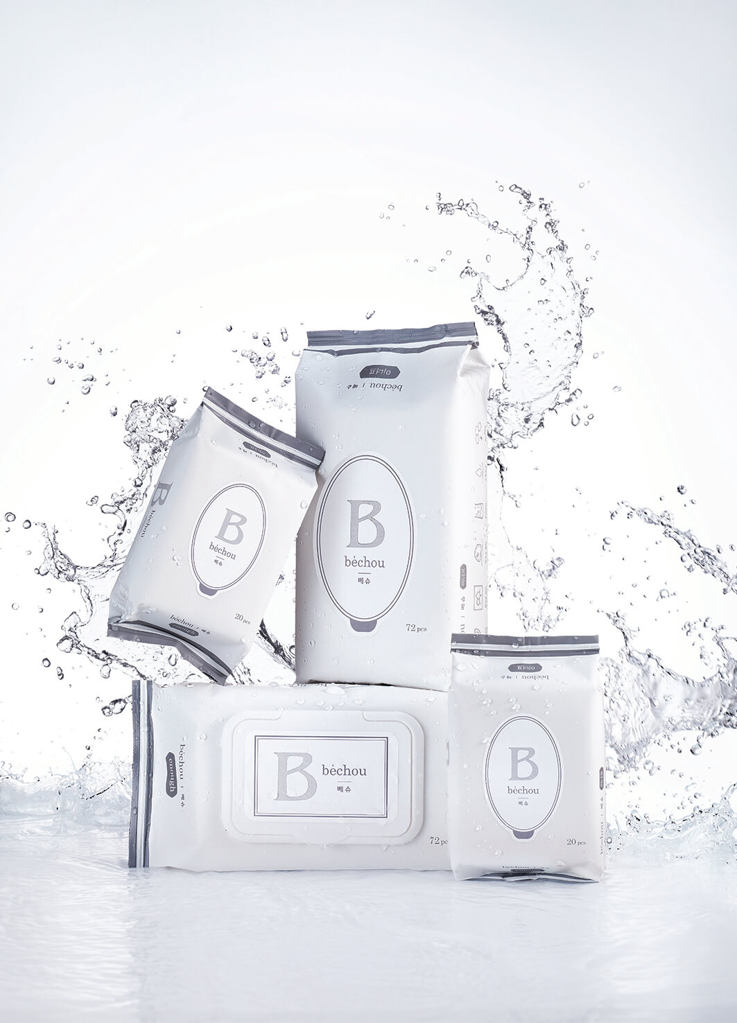
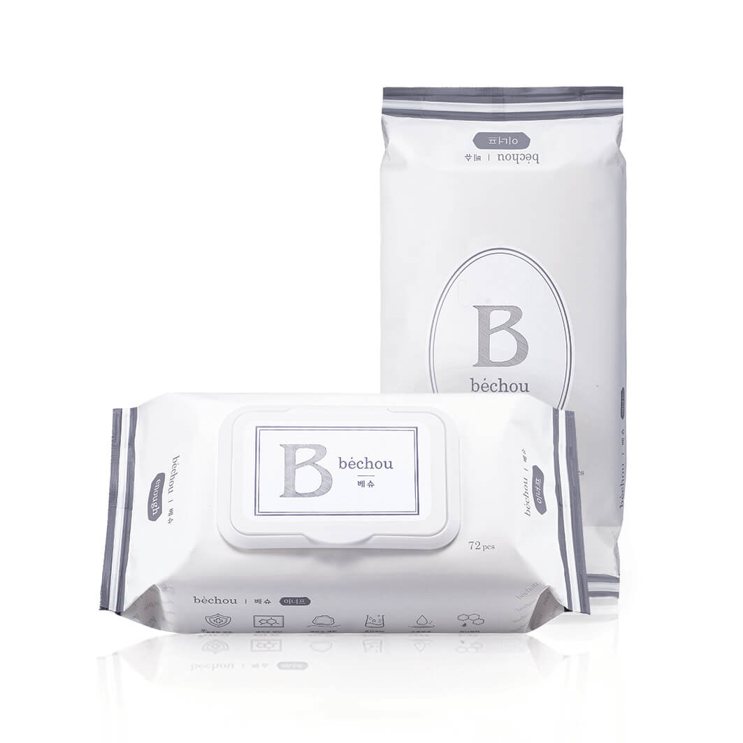
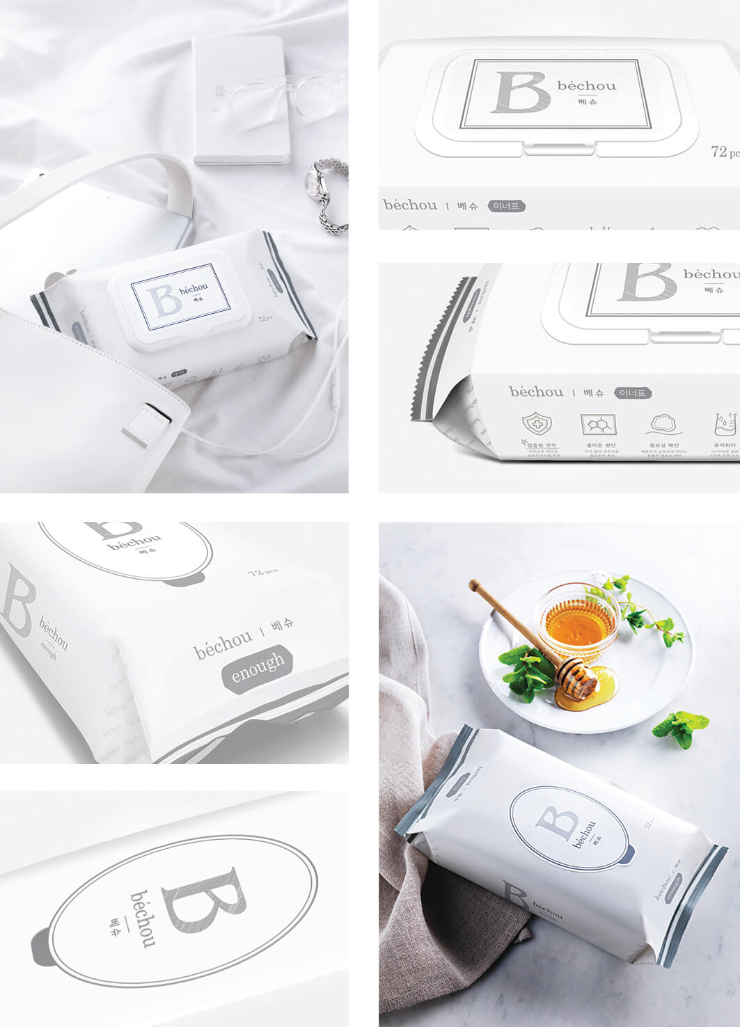
Bechou introduces new baby wipes 'Enough' consist of great ingredients and a suitable design for parents and baby. The typographic logo of Bechou was created with the classic typeface to embody the luxury brand identity, and all lowercase letters exude an approachable and casual vibe. The iconic logo 'B' represents the first initial of the brand name, and it harmonizes with the circular label. Two main cool gray colors best represent the placidity of the brand. The stripes on the edges and the watermark patterns on the sides are delicate and carefully designed.
Year
2016
Affiliation
Inverse Concept Project Design Lab
Designer
JACEY MIN, YOONNA OH, YOUNGEUN SO, DAHAM YOON
本作品版权归 K-DESIGN AWARD 所有,禁止匿名转载及个人使用,任何商业用途均需联系原作者。

新用户?创建账号
登录 重置密码
请输入电子邮件以重置密码。


留言板 (0)
评论为空