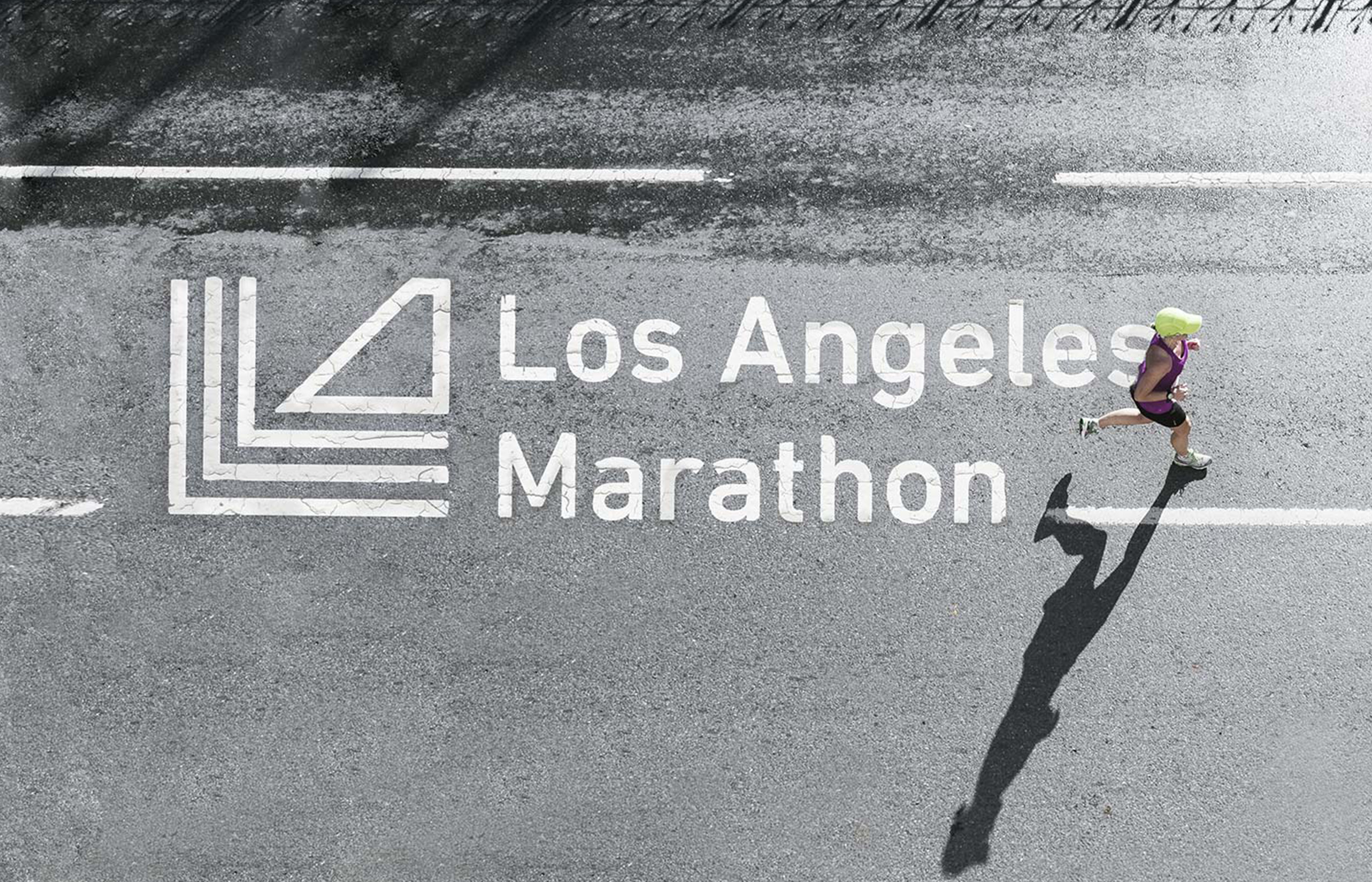
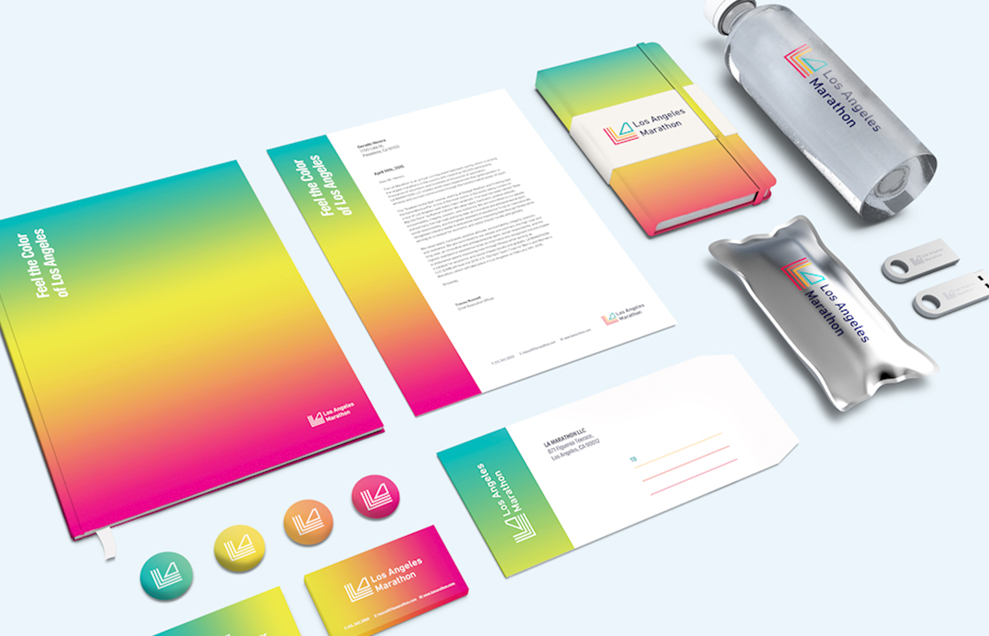
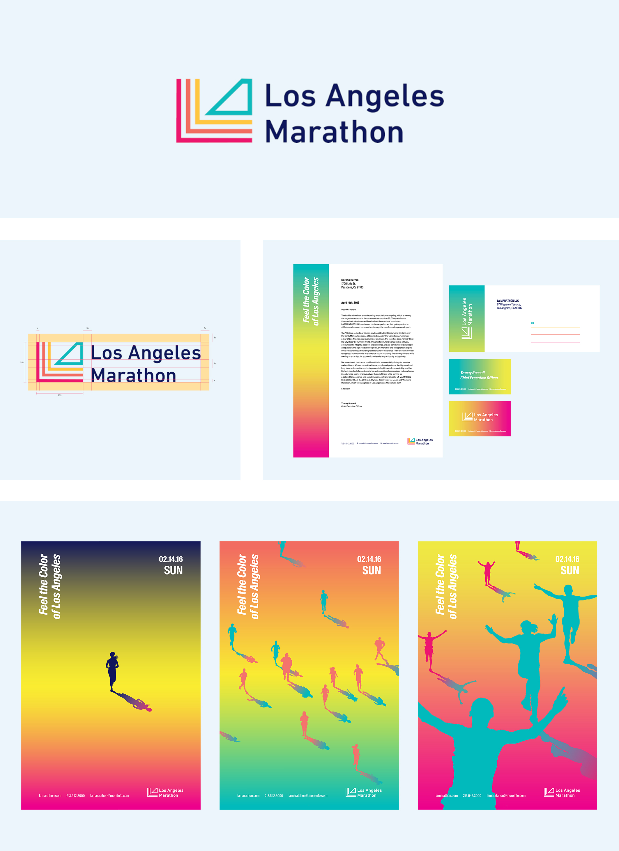
The Los Angeles Marathon rebrand conveys the question of what makes Los Angeles, Los Angeles. Its rebrand emphasizes the identity of its iconic city, and what Los Angeles can offer. The slogan is “Feel the colors of Los Angeles." The runners are not only from California but runners from other states and countries get to feel the iconic city of Los Angeles by participating in the marathon. The new mark has 3 meanings: the letters LA, the marathon routes, and the thriving city represented by a Los Angeles building in its shadows. Its new brand identity embraces the colors of the city of Los Angeles from dawn till sunset. The Los Angeles Marathon rebrand conveys the question of what makes Los Angeles, Los Angeles. Its rebrand emphasizes the identity of its iconic city, and what Los Angeles can offer. The slogan is “Feel the colors of Los Angeles." The runners are not only from California but runners from other states and countries get to feel the iconic city of Los Angeles by participating in the marathon. The new mark has 3 meanings: the letters LA, the marathon routes, and the thriving city represented by a Los Angeles building in its shadows. Its new brand identity embraces the colors of the city of Los Angeles from dawn till sunset.
Country
United States America
Year
2018
Designer
So Yoon Kim
本作品版权归 K-DESIGN AWARD 所有,禁止匿名转载及个人使用,任何商业用途均需联系原作者。

新用户?创建账号
登录 重置密码
请输入电子邮件以重置密码。


留言板 (0)
评论为空