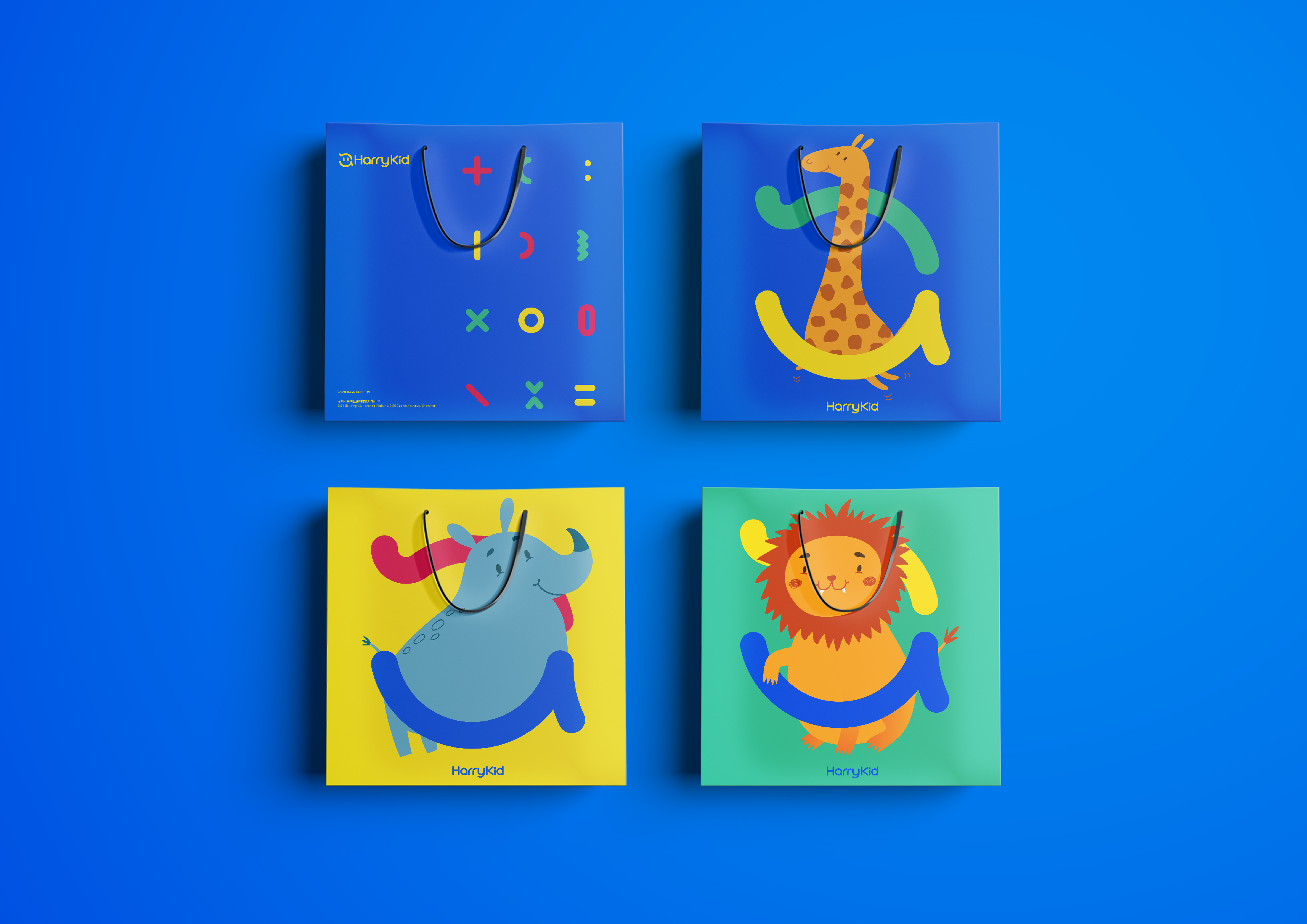
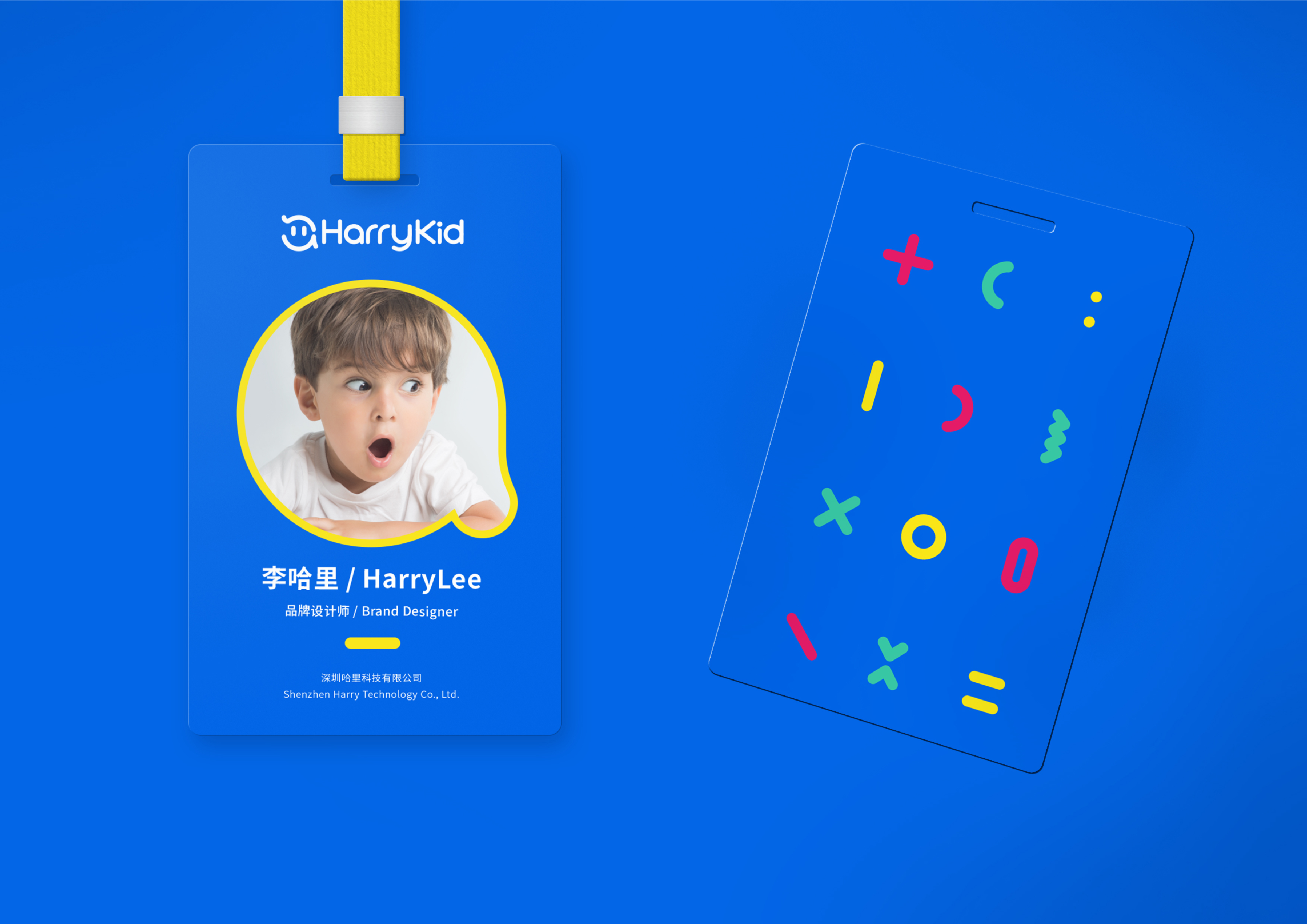
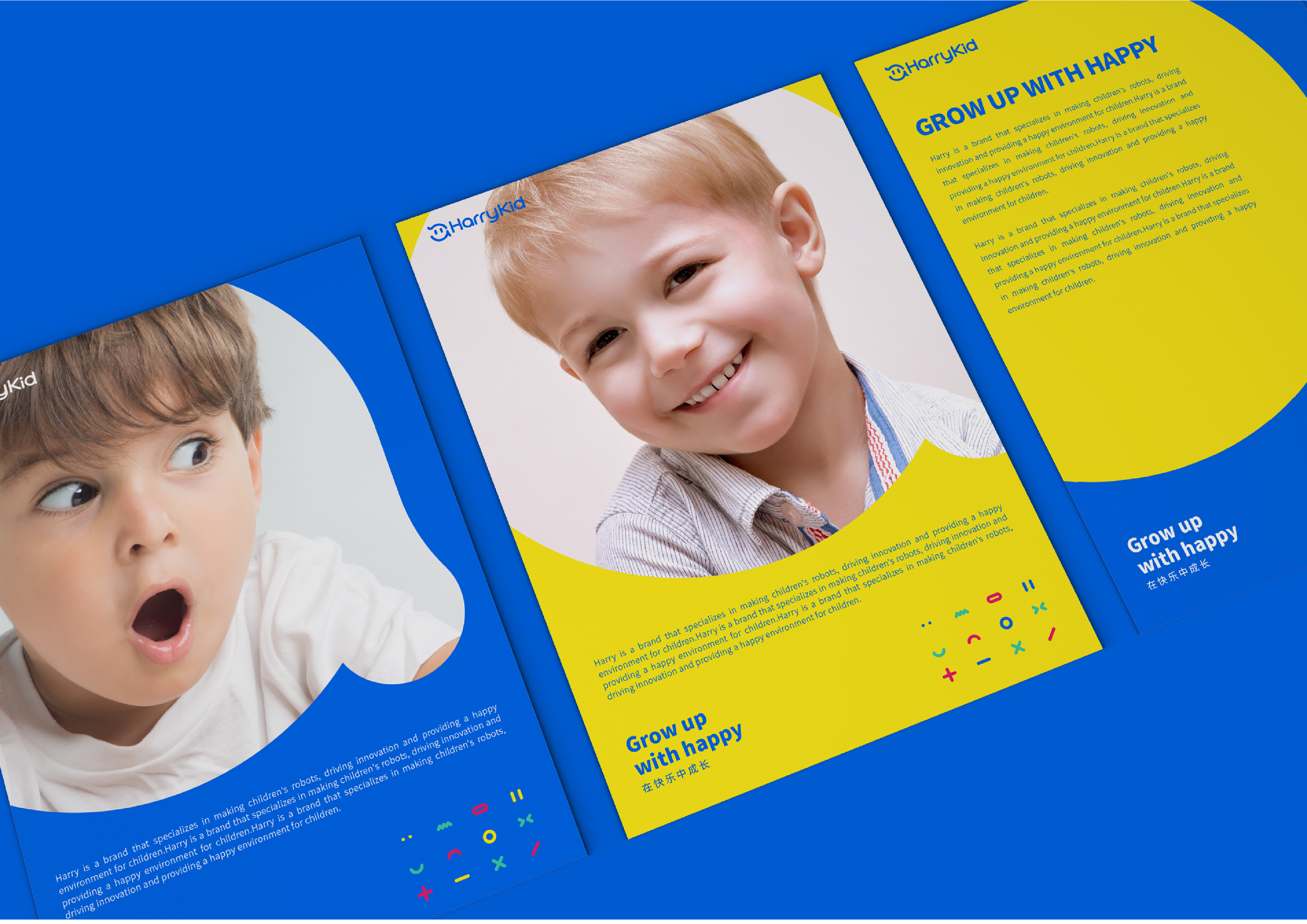
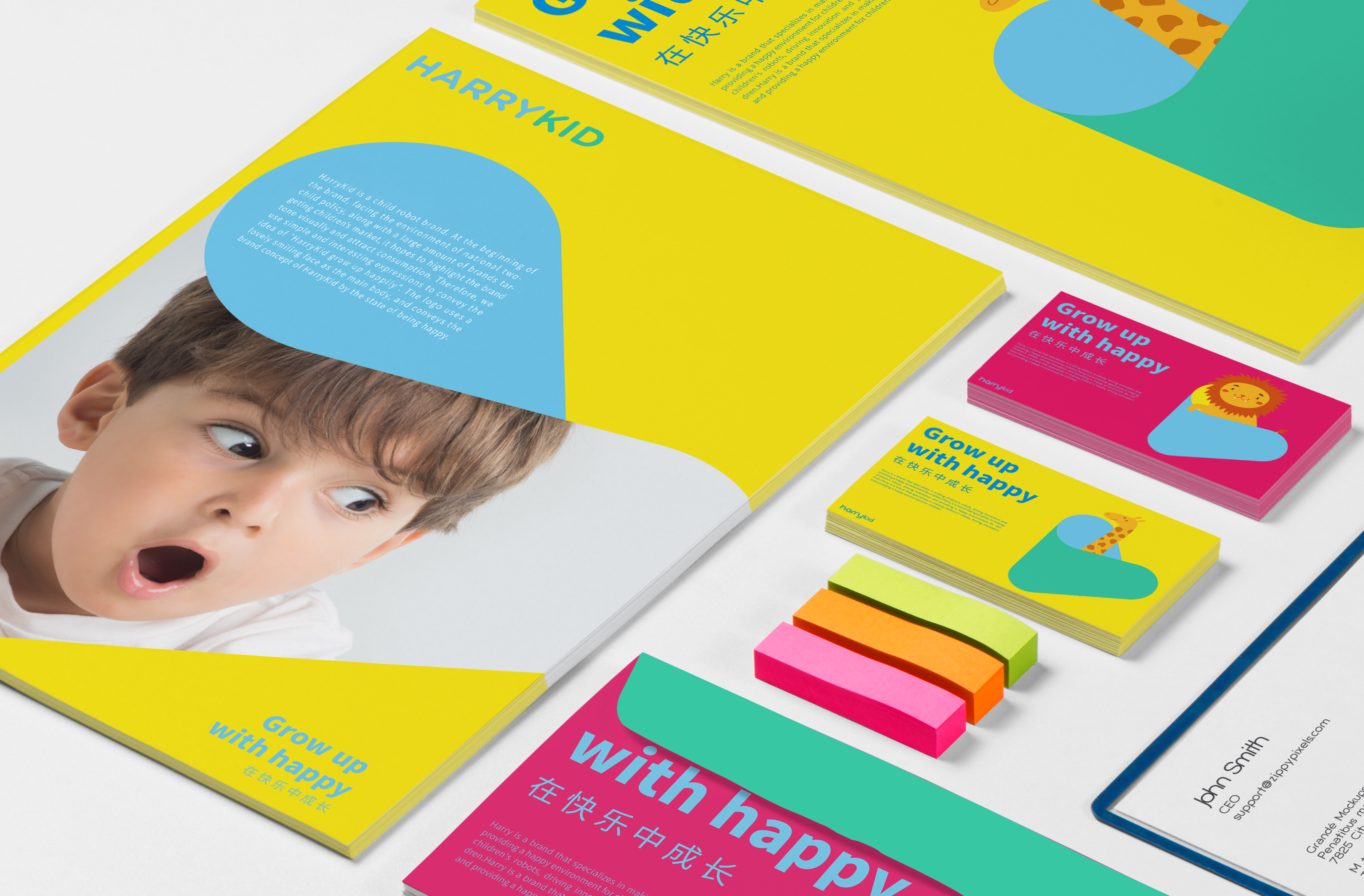
HARRYKID--LOGO & VI BRAND DESIGN HARRYKID (Harry Children) is a brand of children's robots. In the initial face of the national policy of opening up two children, a large number of brands are aimed at children's market players. Jiajian hopes to visually highlight the brand tone and attract consumption. Therefore, we use concise and interesting expressions to convey the concept of "Harry children grow up happily. LOGO uses a lovely smiling face as the main body and conveys Harry's children's brand concept with the concept of happiness. The slightly raised hair also represents a kind of immature and lively. The overall graphic logo is combined with Harry's children's English name "harrykid", which makes letters appear in the graphic logo. The brand logo has uniqueness and specificity. Harry Children will become an indispensable part of the field of children's education, helping children's future with the concept of happy growth. In the extension of VI, we have carried out a series of deformation and expansion of LOGO to form a variety of graphics with different expressions to increase the interest and vitality of Harry's children's overall brand. At the same time, different industry attributes can also be expressed through the combination of different expressions.
本作品版权归 佳简几何XIVO 所有,禁止匿名转载及个人使用,任何商业用途均需联系原作者。
新用户?创建账号
登录 重置密码请输入电子邮件以重置密码。
The color matching is light and harmonious, very good.
The whole VI design is very good, it is in line with the brand image.
The expression of the little model is too in place
What a lovely VI ~