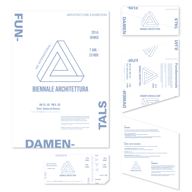
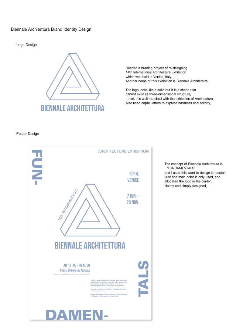
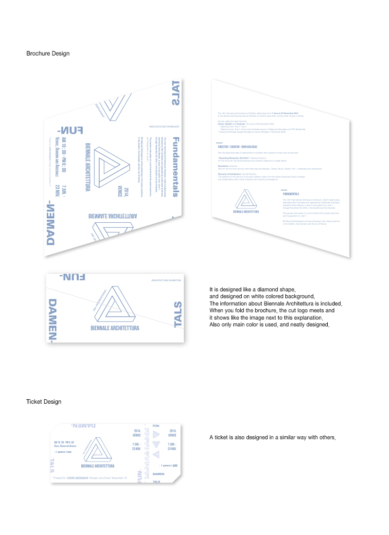
Headed a brading project of re-designing 14th International Architecture Exhibition which was held in Venice, Italy. Another name of this exhibition is Biennale Architettura. The logo looks like a solid but it is a shape that cannot exist as three-dimensional structure. I think it is well matched with the exhibition of Architecture. Also used captal letters to express hardness and solidity. Re-designed a logo, a poster, a brochure and a ticket. Used only one main color and white colored background for the neat design. A new logo is allocated in the center of every single design.
Year
2015
Designer
JIYUN PARK
本作品版权归 K-DESIGN AWARD 所有,禁止匿名转载及个人使用,任何商业用途均需联系原作者。

新用户?创建账号
登录 重置密码
请输入电子邮件以重置密码。


留言板 (0)
评论为空