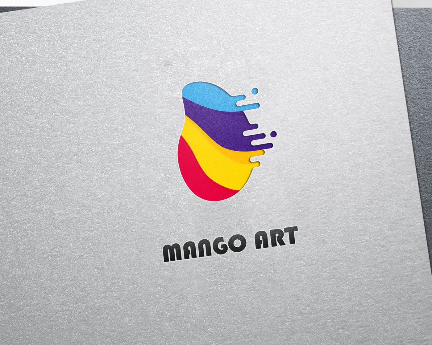
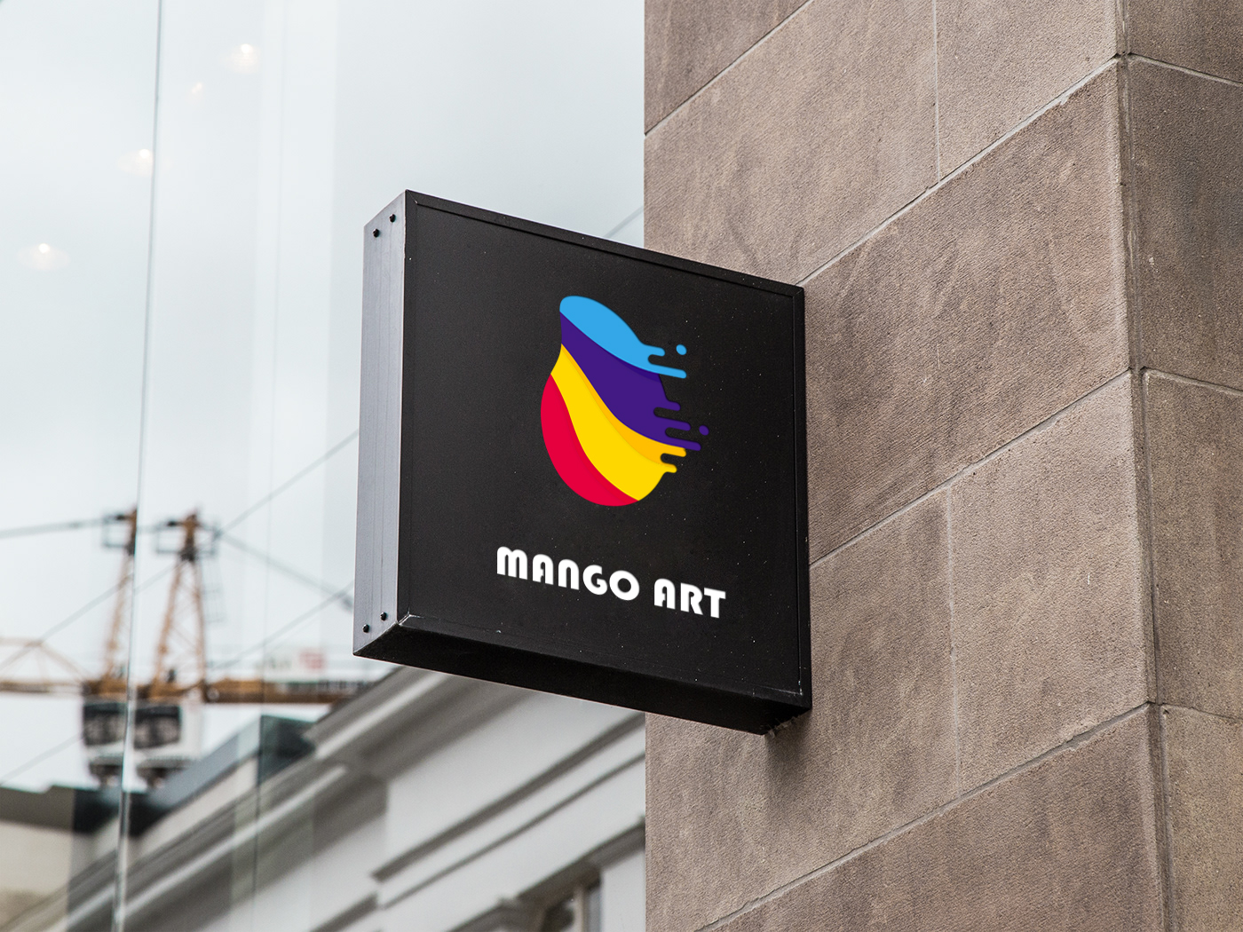
Logo is abstracted and reorganized according to the shape of mango. The lines are round and bring people soft and amiable visual feeling. The text is made of lovely round body and full of children's interest. Logo is mainly composed of five colors: colorful, bright and rich, serious and childlike. Blue represents: confident purple represents: elegant yellow represents: innovative red represents: brave black represents: fusion

本作品版权归 Yaooo 所有,禁止匿名转载及个人使用,任何商业用途均需联系原作者。

新用户?创建账号
登录 重置密码
请输入电子邮件以重置密码。


Not bad
It looks good.
Having said so much, what is the mango aesthetics of this logo, is it a children's art institution?