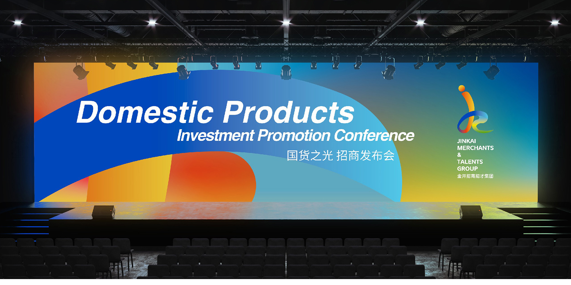
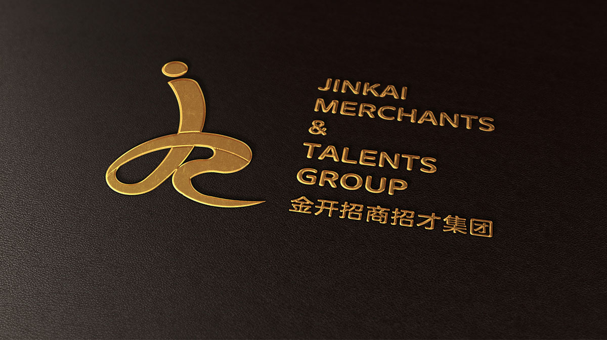
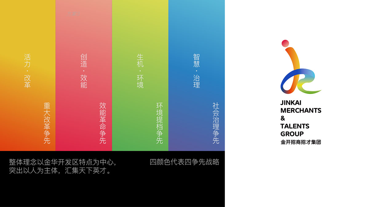
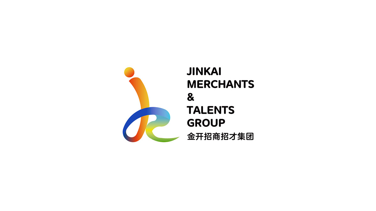
The overall concept of this project is centered on the characteristics of Jinhua Development Zone, which is shaped like the structure of the Chinese character "people", combined with the letter jk, which means that Jinkai is a work feature with people as the core; the circle represents wisdom; the changing curve represents flexible policies and mechanisms. The logo as a whole is based on yellow, red, green, and blue, which reflects Jinkai technology, efficiency, eternity, and has vigorous vitality.

新用户?创建账号
登录 重置密码
请输入电子邮件以重置密码。


Good
The manager's name and background match well.