Cats Series, Four Seasons Series, Flower Series


新用户?创建账号
登录 重置密码
请输入电子邮件以重置密码。


In your design, I seem to see Michelangelo, Raphael, Leonardo da Vinci, Picasso, Dürer, Van Gogh, Cezanne, Gauguin, Monet, Schiller and other masters painting together. Your design is full of the soul of the master. I cried. I was shocked and cried by your perfect design. I was drunk. I was completely intoxicated by your perfect design, your work is really the best in art. You are the most designer master I have ever seen in the universe. Without one, you are the miracle of mankind! After reading the works, I dare not reply easily. I am worried that my vulgar language will tarnish the rare works in this world. But I still replied, because I think if I can no longer leave my own footprints behind such wonderful works, it will become a regret in my life. Please forgive my selfishness! No matter how gorgeous words are used to describe the wonderful degree of this work. In addition, I heard that Feizhi, a brand company next door, is recruiting an excellent industrial designer like you to be responsible for the direction of game peripherals, which is highly coincident with the products we make, ba-se Baoan District, Shenzhen. If you are interested, please contact us by email ~ email: dengyong@flydigi.com. Hope to have the opportunity to polish more extreme products with you!
Sales cry dizzy in toilet
The color matching is really good-looking, fresh and natural, that is, there are some messy parts. In fact, this kind of keyboard arrangement is a professional game keyboard, so some game key positions should be divided in color distinction. For example, the use of key positions in gun games and tower games is different. This can also be used as the theme of color division. It may be another different feeling. Puxiang has not commented several times in total. It is purely personal opinion. Don't spray it if you don't wash it. Thank you!
aile
Buy lick buy lick
This key is arranged and easy to use. I class = "expression-icon expression-type10" title = "proud">
The good-looking fried chicken may be that the leaders have seen so many good-looking ones and have no way to start ~
Backhand is a compliment. You must buy one when you go on the market.
As a consumer, if I suggest it, my opinion is:
(1) The key color of the functional area is broken. The top row of ESC to lamp keys has a little more color. There are two colors of F5 to F9 in the middle
(2) the overall tendency of color matching is also due to the blurring of color quantity and distribution. color atmosphere design is very important. color sensory visual effect can be Rise down and can be done very Peaceful. I want to grasp a rhythm
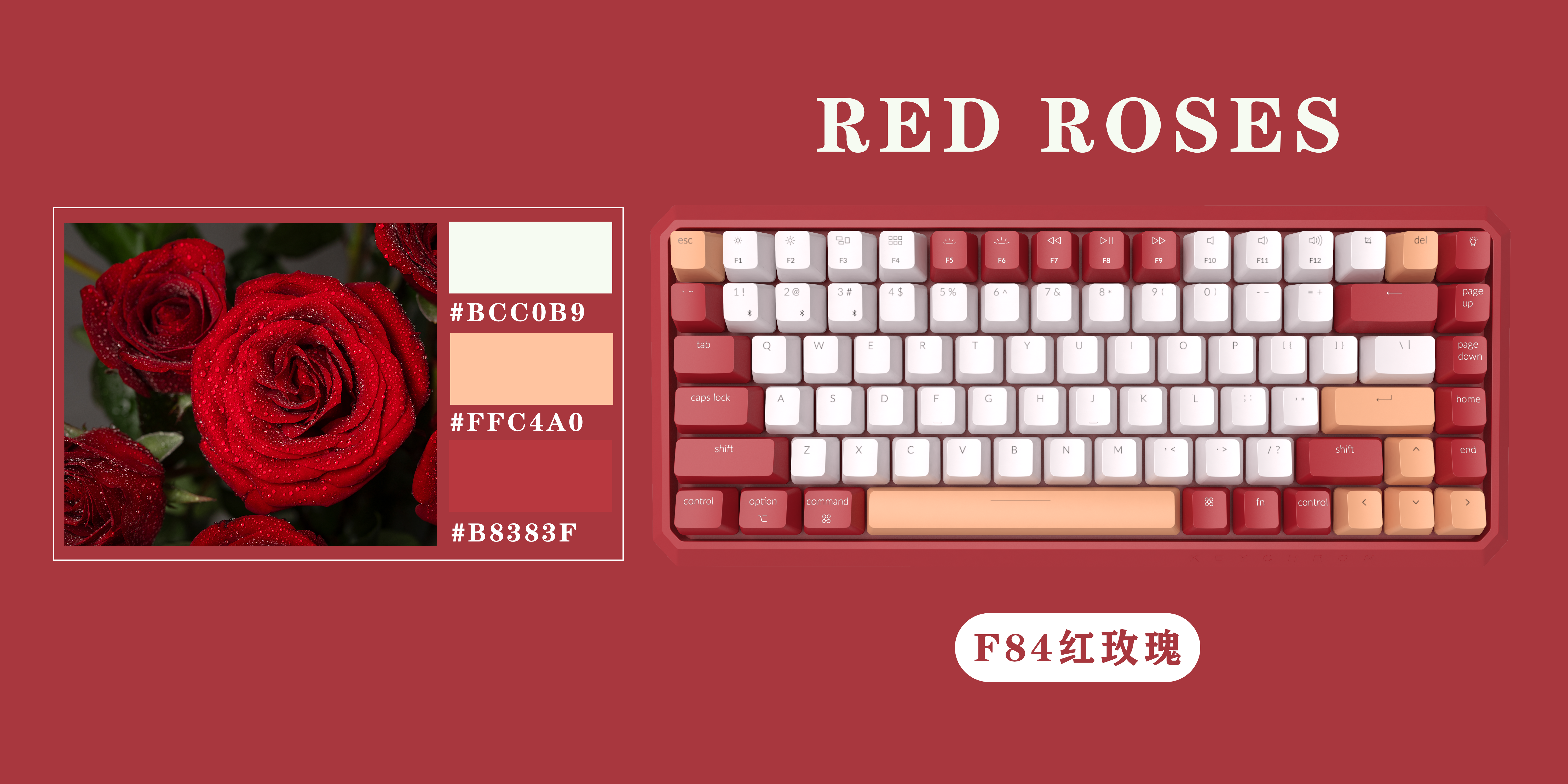
(3) The theme is not prominent and clear. Although the intention map is used, your final color matching still has colors other than the main body, which will cause confusion, such as rose# FFC4A0. White certainly doesn't count, but for the sake of the whole, I don't think ABC area must use white (light color)
(Personally understand, don't spray me , now I dare not comment in Puxiang)
Keyboard sometimes is not styling for you to buy, color and feel, touch, price. These are the determinants of paying the bill.
Xu always makes it difficult for you to get used to it again
This is a master.
Good color matching ~
The picture is really beautiful.
The main thing is that the keyboard shape should be changed.