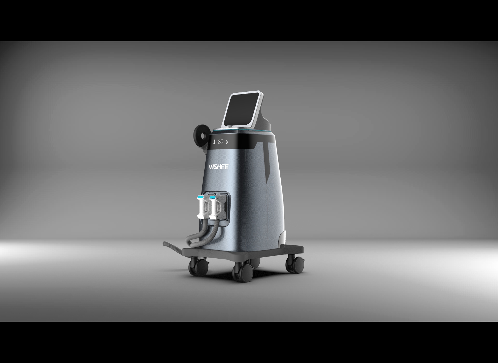
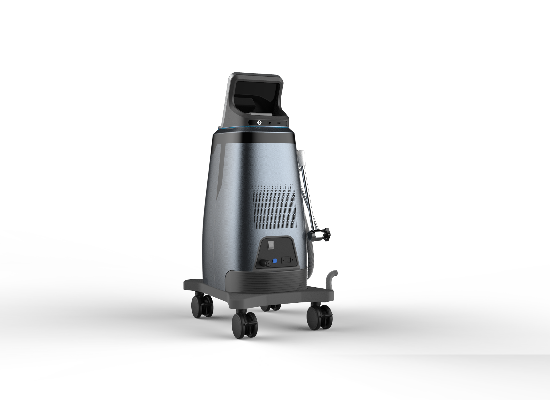
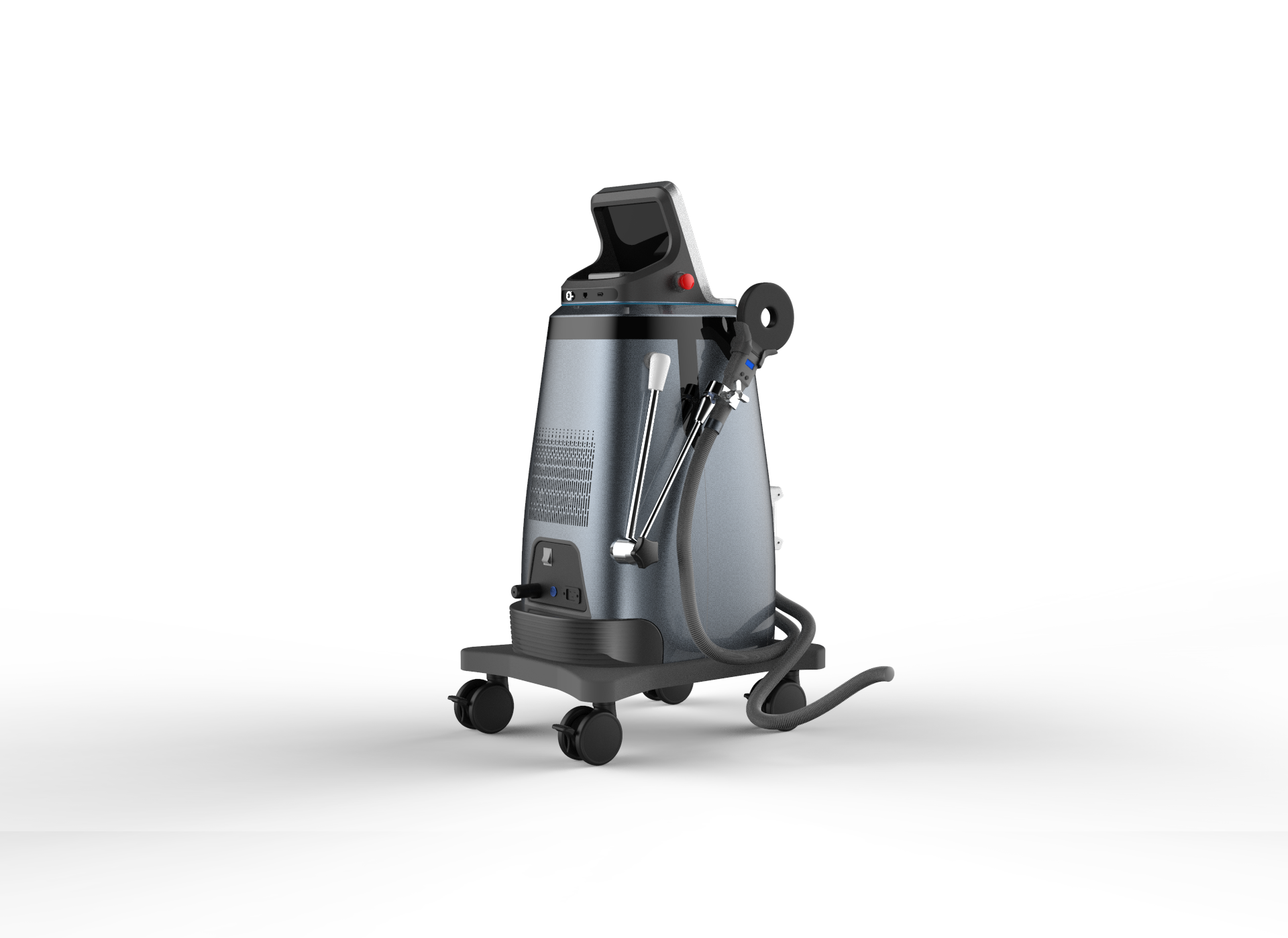
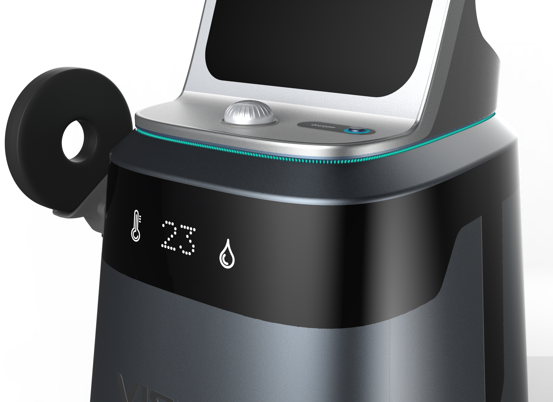
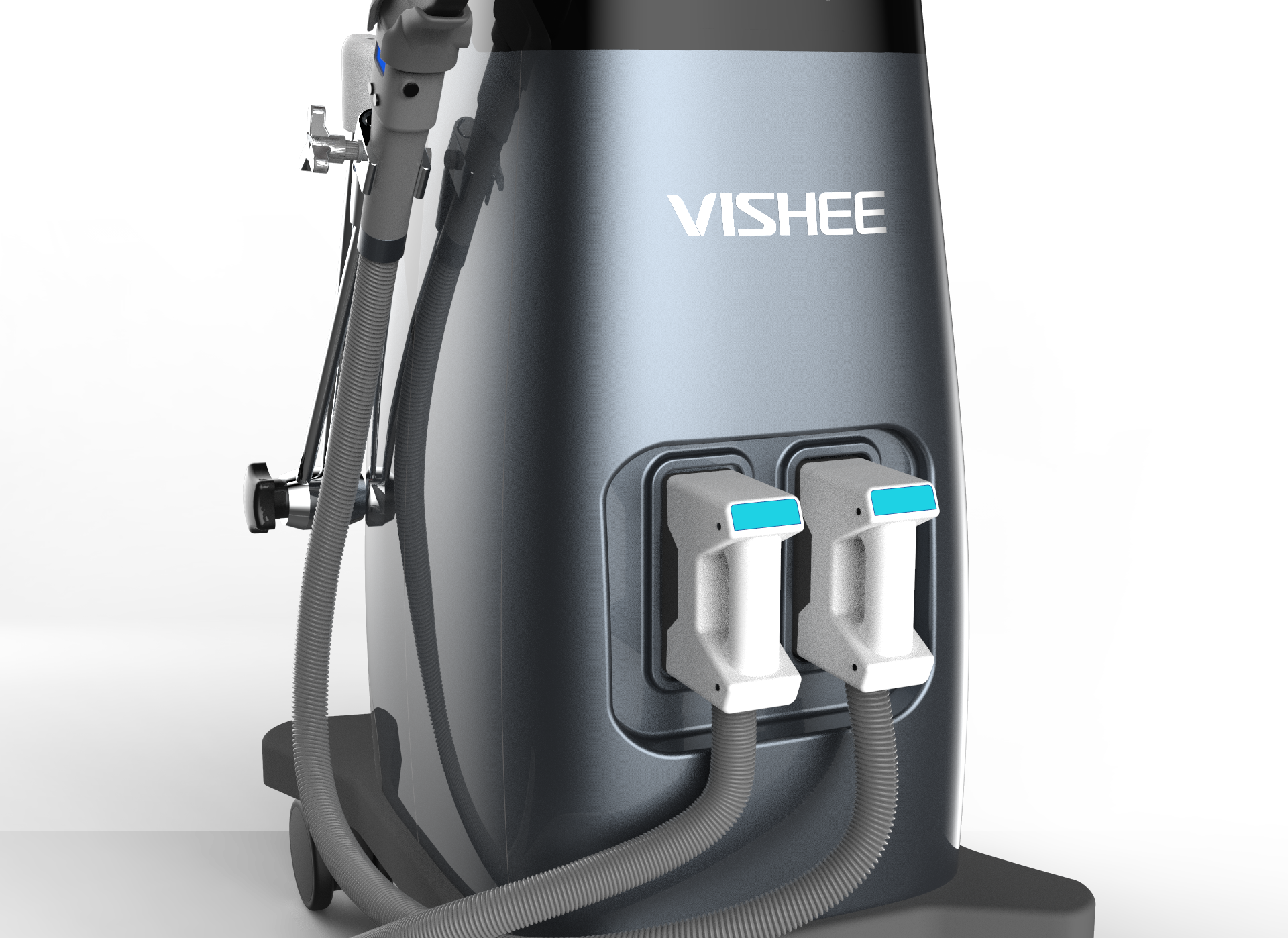
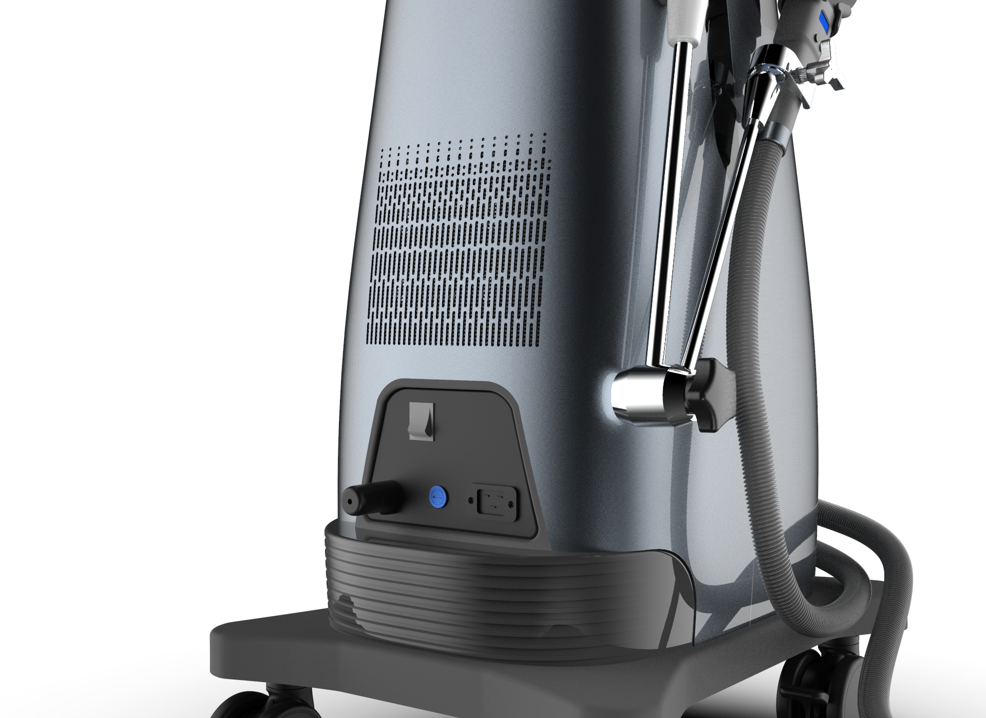
Magnetic stimulation equipment, the design reflects the texture of the product, and the product operation is more man-machine scientific,

本作品版权归 Steven SYD 所有,禁止匿名转载及个人使用,任何商业用途均需联系原作者。

新用户?创建账号
登录 重置密码
请输入电子邮件以重置密码。


It feels great overall
Change the logo, the boss will feel good, his logo is a word ugly
It's too immature. There is a big problem with the size of all kinds of rounded corners. First, no display will be equipped with such a large rounded corner. Second, the parting line does not seem to have a rounded corner at all. In addition, the LED screen is too large. It is suggested to check the price of relevant components and ask the medical technology company how large the LED screen is generally. This size ratio is absolutely strange. There is also a problem with the material attached. Generally speaking, it's like building a large pile of switches and other parts on the forehead and starting to produce rendering pictures. I don't know what you have made now, but the first version of the scheme is really shameful... In addition, please avoid using ks default background like the first one, which is very good, but you can see that you are a novice when you look at the background. It is better to change to pure white like the last few.
In short, I hope to improve it. The design of this thing still has to fall to the ground.
Stick