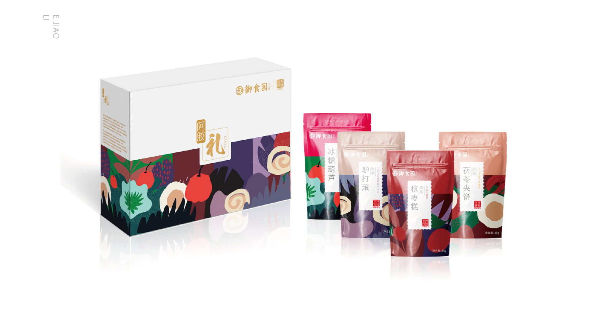
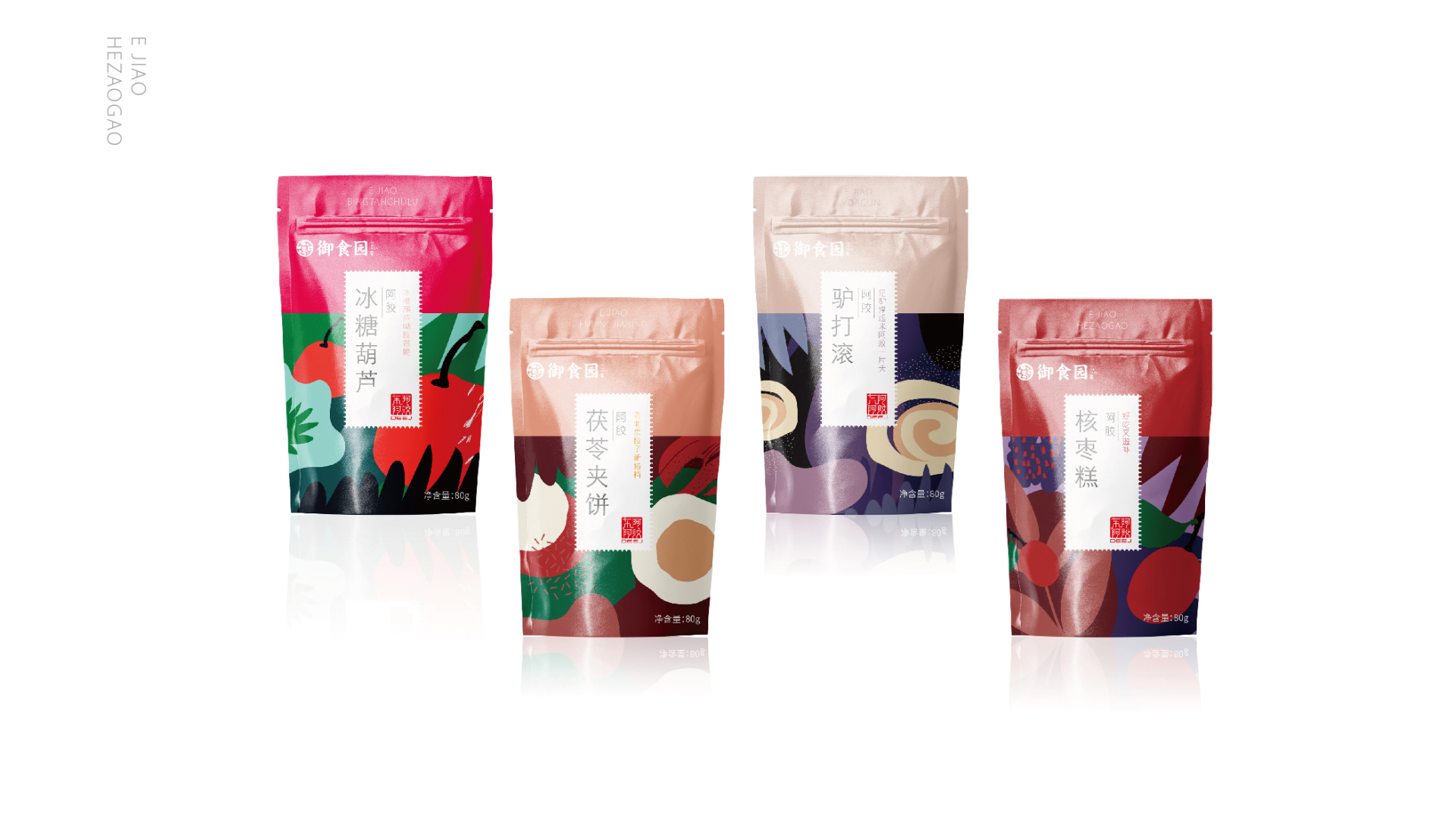
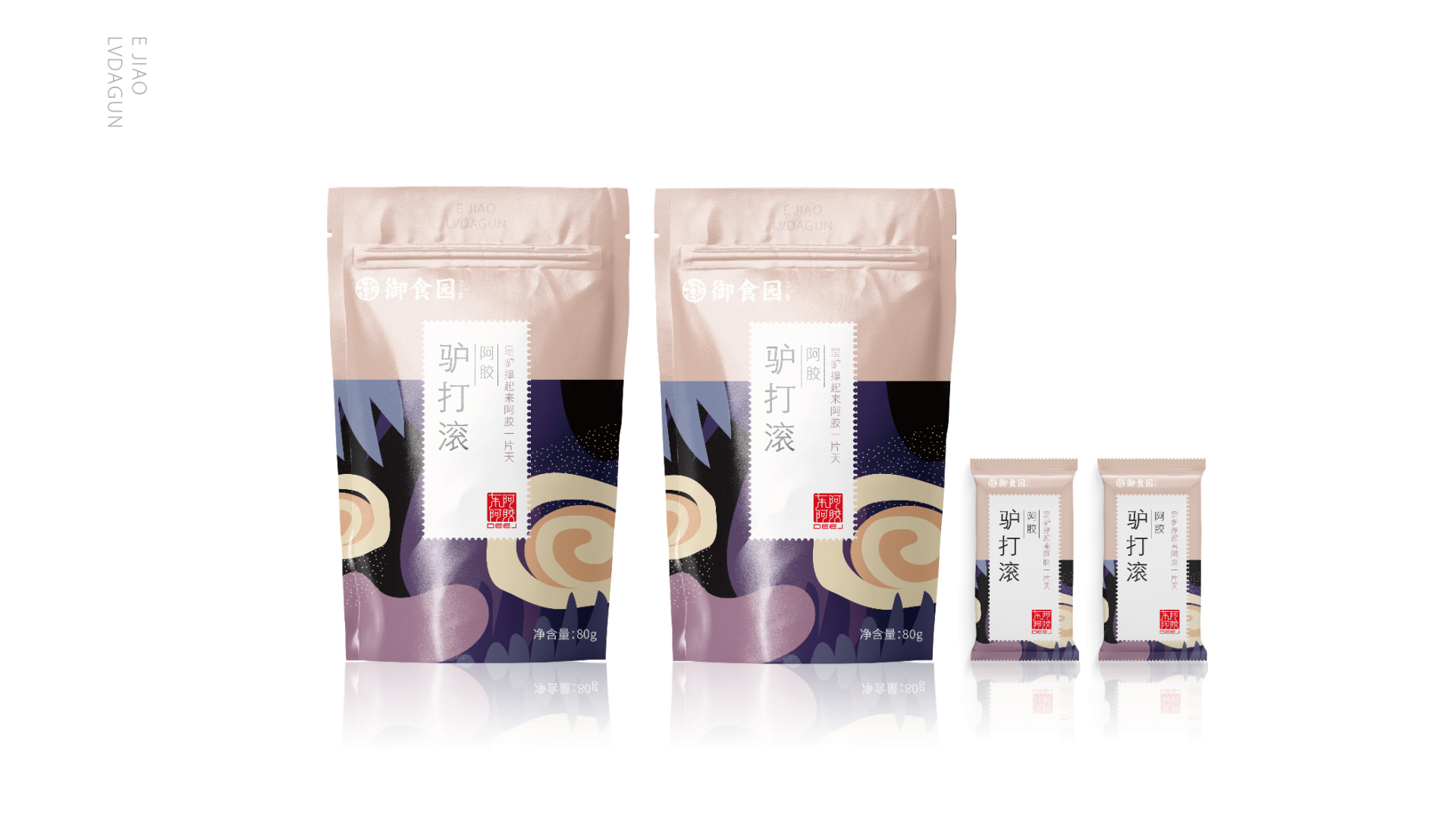
Project background: In the market competition in the new consumption era, the products of major snack brands tend to be similar in quality and taste, and it is difficult to show differentiated advantages in packaging. The trend of packaging design in the market is getting younger and more diversified. User Demand: Not only are the traditional food brands of Royal Food Garden, Daoxiang Village and Red Snail constantly innovating, but also the younger Internet brand packaging of good products shops is also recognized by people. Brand products are deeply liked by consumers because of their novel design, exquisite design and form innovation, so a packaging suitable for brands and consumers is the core of the products. Market research: traditional snack foods mostly use colors with high purity and brightness, such as red, pink, emerald green, yellow, etc. Design style: Internet brands excavate the characteristics of snack products in terms of form and taste, and use vector graphic elements or high-definition pictures to present the packaging, resume their own unique brand visual assets. Optimization and upgrading: use the background color of snacks to distinguish each product series, enhance brand packaging recognition and brand recognition with large color blocks, and unify the brand family relationship. Internet new retail brands mostly use colors with low purity and saturation, such as gray, light green, light blue, and other high-level colors. According to the characteristics of the enterprise's own brand, Rococo forms visual memory points and colors for new products that conform to their brand attributes.

本作品版权归 洛可可咨询设计 所有,禁止匿名转载及个人使用,任何商业用途均需联系原作者。

新用户?创建账号
登录 重置密码
请输入电子邮件以重置密码。


Dacheng series
The packaging is really tasty