Kaycho is a Japanese brand of maternal and infant products. It is committed to creating a parenting experience that pays attention to parents while helping the baby grow up. Through accurate user positioning, friendly and fashionable caring image and cheap products, it creates an unprecedented parenting experience for precious mothers.
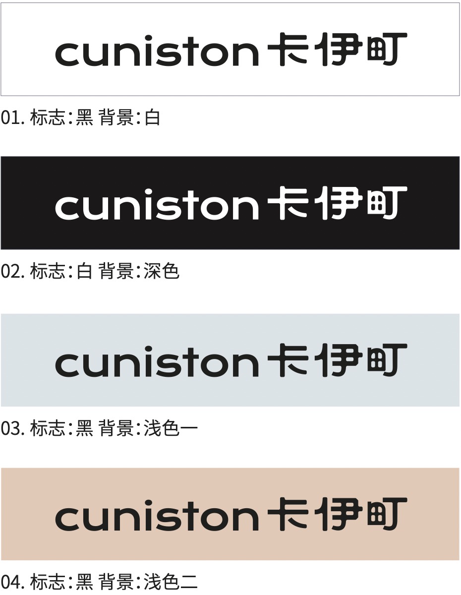
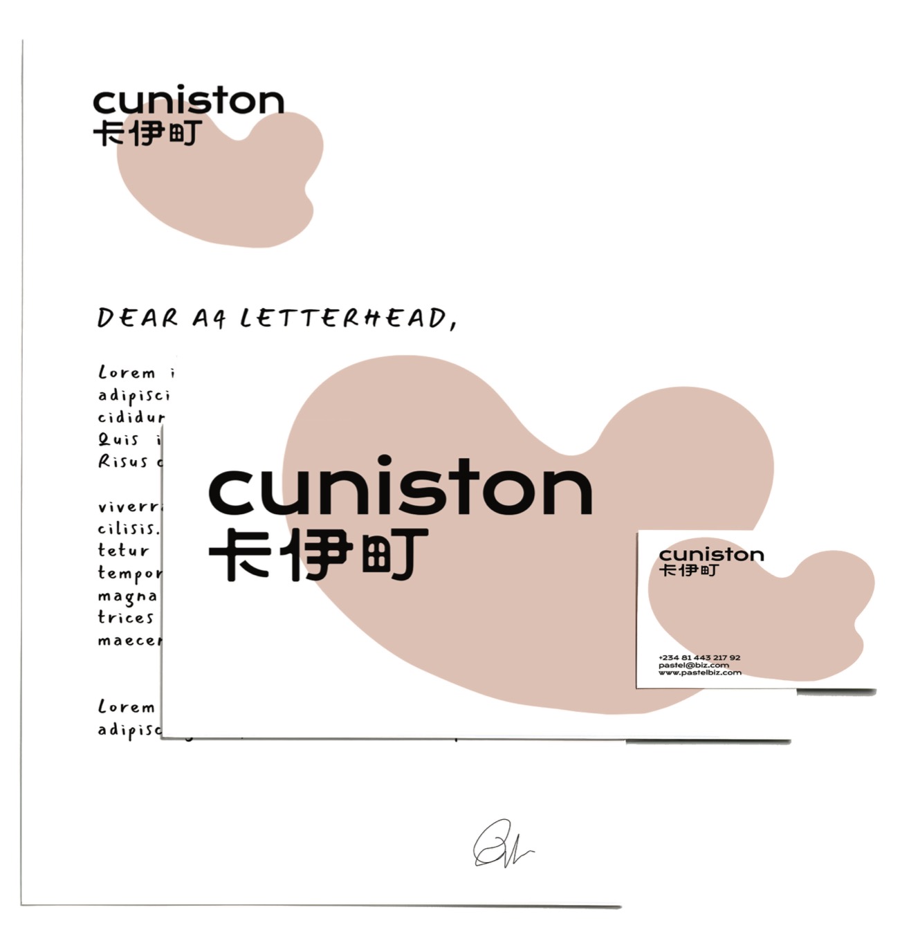
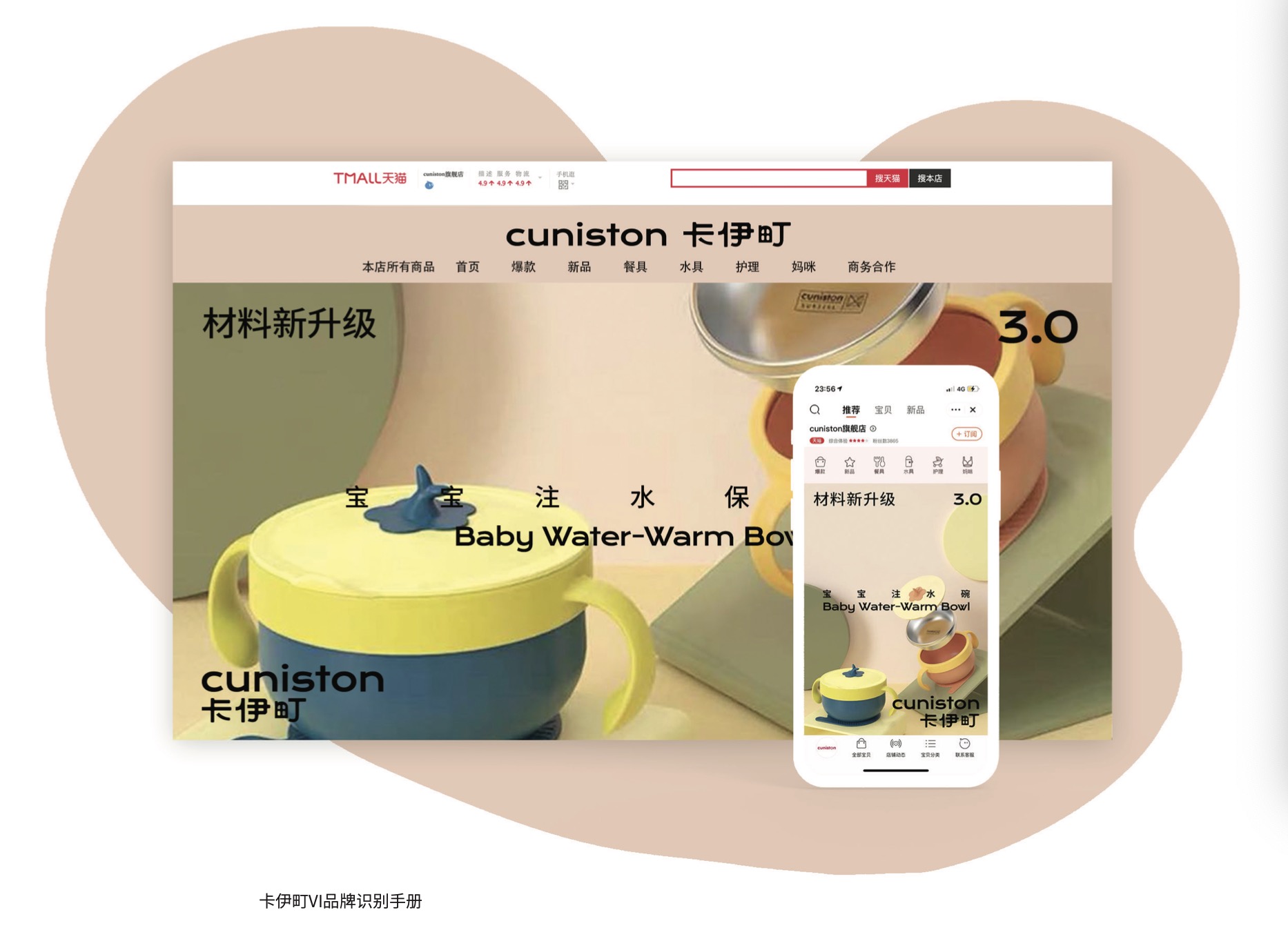
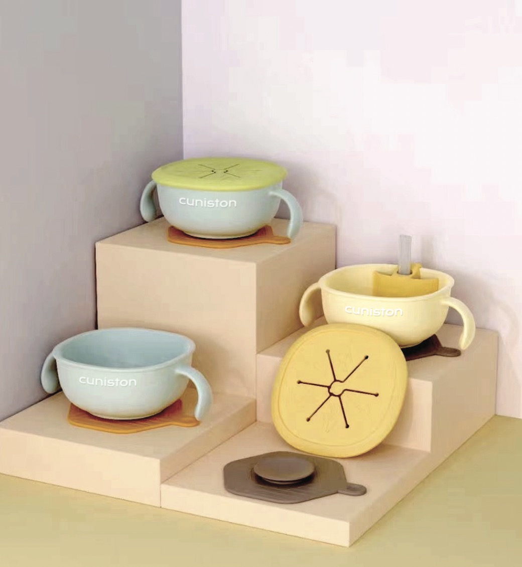
The brand identification manual made for Kaycho this time includes: brand interpretation; Brand Slogan, Chinese and English logo, brand color and proportion; Chinese and English fonts, graphic element design; Product packaging design, office supplies design and indication.
Brand Keywords: Friendly, Reliable, Trust, Environmental Protection, Love, Warm, Quality, Safety, Color Value
Kaycho is a high-end and reliable brand of maternal and infant food products, which transfers love while taking into account the concept of quality and safety.
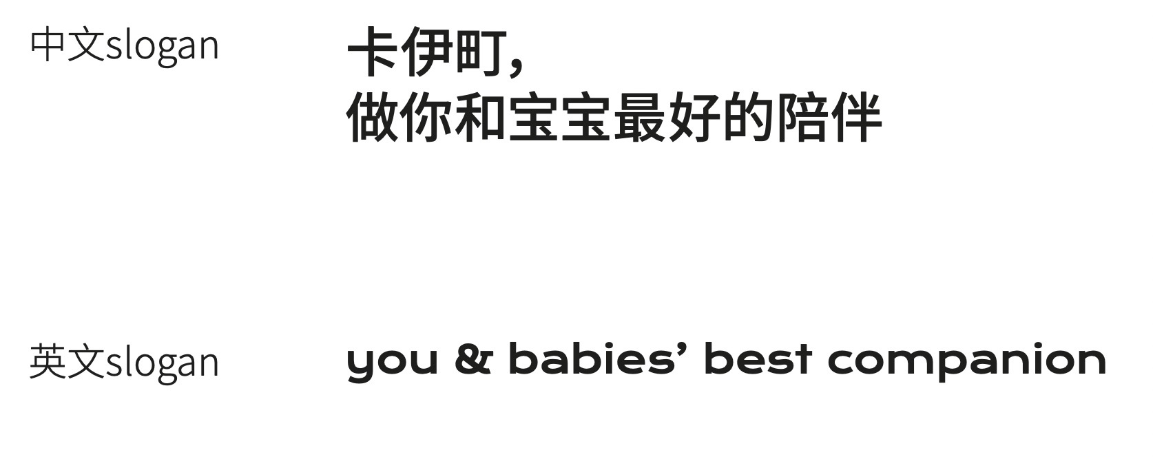
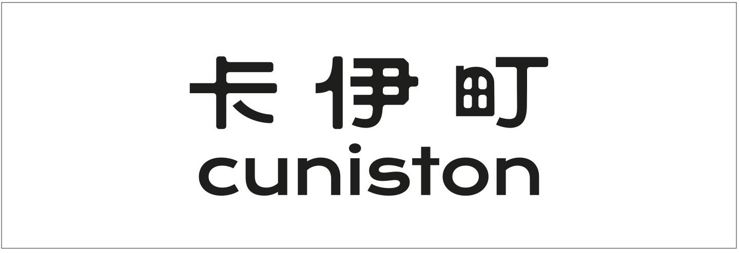
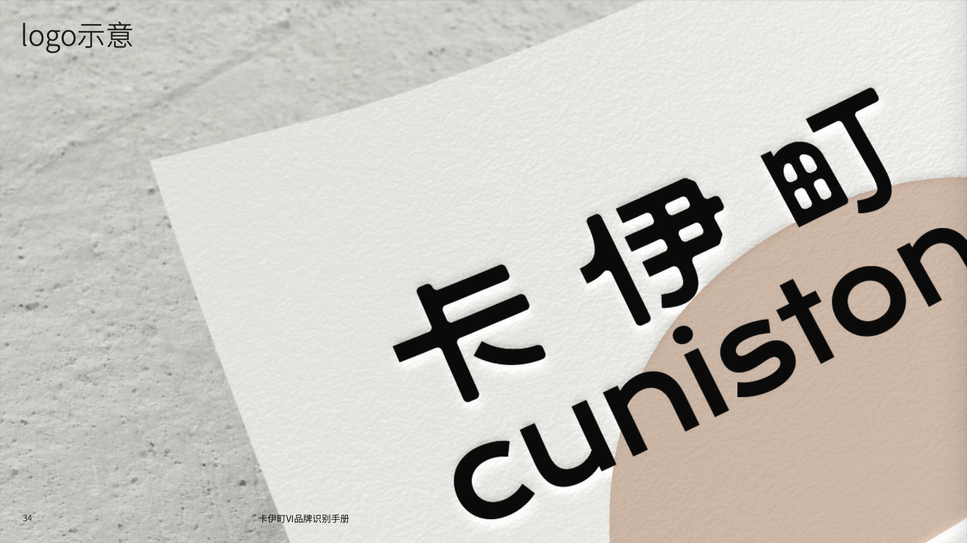
We hope that logo reflects the demands of the corresponding consumer groups for kindness, warmth and high color value, so we adopt modern and cute customized Chinese fonts, combining interesting and personalized English.
Text, concise but without losing details.
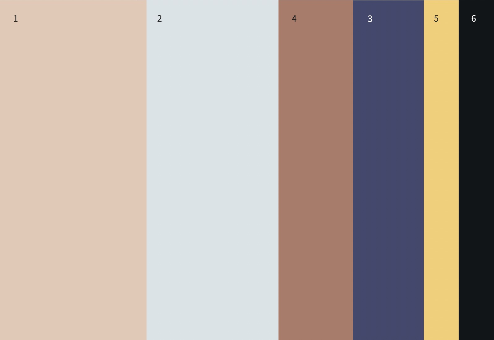
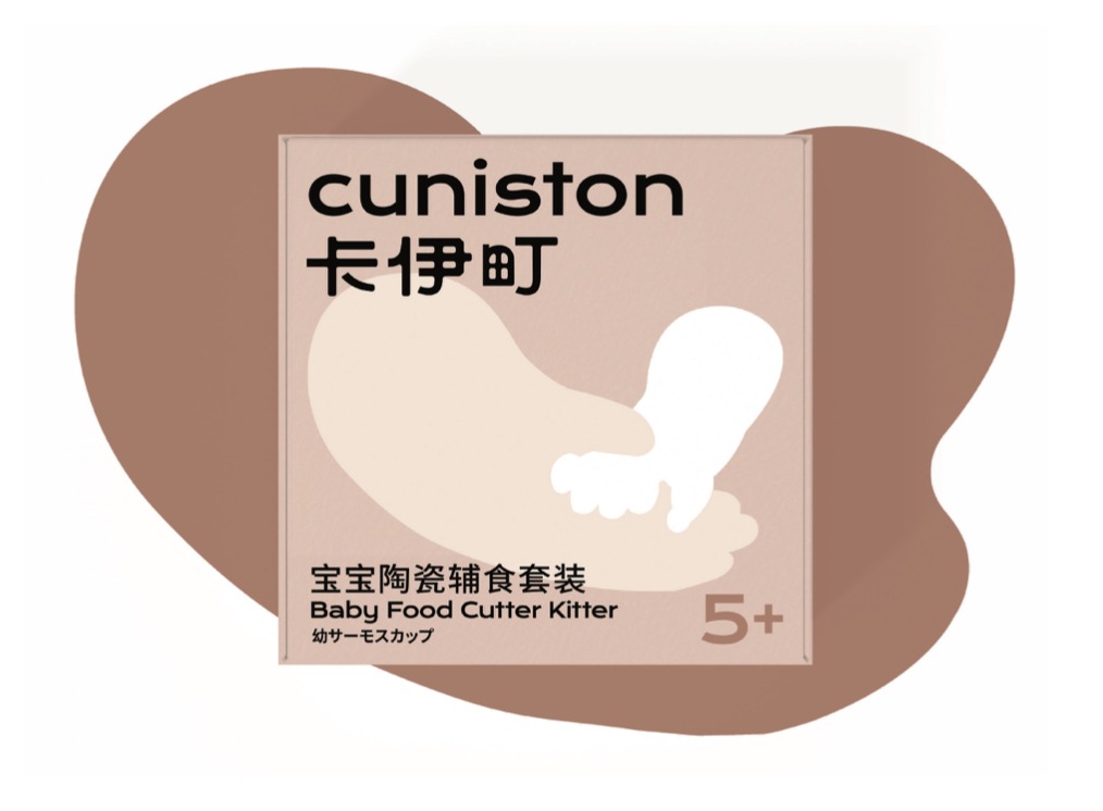
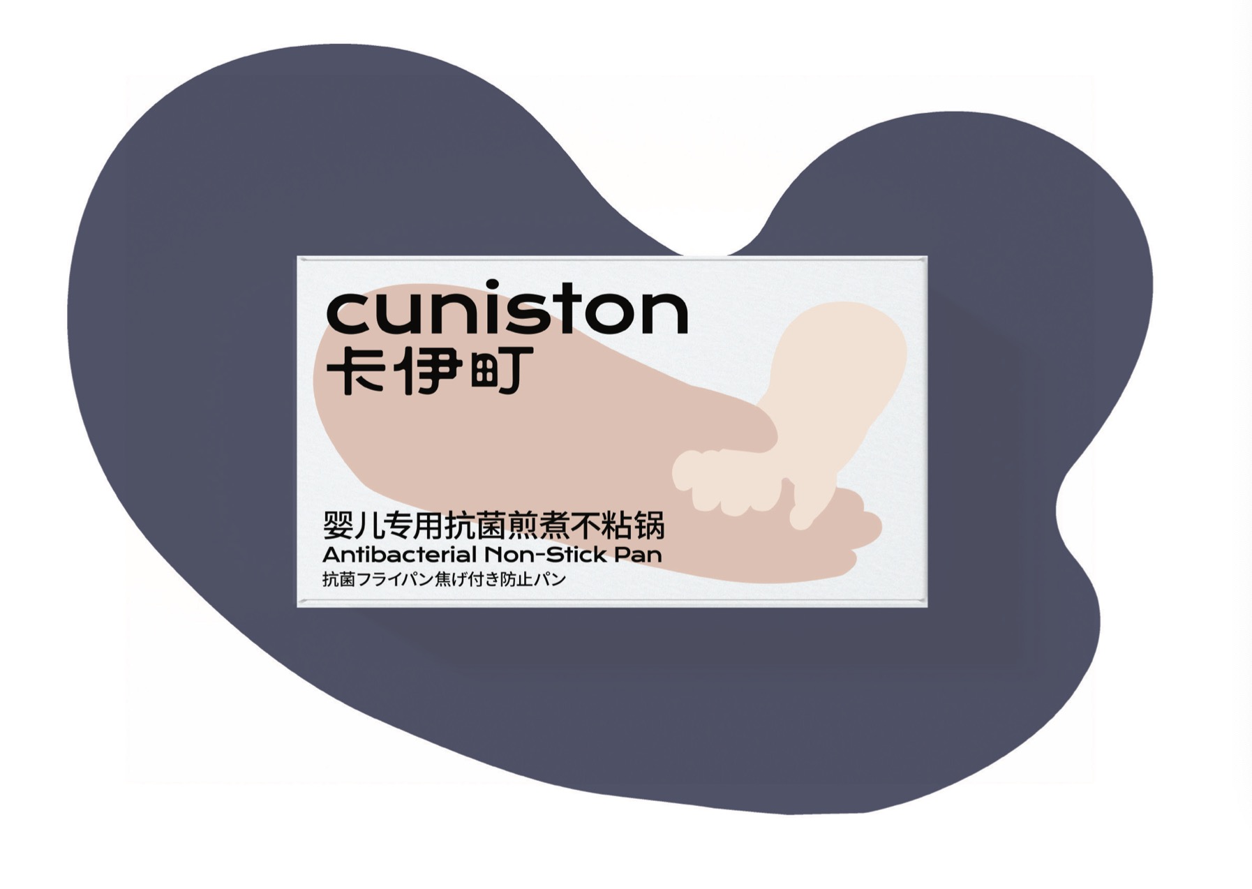
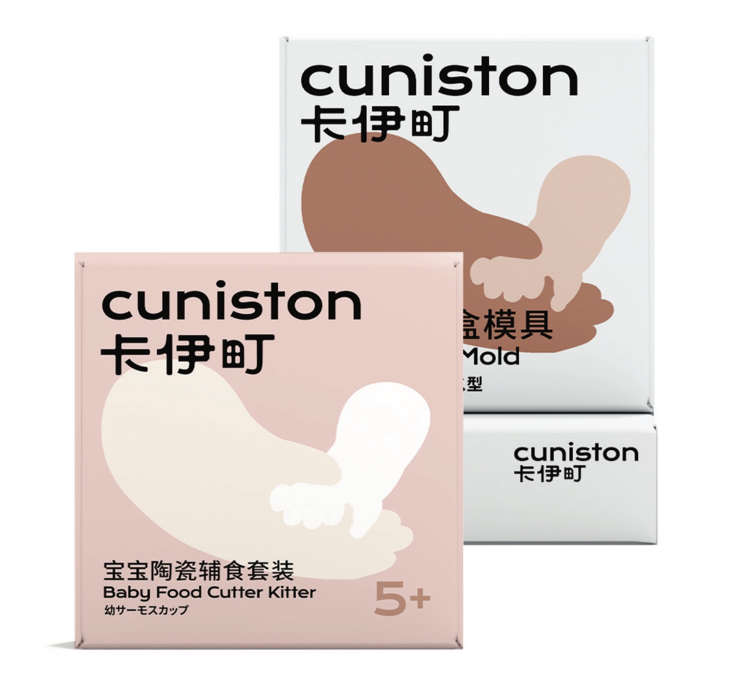
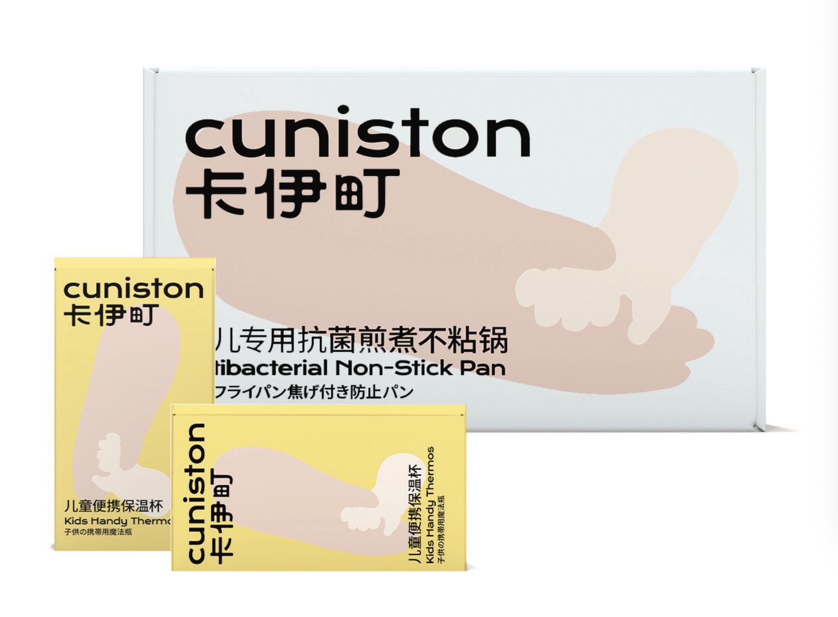
We express the kindness and originality in the product through the primary color of the more neutral skin, and use the same neutral dark and light color for auxiliary application. Present a healthy, environmentally friendly and reassuring visual experience.
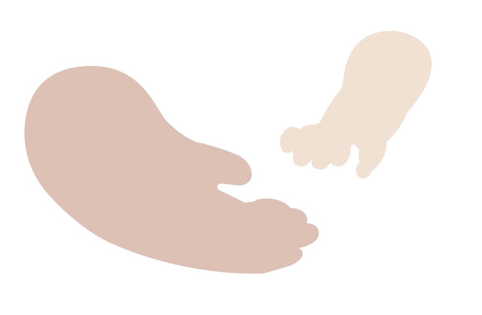
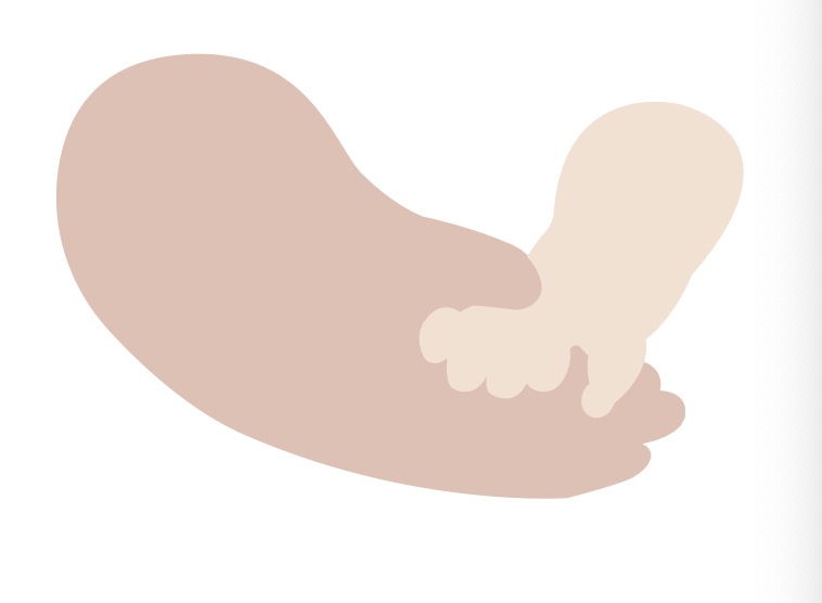
We extend and form patterns based on the sense of care and the brand mainly for groups. The graphic elements use illustration to outline the hands of the mother and baby, which is natural and full of affinity.
Can be used for flat surface and packaging, etc.
本作品版权归 上海物集设计咨询有限公司 所有,禁止匿名转载及个人使用,任何商业用途均需联系原作者。

新用户?创建账号
登录 重置密码
请输入电子邮件以重置密码。


留言板 (1)