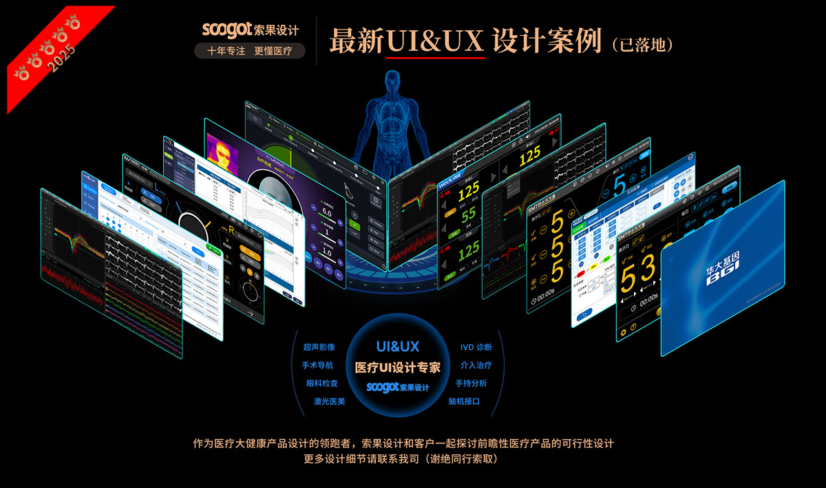
Sogo Design... Ten years of focus on medical health the only track.
Cooperative customers: well-known confidential customers
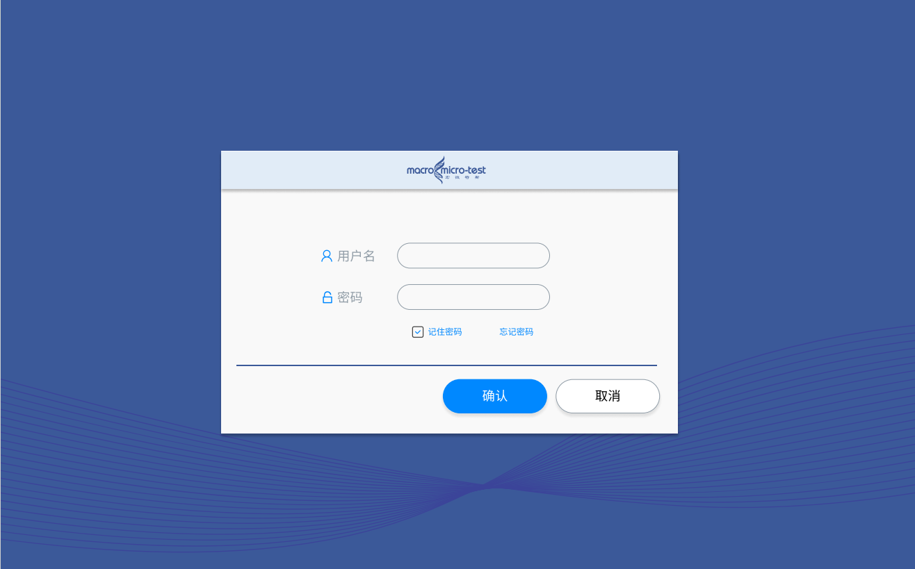
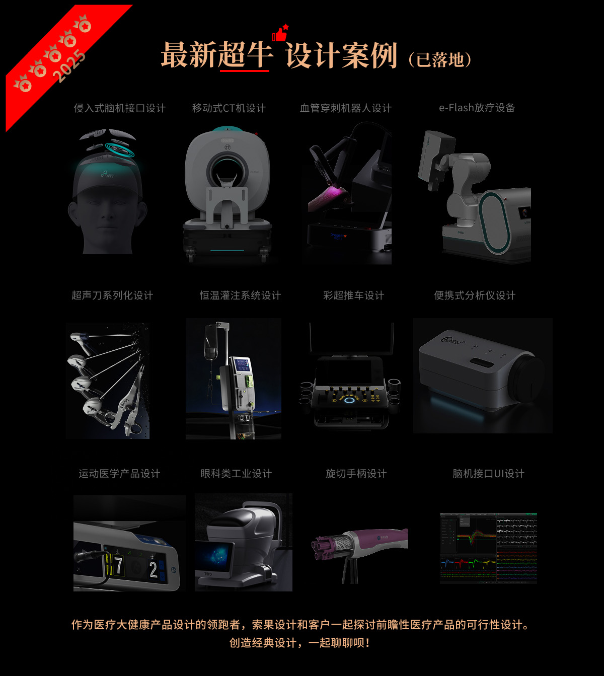
Project Name: Macro Wetus UI Design
Cooperation content: design analysis | appearance design | structural design | prototype production | accompanying running assistance
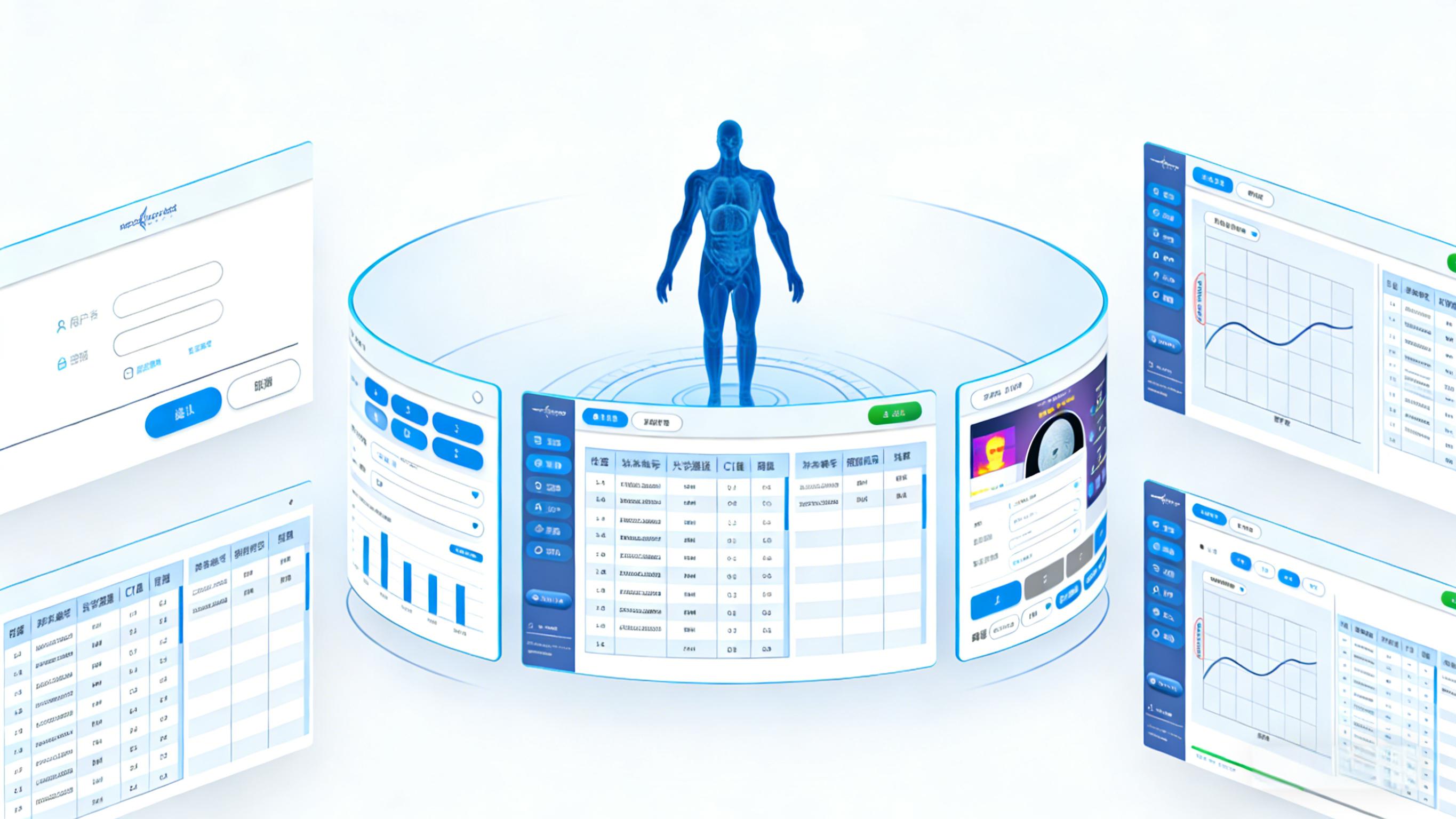
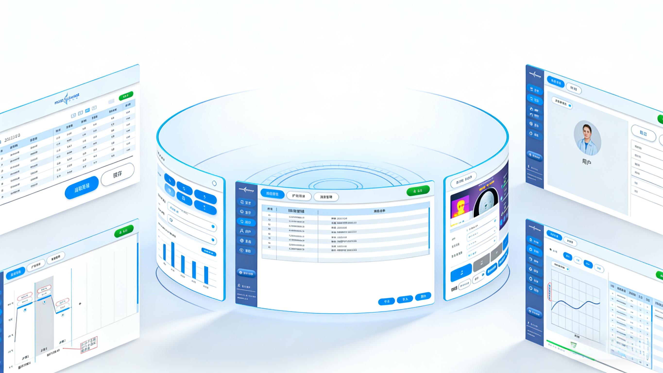
In the UI field of medical diagnostic equipment, Macro Micro's UI design redefines the fusion of professional data and clinical operations with a visual architecture of "surround-type multi-screen collaboration. This system takes human body model as the visual core and integrates multi-module interfaces such as login, data table and curve analysis, which not only meets the professional rigor of medical scenes, but also enables medical staff to obtain more efficient and friendly operation experience in high-intensity diagnostic work through humanized design details.
1. Design Positioning: "Integrated Data Hub" for Clinical Scenarios"
The core positioning of Macro Micro's UI is "to serve the efficiency and accuracy of clinical diagnosis". Different from ordinary consumer UI, it is aimed at medical personnel who need to process multi-dimensional diagnostic data. Therefore, the design starts from "clinical workflow" and integrates functional modules such as login, case retrieval, data analysis, report generation, etc. in a surrounding layout, simulating the real scene of multi-screen collaboration in the operating room. This design not only breaks the information limitation of the single-screen interface, but also enables medical staff to quickly associate the diagnostic data of different interfaces around the visual focus of the human body model, realizing the integrated interpretation of "signs-data-conclusion" and greatly improving the diagnostic efficiency.
2. Design Language: The Unity of Medical Professionalism and Lightweight Experience
Macro Weites UI adopts a restrictive design language that fits the medical scene and finds a precise balance between professionalism and friendliness:
Color system: light blue and white are used as the base, and dark blue is used as the functional emphasis color, which not only continues the professional visual symbols in the medical field, but also reduces visual fatigue through low saturation tone, which fits the "calm and focused" atmosphere of the operating room.
Morphological language: interface elements are generally processed with rounded corners. from input boxes, buttons to cells of data tables, rounded corners weaken the "cold feeling" of medical equipment. The smooth curved surface of the surrounding interface makes the multi-screen layout form an organic whole and avoids fragmented visual experience.
Family layout: all functional interfaces continue the framework of "left navigation bar main content area". The navigation bar adopts the combination form of "icon text", which enables medical staff to quickly identify functional modules without memorizing complex operation logic, thus greatly reducing learning cost.
3. design details: function-oriented precision landing
The details of the UI of Hongweites reflect the "user-centered" design thinking everywhere:
Winding layout: with the central mannequin as the visual anchor point, the surrounding interface is arranged in an arc, which simulates the correlation logic of "signs-data-diagnosis" in clinical practice, so that medical staff can intuitively establish the corresponding relationship between human body parts and data.
Data visualization optimization: the curve analysis interface displays the original data with dark blue curves, and the abnormal intervals are marked in red, so that the trend of lesions is clear at a glance; The data table adopts alternating row color design, which is not easy to serial when reading long lists, thus improving data processing efficiency.
Polishing of interaction details: sufficient spacing is reserved for the input box of the login interface to avoid accidental touch during glove operation; The "exit" button of each interface is uniformly placed in the upper right corner to form a fixed interactive memory point. The button adopts the design of "highlight color rounded corners", which not only highlights the operability, but also improves the visual friendliness.
4. Ergonomics: Experience Optimization Adapted to Clinical Operations
The ergonomic design of Macro Weites UI is deeply in line with the working habits of medical staff:
The wrap-around layout conforms to ergonomics: the arc-shaped interface reduces the turning range of medical staff when switching between multiple screens and reduces neck fatigue; The central mannequin serves as the visual focus, making the association of multi-interface data more intuitive and reducing cognitive load.
Scientific control of information density: the information density of each interface is optimized through clinical testing, the row height of the data table is set to 24px, and the button size is not less than 48 × 48px, which not only ensures the information carrying capacity, but also avoids visual oppression.
Consistency of operation logic: the function sequence of the left navigation bar (experiment → query → process → user) completely conforms to the workflow of clinical diagnosis, and medical staff can complete the whole process operation without additional jump, realizing "synchronization of action and logic".
From the wrap-around visual architecture to the row color design of the data table, the macro-micro-Tex UI always revolves around "clinical value. It is not a simple interface beautification, but a design as a link to make professional medical data more readable, the operation process more efficient, and ultimately achieve the design goal of "data collaboration" and "experience symbiosis", which provides a practical paradigm for the UI innovation of medical diagnostic equipment. Sogo Design: www.soogot.com


Yeah, that's it.
It's perfect, huh