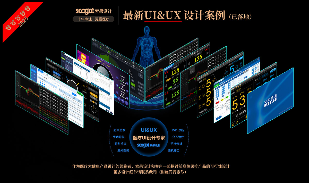
Soko Design... Ten years of focus on medical health the only track.
Cooperative customers: well-known confidential customers
Project Name: UIdesign_Version
Cooperation content: design analysis | appearance design | structural design | prototype production | accompanying running assistance
In the UI design of medical diagnostic equipment, "precise landing of professional functions" and "operation experience of medical staff" are often the core contradictions-too much emphasis on professionalism will make the interface redundant and obscure, and the emphasis on experience may sacrifice data accuracy. UXON's UIdesign_Version design is a UI system for ophthalmic diagnosis scenes. It takes medical-grade functional logic as the base, and realizes the efficient integration of professional data and human-computer experience through systematic design language and refined detail processing.
1. Design Orientation: "Function First, Experience Adaptation" in Medical Scenarios"
As a supporting UI for ophthalmic diagnostic equipment, the core positioning of UIdesign_Version is "the efficiency and accuracy of clinical diagnosis". Ophthalmic diagnosis involves multi-dimensional data (fundus imaging, intraocular pressure records, case files, etc.), so UI must first meet the professional requirements of "complete data, easy access and analyzable". At the same time, medical staff have a fast pace and high concentration of clinical work, and UI needs to reduce operating costs and visual and cognitive fatigue-this position determines that its design logic is not "aesthetic priority", but "function is nuclear, experience adaptation function".
2. Design Language: The Unity of Medical Professionalism and Lightweight Interaction
UIdesign_Version uses a "restraint design language" that fits the medical scenario ":
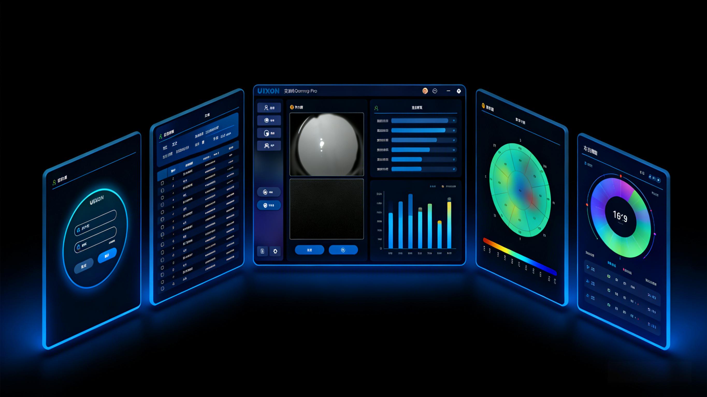
Hue system: dark gray/black as the interface substrate, with low saturation blue as a highlight color. The dark interface not only conforms to the "calm and focused" atmosphere of the operating room, but also reduces the visual stimulation of screen reflection on the screen for a long time. As a landmark color in the medical field, blue not only conveys professional credibility, but also avoids visual interference caused by high saturation color.
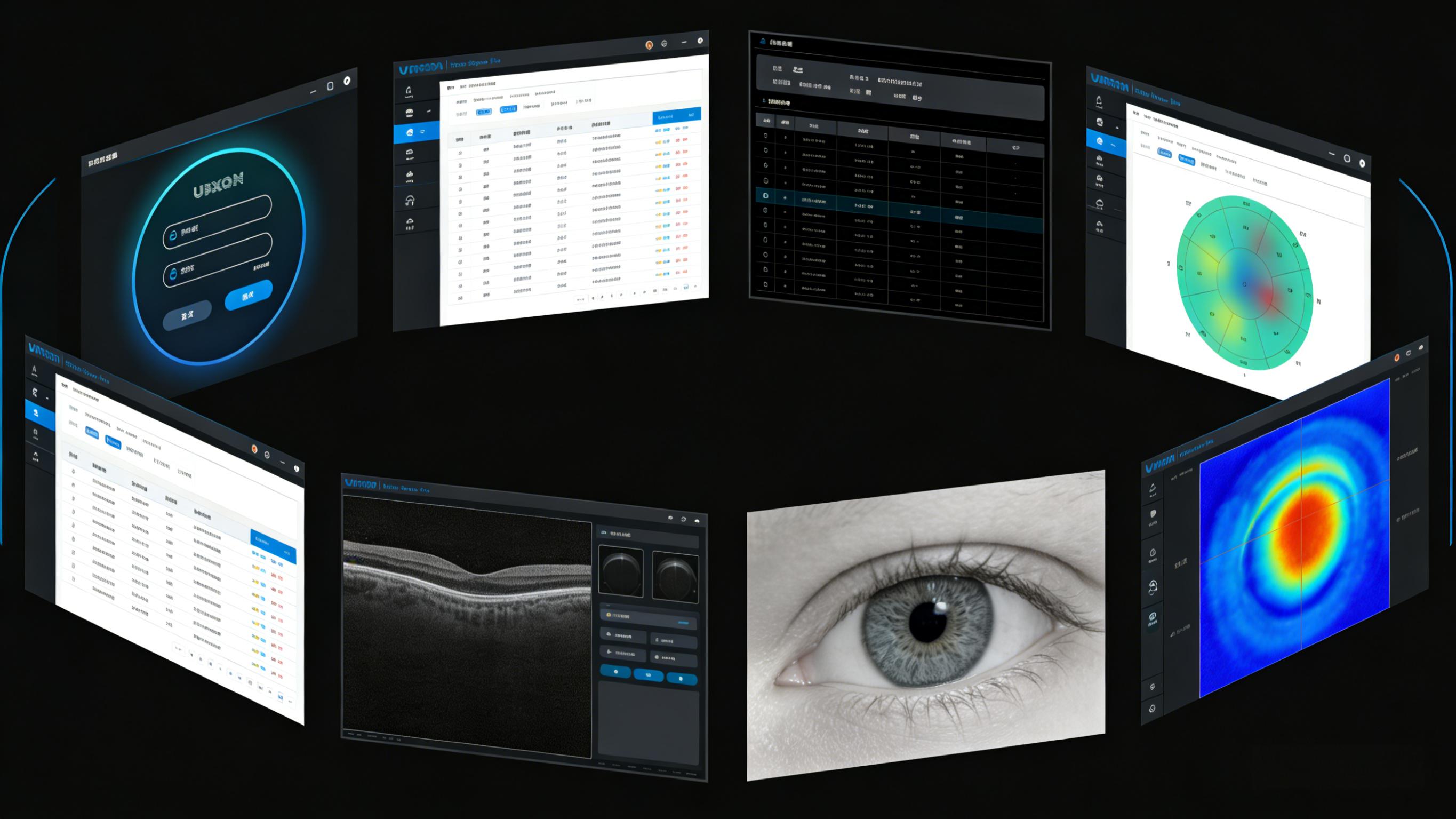
Framework Unity: All functional modules continue the family layout of "main content area of title bar at the top of left navigation bar": the sidebar presents core functions (case management, imaging analysis, etc.) with "icon text", and the top fixed brand logo "UXON" and the current module name. This unified framework allows medical staff to switch diagnostic links without having to re-adapt to the interface logic, significantly reducing learning costs.
Visual texture: the interface elements are mainly simple geometric forms, and the buttons and cards are designed with rounded corners, which not only weakens the "cold feeling" of medical equipment, but also conforms to the lightweight aesthetics of modern UI.
3. design details: precise optimization of service professional needs
Detail handling is the key to UIdesign_Version the balance between "professional" and "experience:
Information hierarchy distinction: in the data table, abnormal indicators are marked with color labels (yellow and red), normal data are presented in light gray, and medical personnel can capture abnormal information in 1 second. The imaging interface highlights the lesion area with "thermal force gradient ring scale" to convert abstract corneal curvature and retinal thickness data into intuitive visual symbols.
Control scene adaptation: the operation button adopts a moderate size of 24 × 24px or more, with 5px rounded corners-not only to avoid accidental touch when wearing sterile gloves, but also to fit the comfortable area of manual clicking; The slider of imaging adjustment increases visual feedback of damping sense, and the highlight change of progress bar when dragging makes the operation more "deterministic".
White space and typesetting rhythm: the data form keeps 1.5 times the row spacing and 8px the column spacing to avoid information congestion; A 16px blank space is reserved between the main content area and the navigation bar to reduce the visual pressure of long-term operation.
4. Ergonomics: Adapting the Manipulation and Cognitive Habits of Medical Users
The "ergonomics" of UIdesign_Version is not the adaptation of physical level, but the optimization of operation process and cognitive habits of medical staff:
Process synchronization: UI function sequence (login → case retrieval → imaging acquisition → data analysis → report generation) fully conforms to the clinical process of ophthalmic diagnosis without additional jump, realizing "synchronization between operation action and interface logic".
Visual comfort: The combination of low saturation tones in the dark mode reduces the irritation of the screen light to the eyes-this is especially friendly to ophthalmologists (who have higher requirements for visual comfort).
Cognitive load reduction: convert complex ophthalmic data into visual graphics (heat map, circular distribution), replace "pure digital presentation" with "graphic language", so that medical staff can complete data interpretation in a short time and reduce cognitive fatigue.
From the visual presentation of professional data to the scene adaptation of the operation process, the design of the UIdesign_Version always revolves around the "actual needs of medical users"-it is not a simple interface beautification, but takes the design as the carrier to make the operation of ophthalmic diagnostic equipment more efficient, the data easier to read and the experience more friendly. This "user-centered professional UI design" also provides a feasible direction for UI innovation of medical devices. Soko Design: www.soogot.com
本作品版权归 索果设计-专注医疗大健康设计 所有,禁止匿名转载及个人使用,任何商业用途均需联系原作者。

新用户?创建账号
登录 重置密码

请输入电子邮件以重置密码。
quite OK
This doesn't look easy, huh