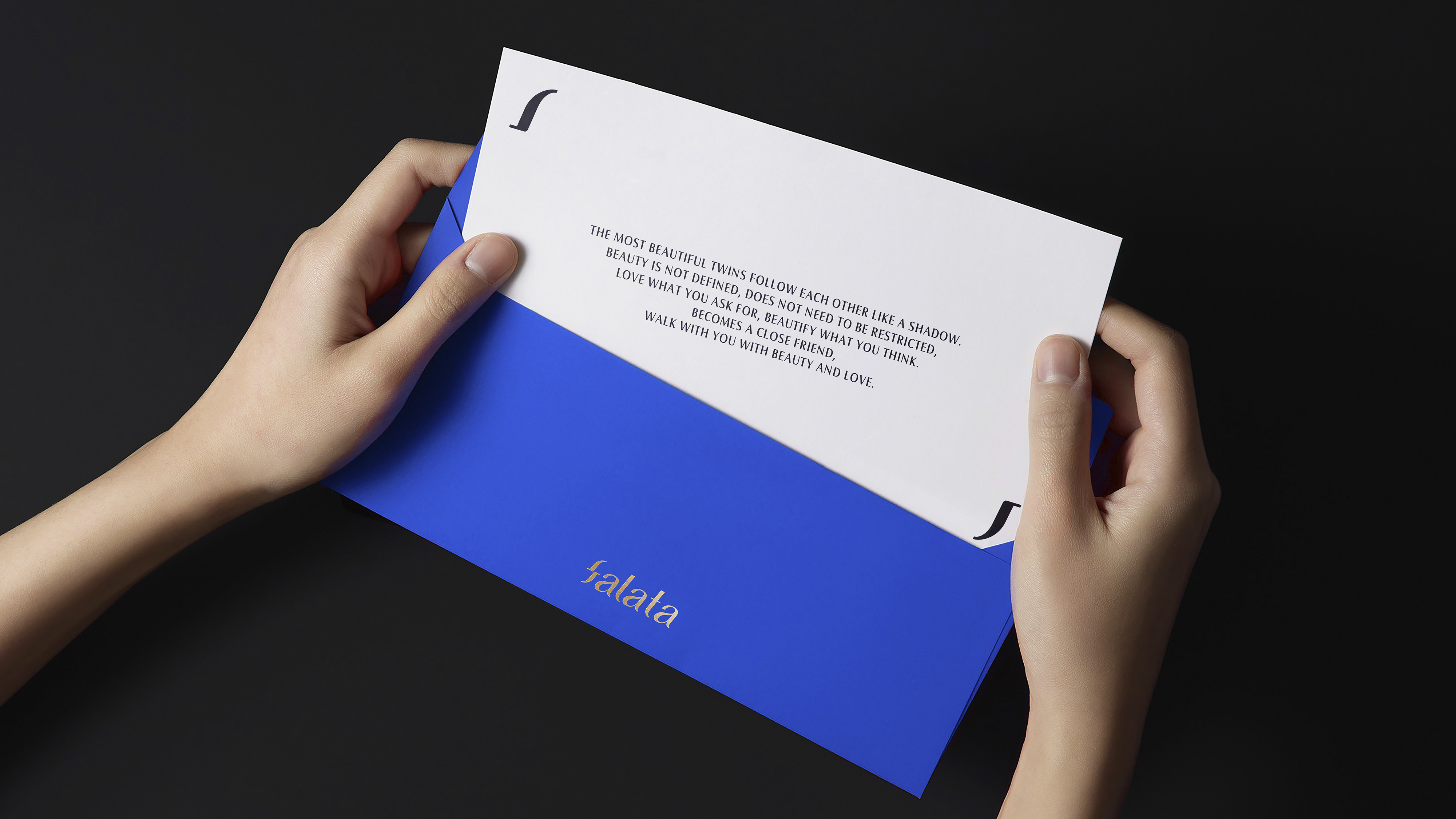
Falata is a brand that focuses on the relationship between products and the United States. This is a twinned relationship like twins. The brand hopes that it can also form this close connection with users. Based on this, we have re-established the brand concept of "to the United States and the United States" for Falata to help it reshape its brand spirit.
This relationship is reflected in their Slogan, brand building, product development and other aspects, so we also focused on this twin relationship when designing.

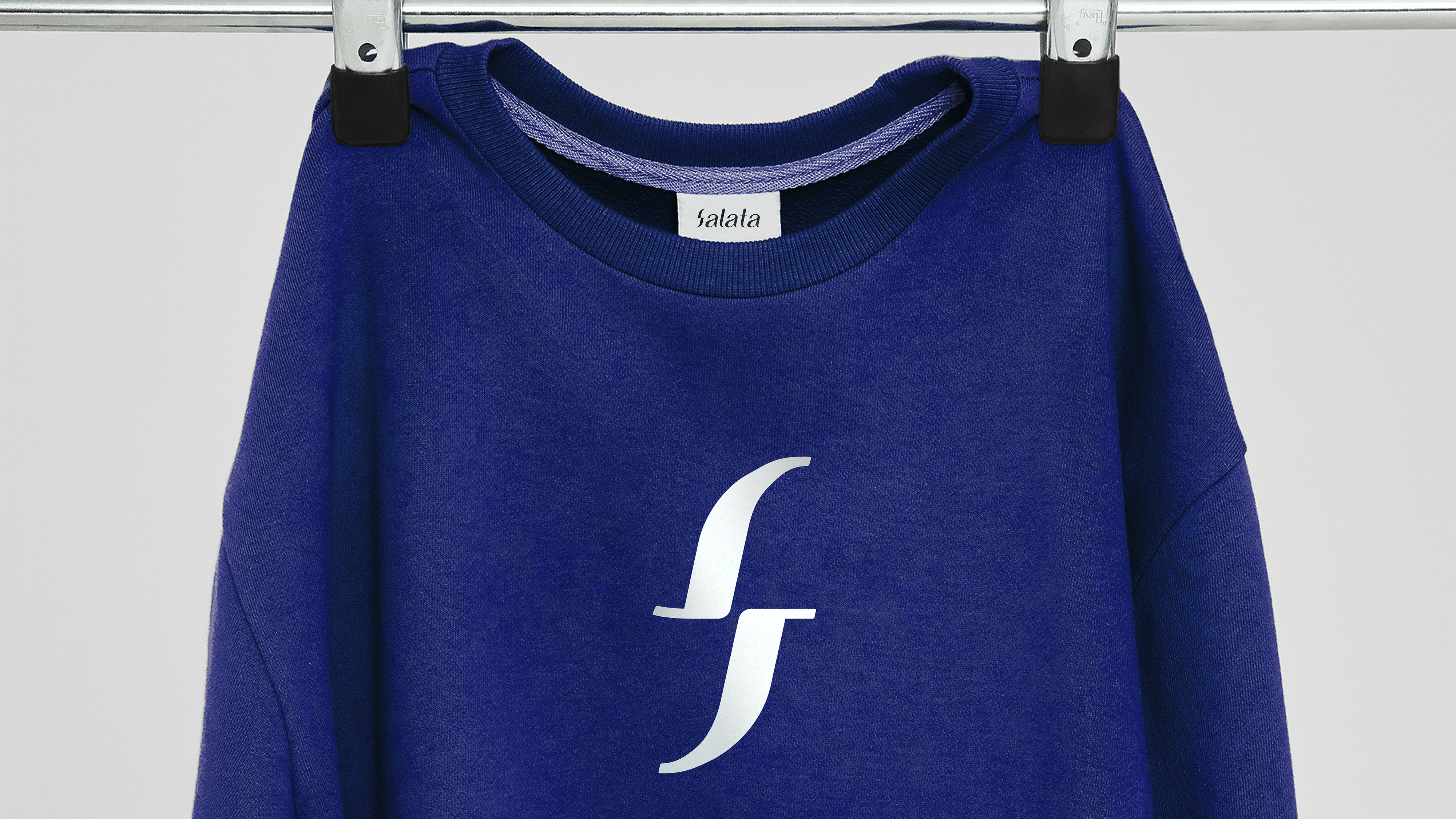
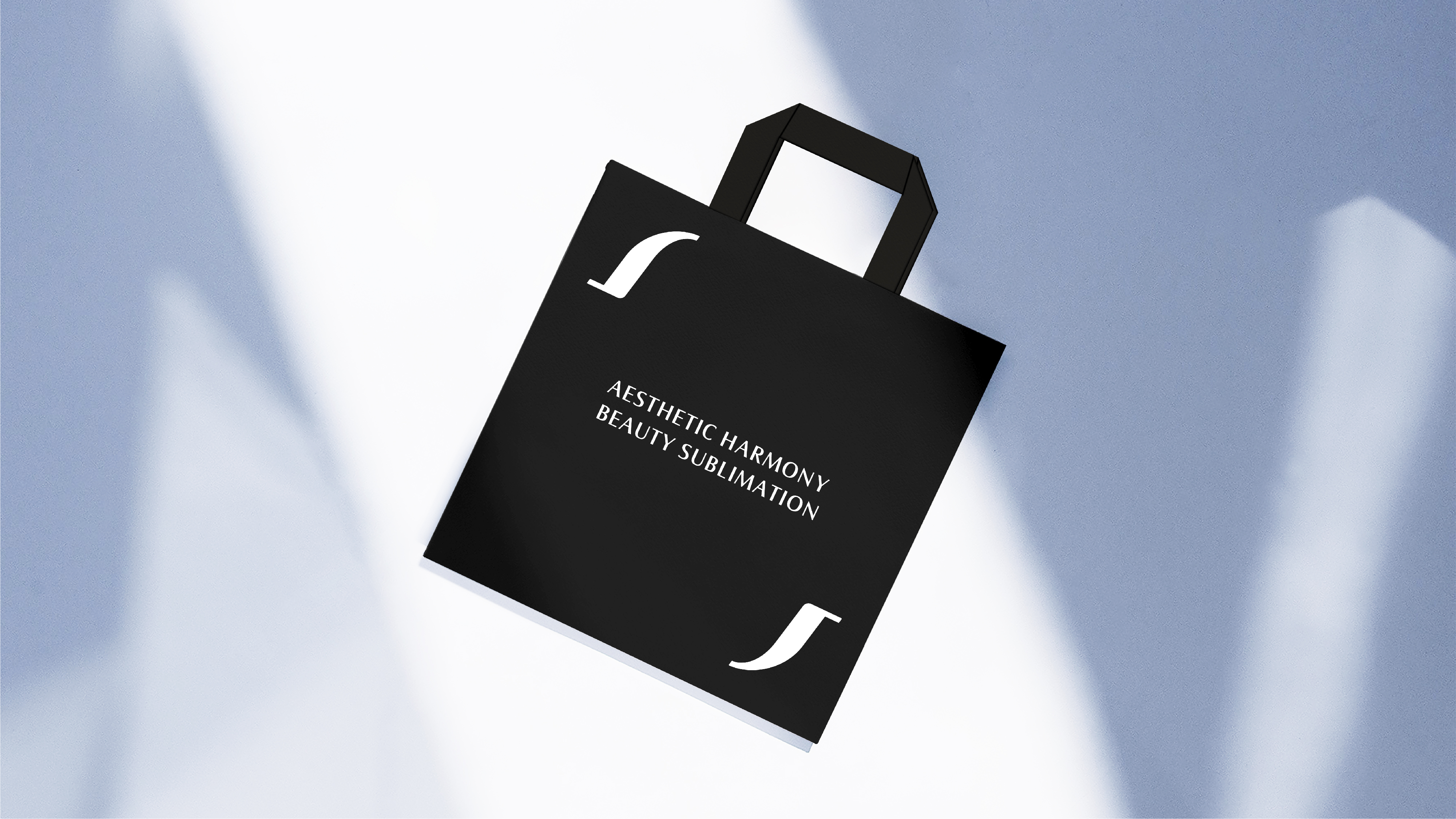
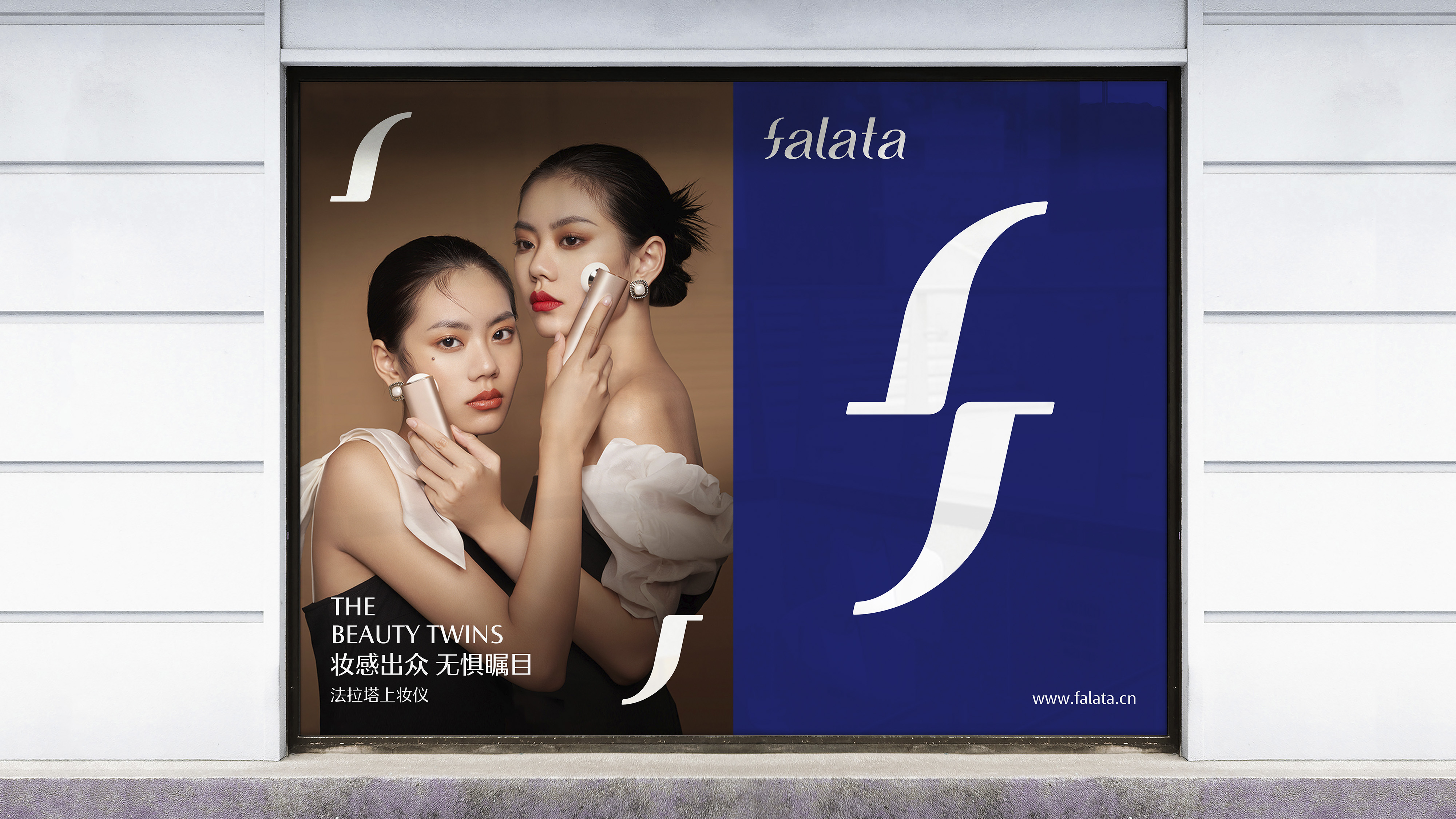
According to the characteristics of the handwritten letter "f", we have designed the upper and lower comparison, and the letter "f" that can be completely overlapped after rotation is also based on the font, forming a kind of echo and feeling with the brand definition of "beauty twin.
本作品版权归 后浪设计 所有,禁止匿名转载及个人使用,任何商业用途均需联系原作者。

新用户?创建账号
登录 重置密码
请输入电子邮件以重置密码。


Can