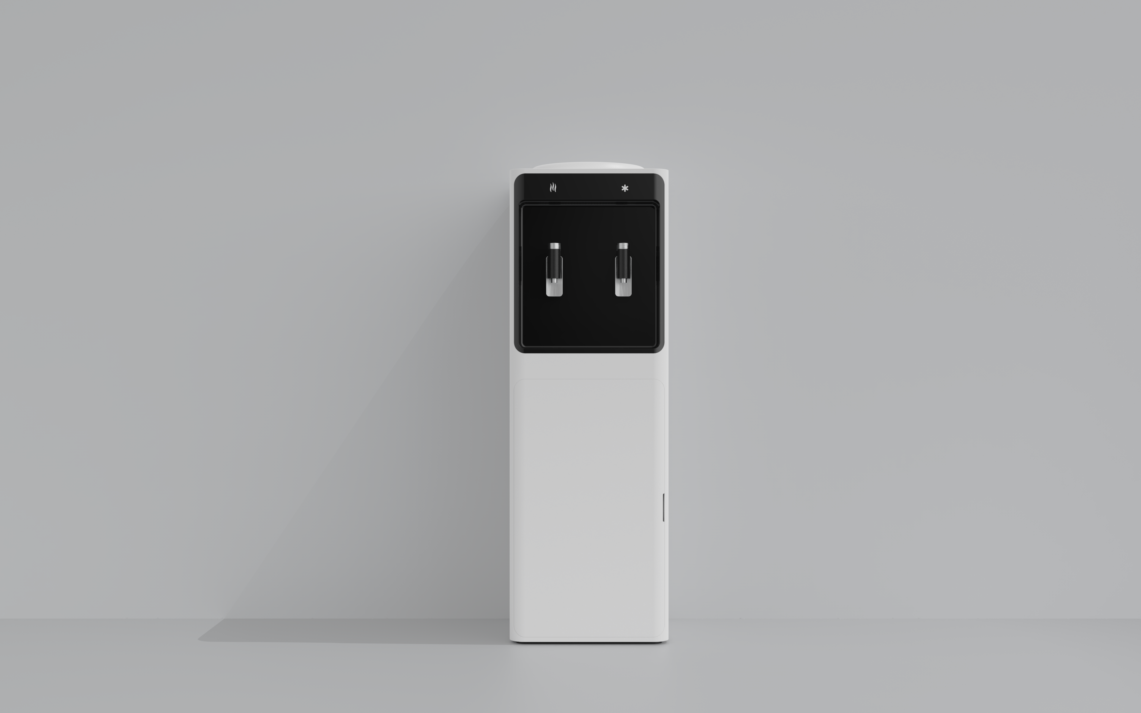
The first picture emphasizes the contrast. First, the most direct contrast between black and white, followed by the contrast between the white large acute rectangle and the black rounded rectangle, which will attract the viewer's visual focus to the top two right angles. After emphasizing the contrast, the unity is conveyed. The black part fits the three sides of the white rectangle as much as possible, and the three sides are made narrow and equal in width. Then the rounded corners of the black area and the rounded corners of the overall white rounded rectangular stretch body are also unified. Generally speaking, it conveys the aesthetic law of unity and contrast.
There are cold and hot aspects that take into account the user experience and user needs. It is really necessary to make a difference or indicator light (without affecting Jane) ; If the design starting point is to avoid bending over and stand to receive water, and the space below is quite large, it is a waste of emmm to store tea bags (it would be great if it can be realized as a micro refrigerator)
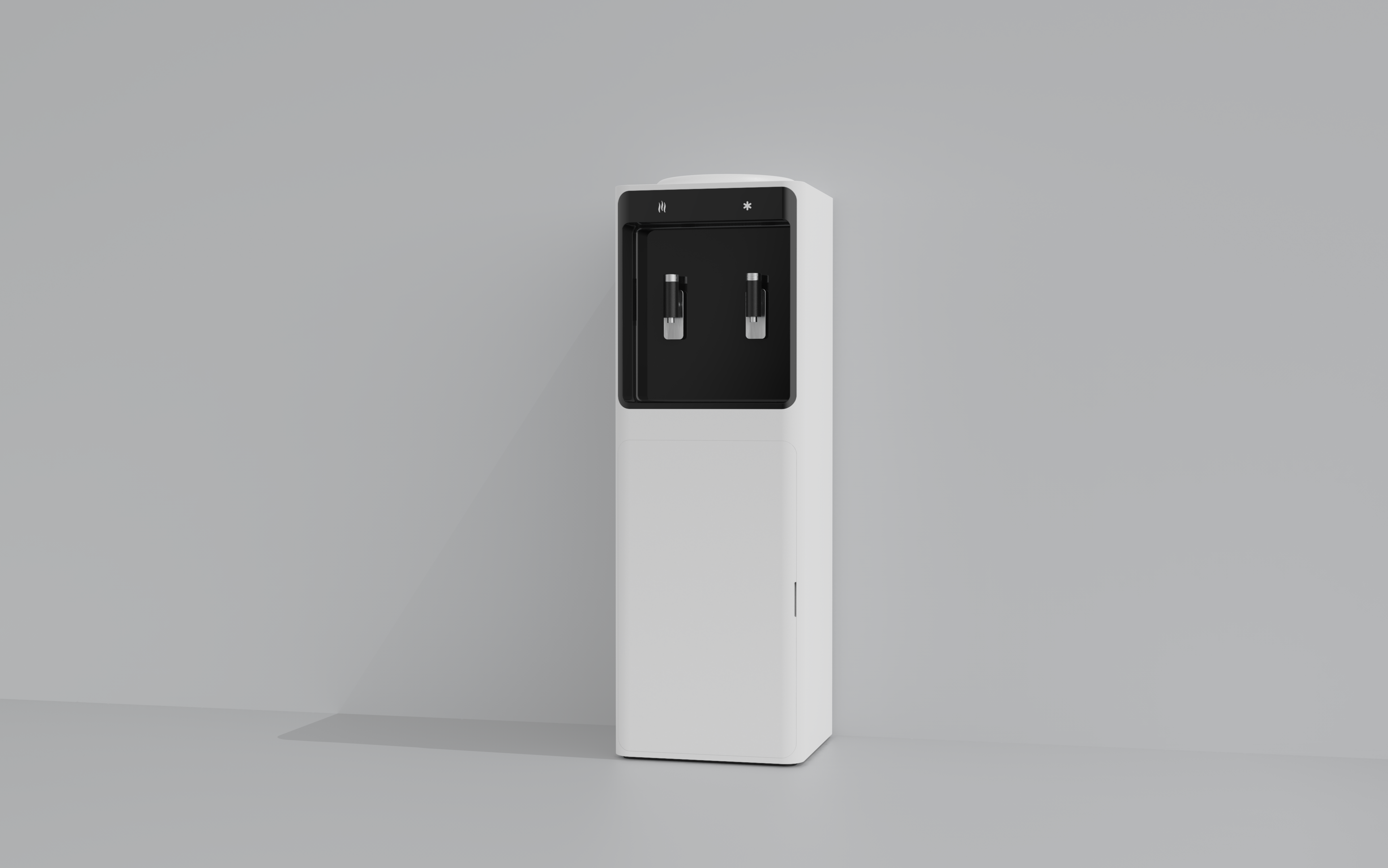
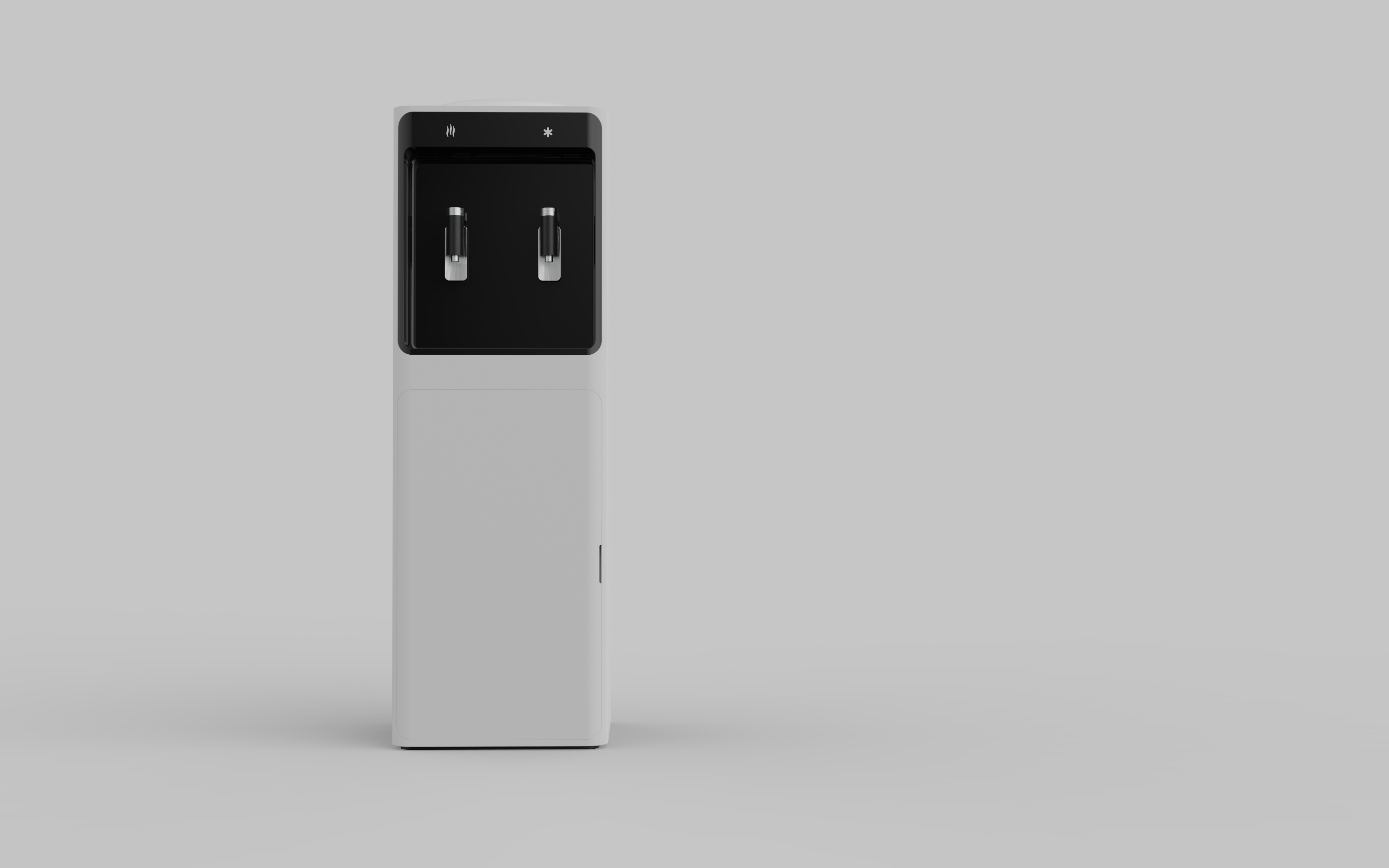


The first picture emphasizes the contrast. First, the most direct contrast between black and white, followed by the contrast between the white large acute rectangle and the black rounded rectangle, which will attract the viewer's visual focus to the top two right angles. After emphasizing the contrast, the unity is conveyed. The black part fits the three sides of the white rectangle as much as possible, and the three sides are made narrow and equal in width. Then the rounded corners of the black area and the rounded corners of the overall white rounded rectangular stretch body are also unified. Generally speaking, it conveys the aesthetic law of unity and contrast.
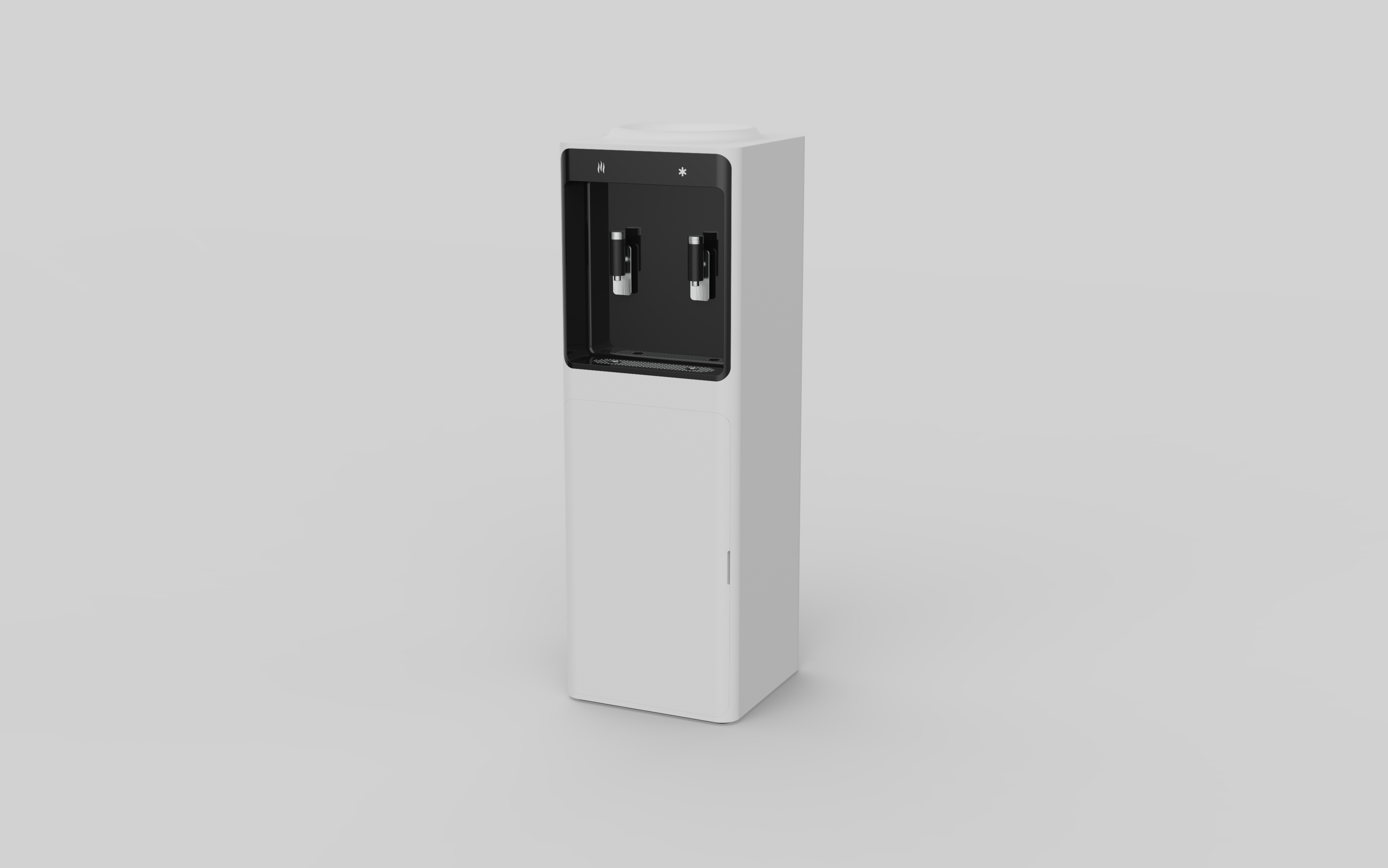
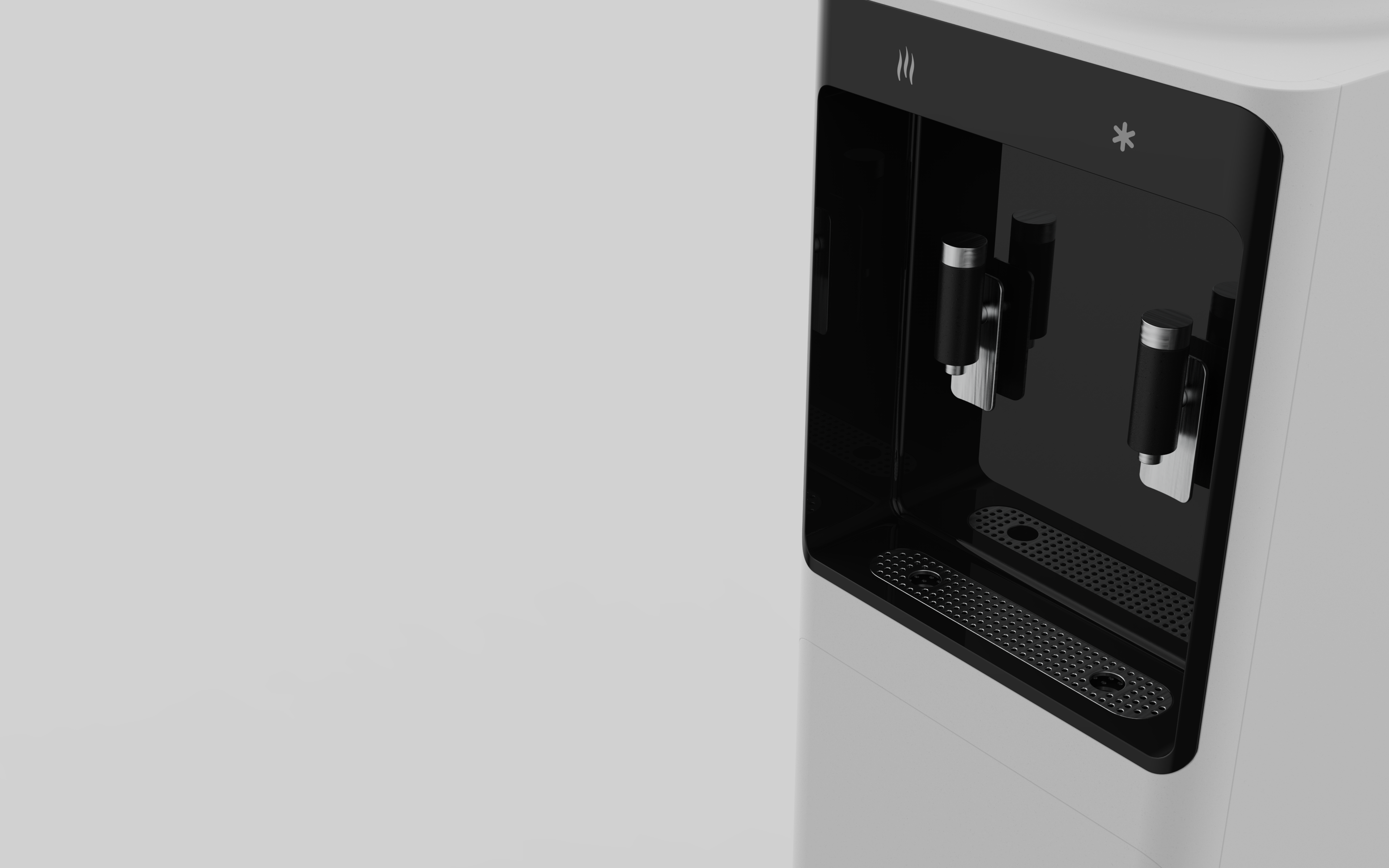
Is the protrusion on the top inserted into the bucket?
I have an idea to make some differences in the switch of hot water and make the outlet smaller. Will it be more humane? Welcome to discuss
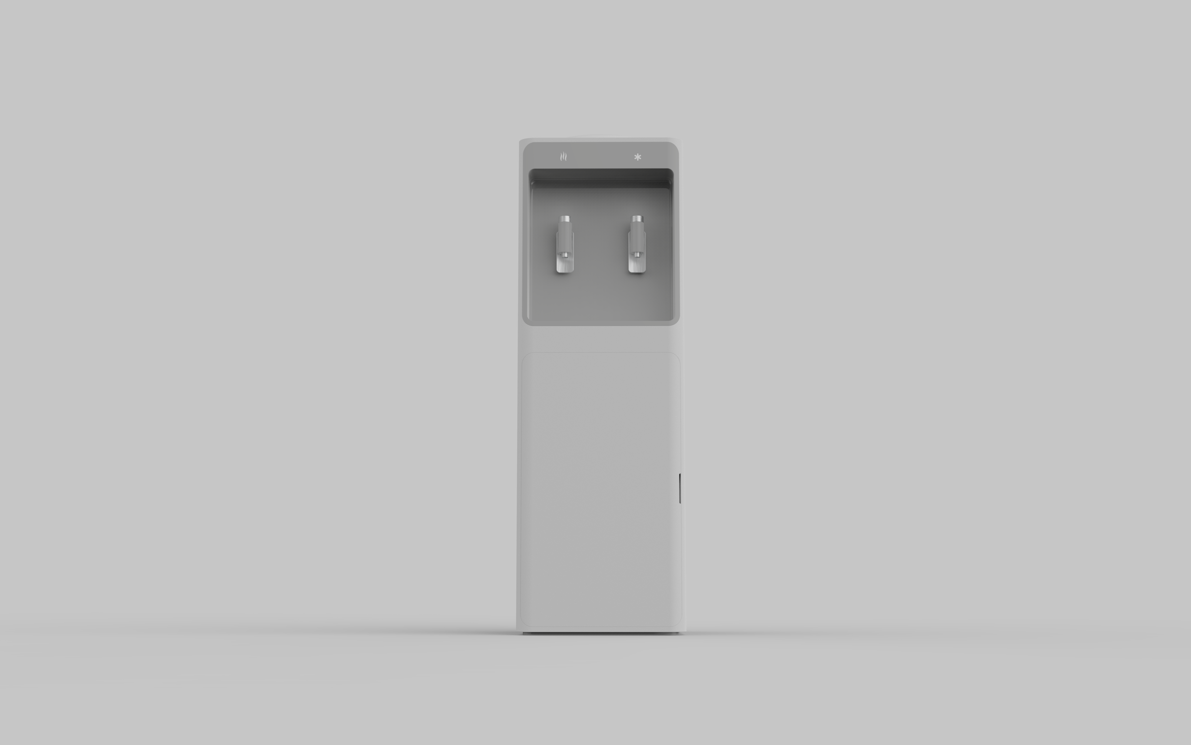
Black, white, gray, concise