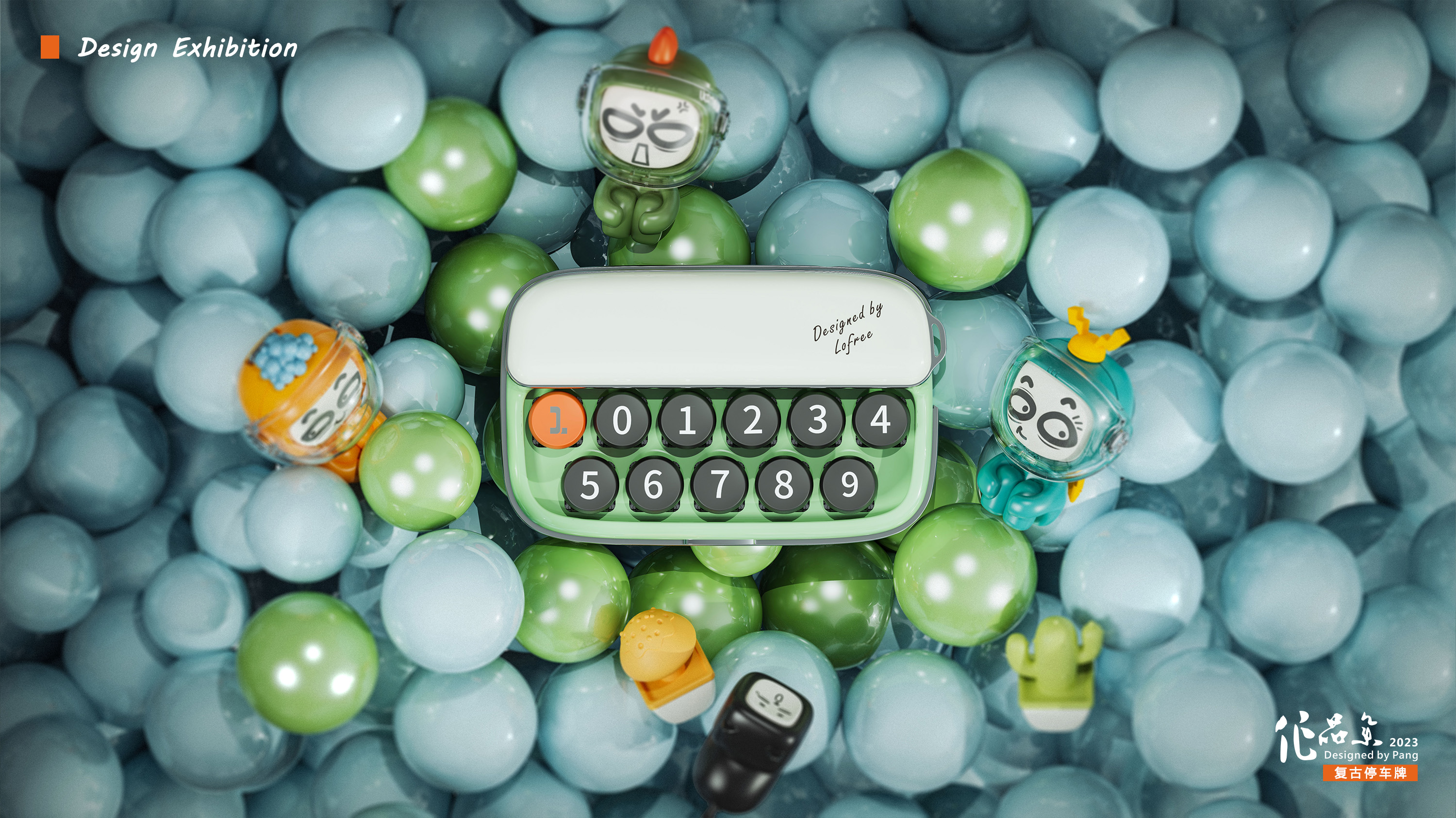
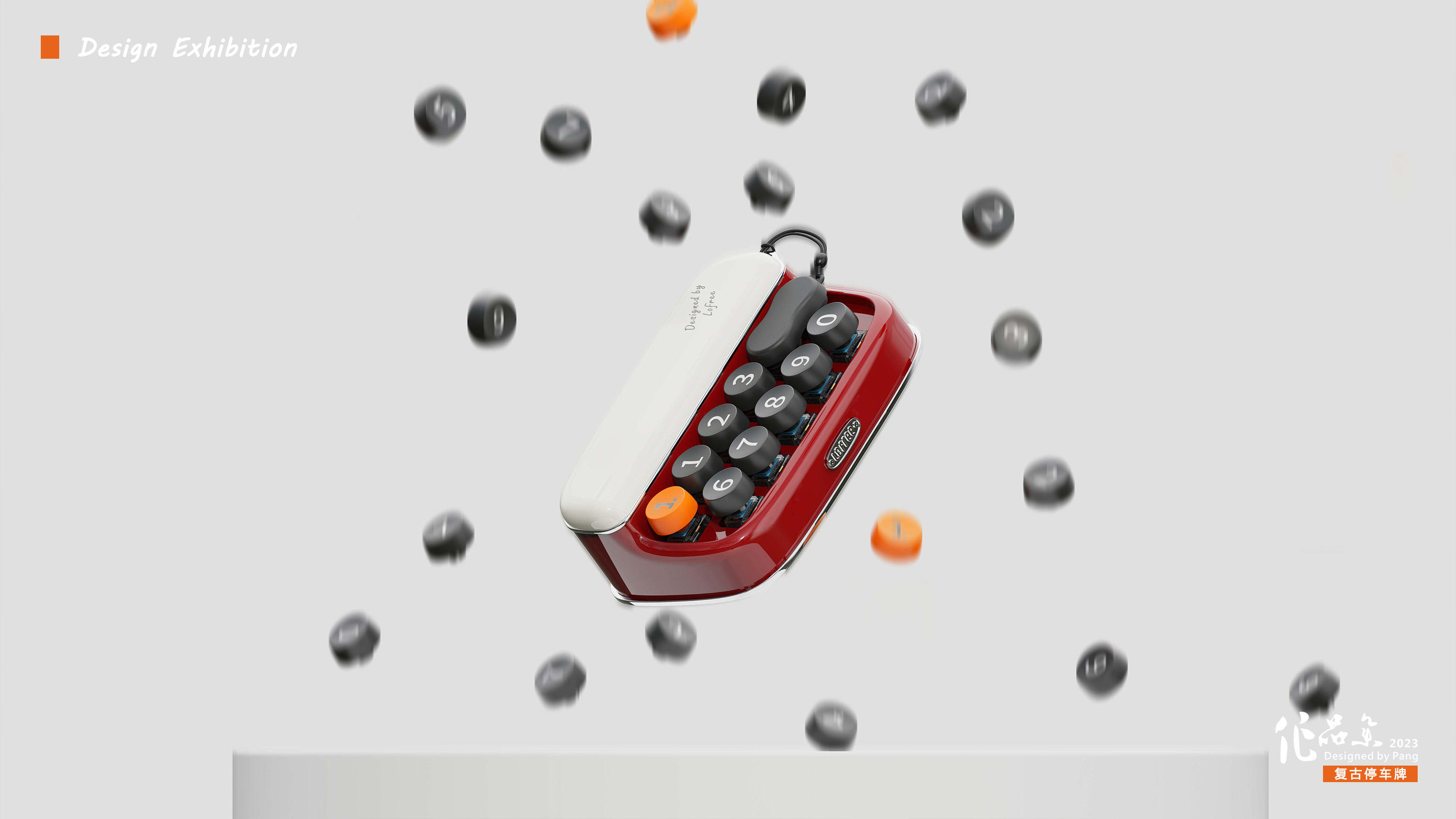
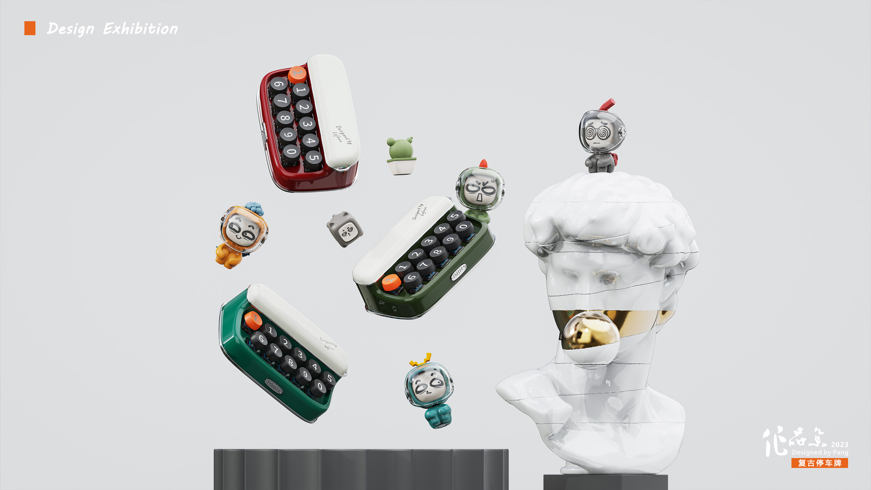
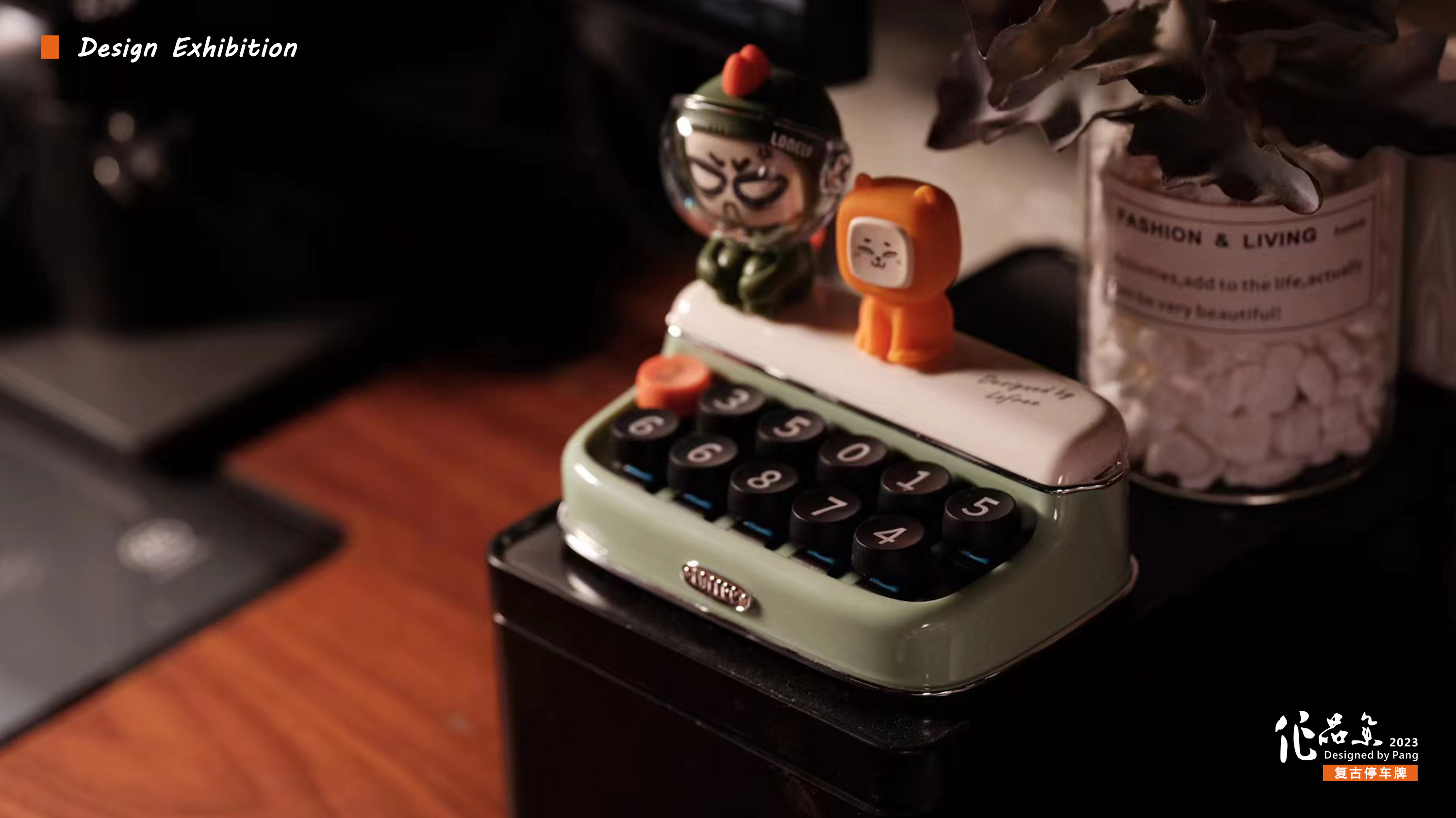
Recently, I turned over the previous works and "returned to the furnace to rebuild" it. This parking sign is based on a retro typewriter. It innovatively designs a row of digital patterns into two rows to make the overall ratio more compact. Among them, the shaft key function is also added, so that it can not only be seen, but also can be played with hands, decompressing your driving journey and adding a little interest; at the same time, it can also be placed on the office desktop as a beautiful decoration for viewing, which can give full play to its more value.

本作品版权归 Felix Design 所有,禁止匿名转载及个人使用,任何商业用途均需联系原作者。

新用户?创建账号
登录 重置密码
请输入电子邮件以重置密码。


A special
Will the two-line characters give people a misunderstanding, personal opinion, or a row of long characters is more intuitive
Exquisite and retro
Wow, what is the blurring effect of the black object behind P2?
What a lovely feeling
I feel that my little broken car is not worthy of this parking sign.
So delicate
This design is really great
The shape is very design, and the rendering effect is also very good, it looks like a work of art.
It's too delicate!