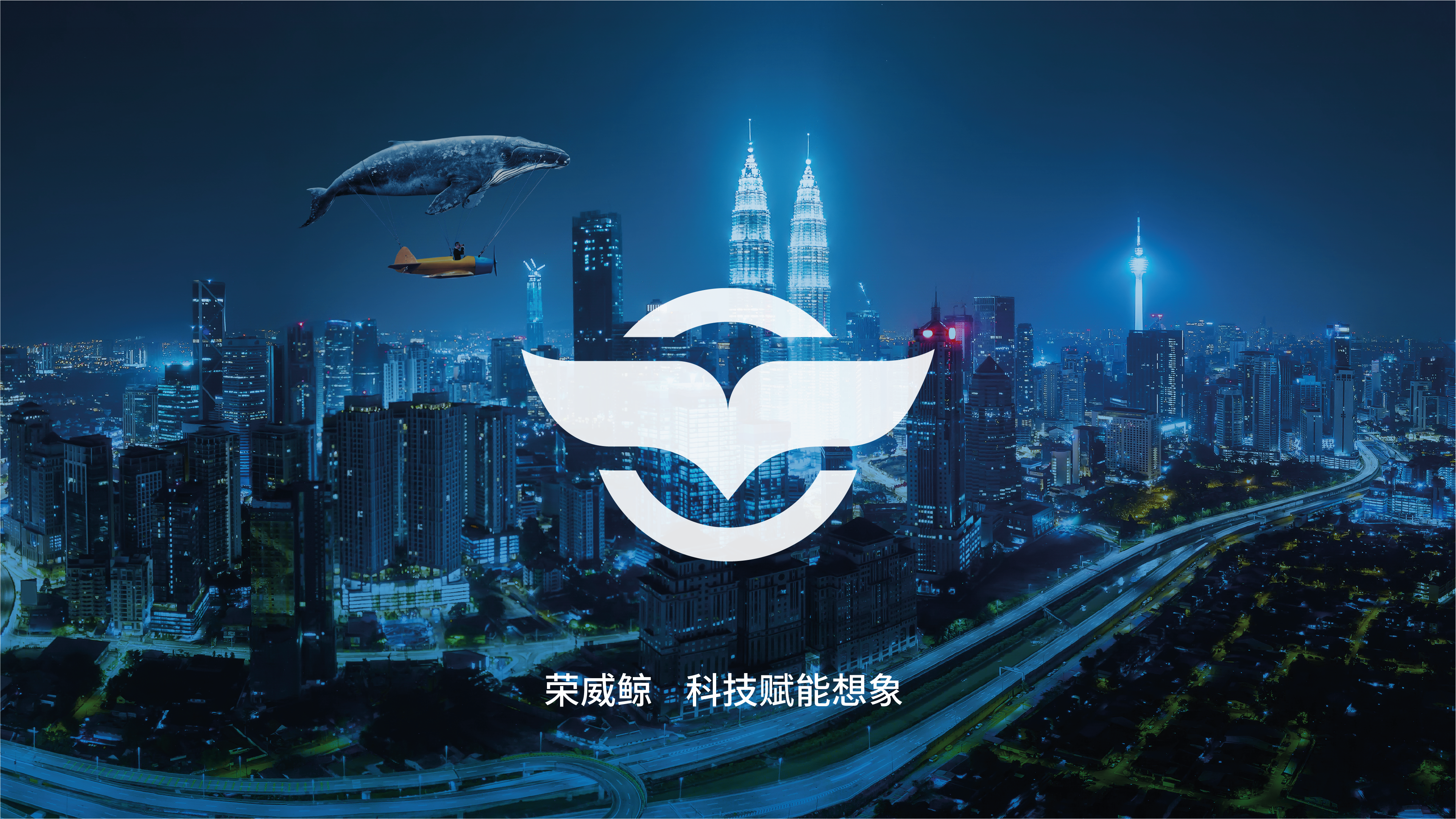
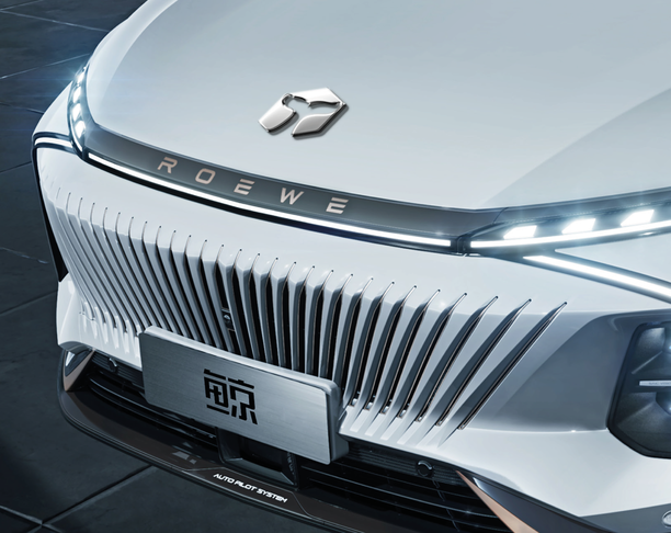
1. Rhythm Awakening
Inspired by the whale's classic tail-slapping (hitting the water surface with the tail fin), it creates a huge sound. It is an effective way for whales to exchange emotional information, which coincides with the design concept of "rhythm awakening" of Rongwei whales.
2. Kunpeng's ambitions
Kunpeng is a big fish that can be transformed into a bird in ancient legends. It describes the comfortable sense of space and wide driving vision of the Roewe whale. It also reflects Roewe Whale's cross-border thinking of constantly innovating and surpassing itself.
3. Intelligent Technology
The circular symbol in the logo is both a steering wheel and a care, implying that all settings are in control. Reflects the Roewe whale personalized, intelligent and technological direction.


本作品版权归 Frankdesign 所有,禁止匿名转载及个人使用,任何商业用途均需联系原作者。

新用户?创建账号
登录 重置密码
请输入电子邮件以重置密码。


The user [nickname Frankdesign] was reported by multiple netizens to have improper and radical remarks. After verification, his account has been banned. Please all designers cherish your rights and communicate rationally and civilly.
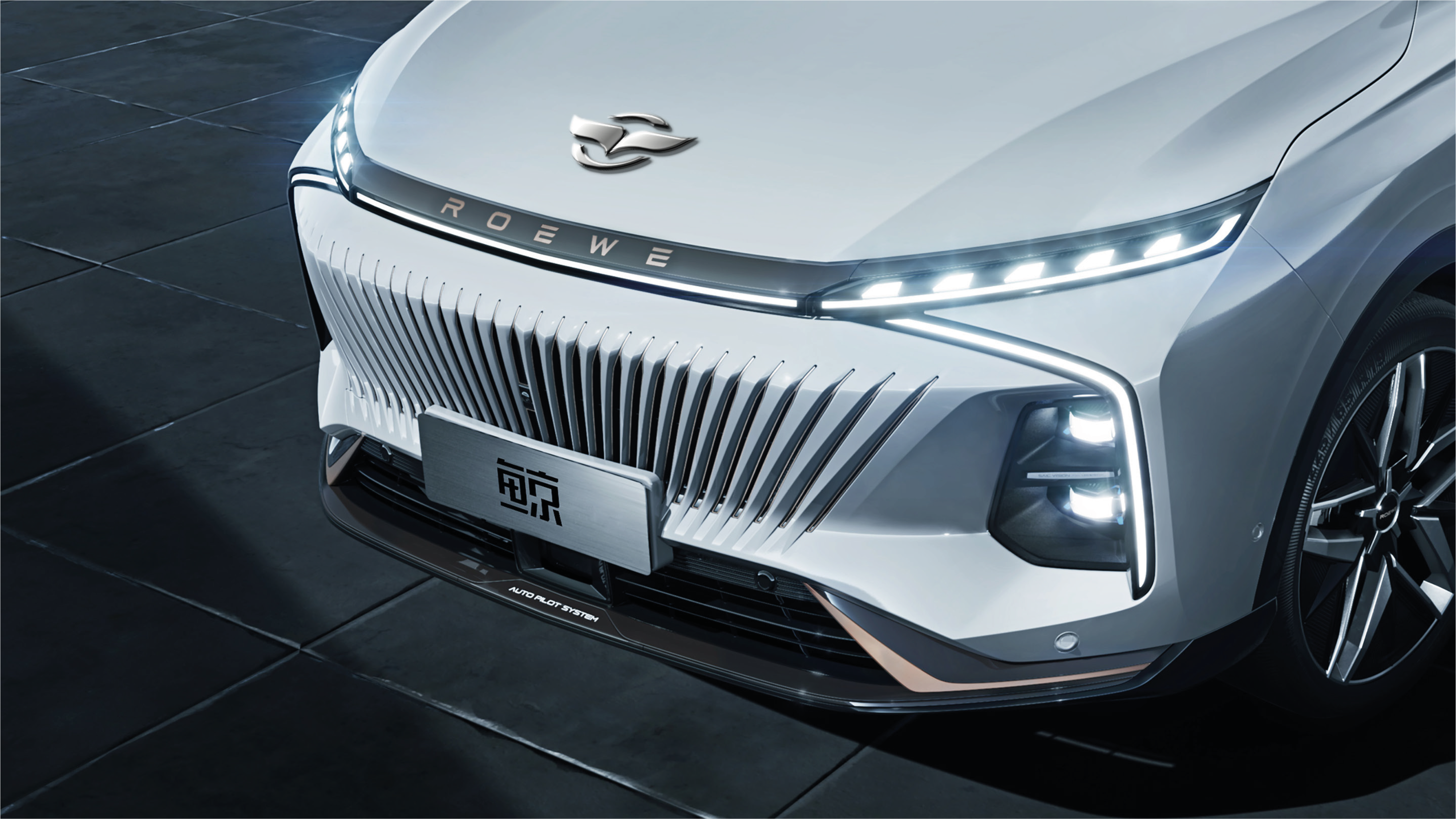
When you put the logo on the front of the car, I went directly....
This logo is really ordinary, mainly because too many designs that want to express whales use whale tails. Although tails are also characteristic, they are already aesthetically tired and have no memory points and no freshness.
My feeling: the lines are too thick, so I don't look at them carefully.
You're a little lacking in the beauty of graphics.
Horse.. Mazda?
I can see that everyone is leaving a message on this most common plan, but not commenting on several other more innovative plans. The sunspots are really black.
I have designed four logo models. I can see that I have paid my heart, so I am indignant when I am not selected. After reading your works, to be honest, you should reflect on yourself.
Criticism is also welcome. If you say that you are not good at it, delete it and point your face.
Hello everyone, our company has submitted 4 design schemes this time. I think this ordinary one can look at other ones. Thank you for your criticism and correction. Only by being shown can we make progress and live up to our designer's hard work for a week. Thank you again!
It is very common to have the same effect as many logos.
Similar to one of the finalists
It's quite good
It looks good
Not bad