🟢Project Thinking: How to Make Shelf the First Strategic Officer of Brand
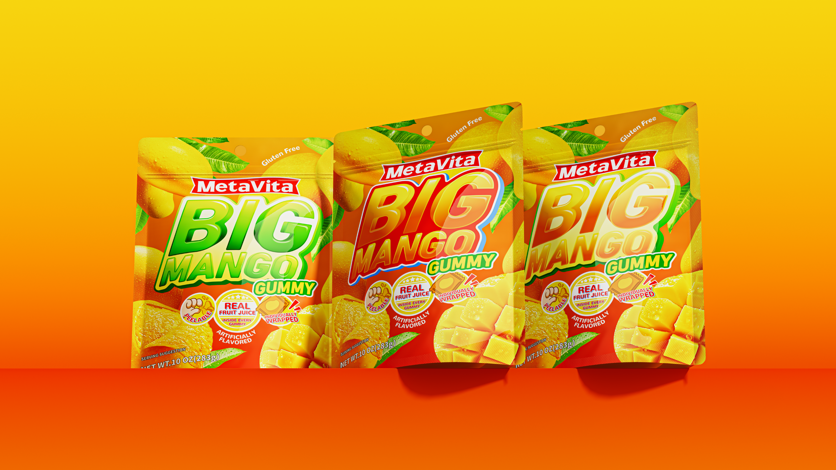
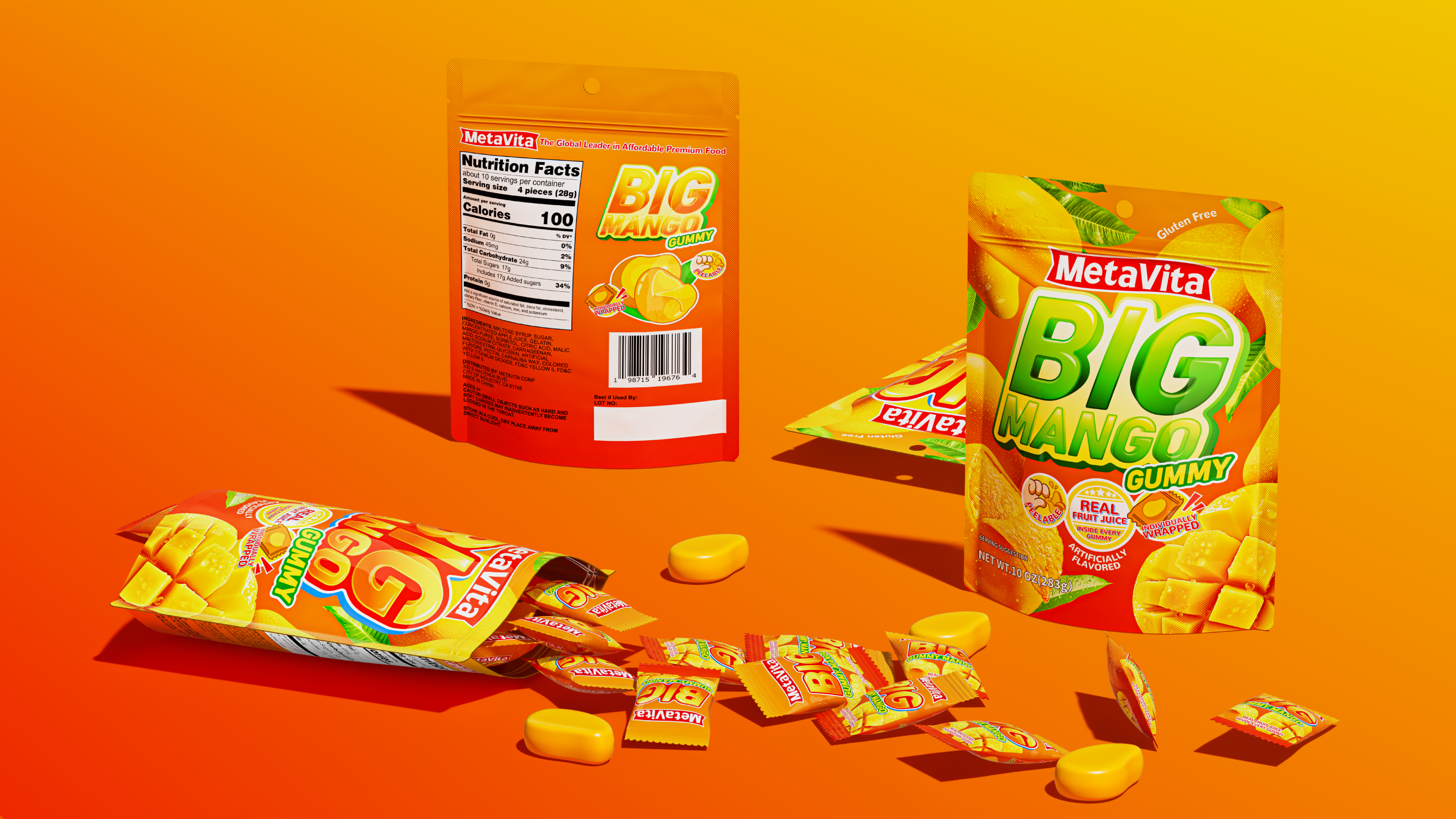
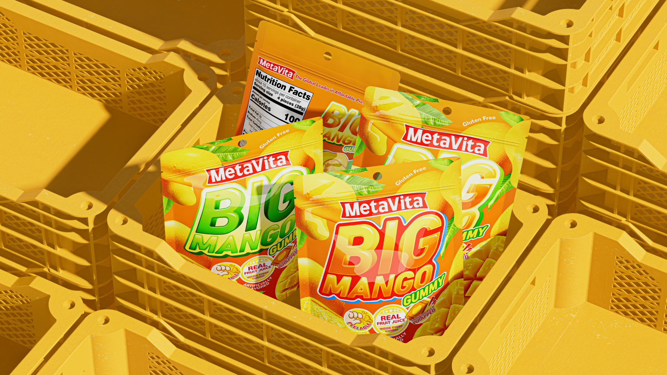
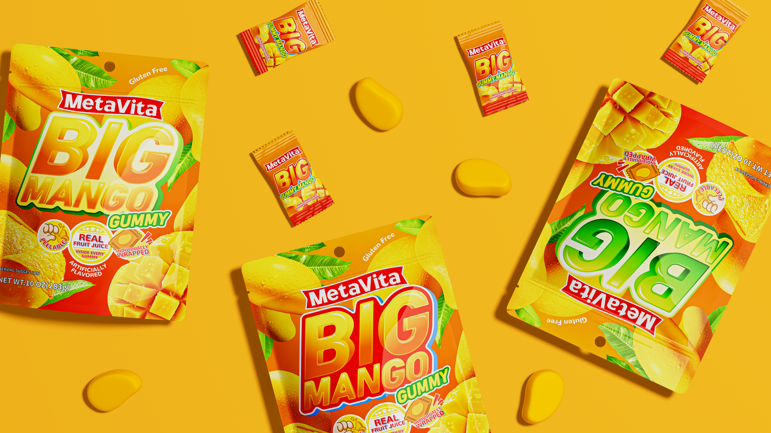
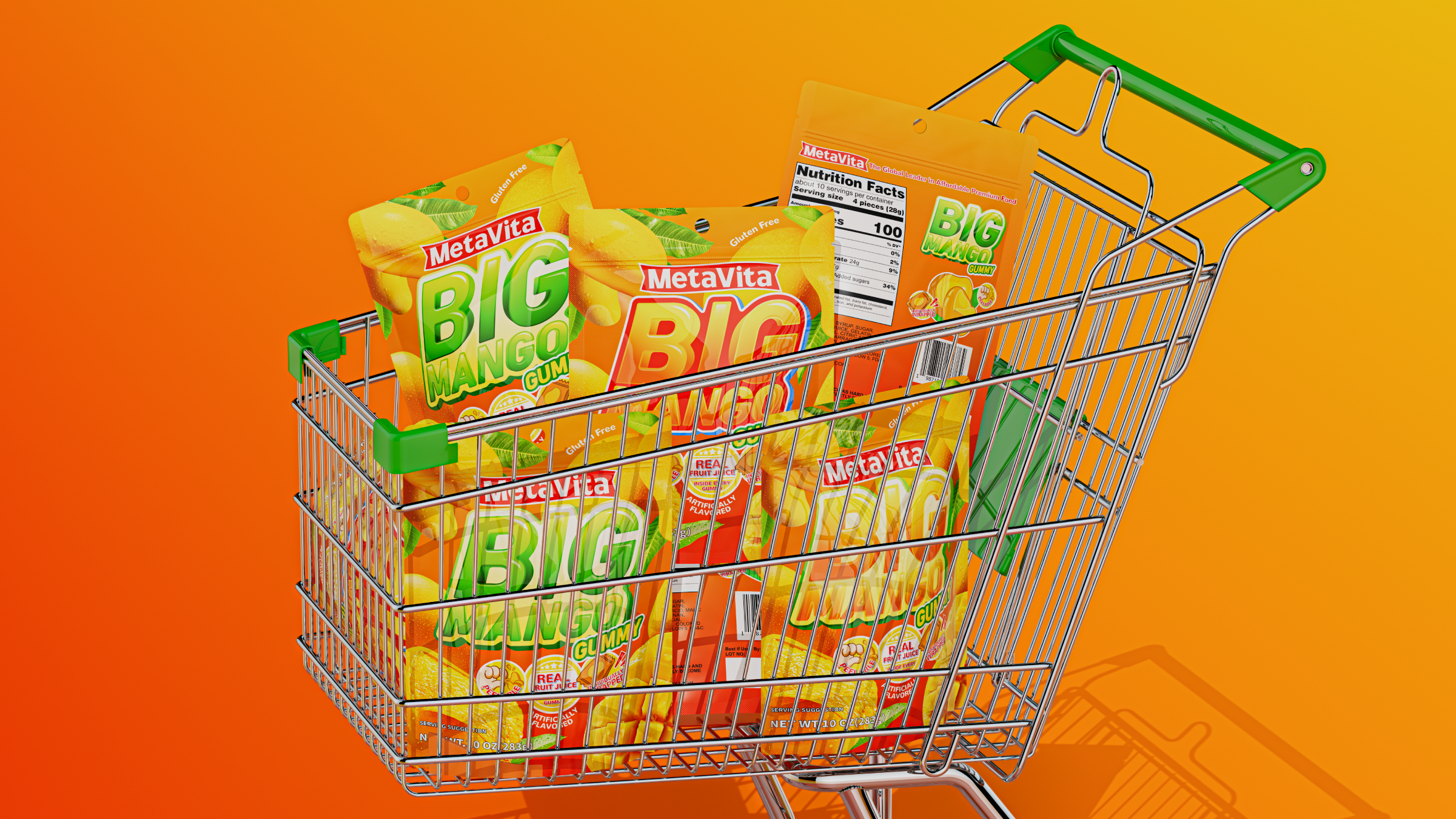
In the terminal battlefield of snack food category, packaging is a silent sales technique, making BIG MANGO a "visual magnet" on the shelf, standing out in the North American market and generating the impulse to place an order is the problem we need to focus on.
🟢We think from the following three aspects: super symbol, color hint, detail description:
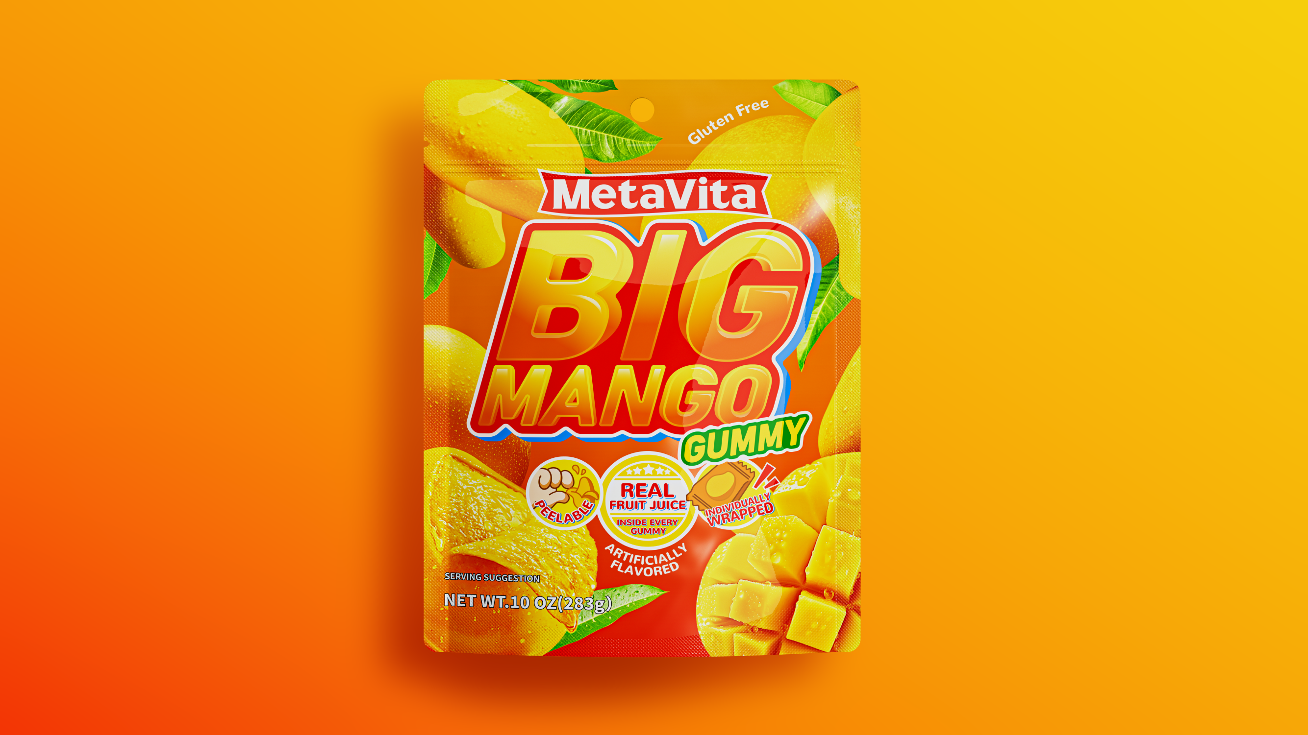
🟢BIG Super Symbol: Vision is the Reason to Buy
Take "peeled mango" as the main vision. Fine and realistic pulp texture. Match with super-large wordmark "BIG". Instantly transmit the strong hint of "big fruit grain with high cost performance". Form the appetite impact of "what you see is what you get" on the shelf.
🟢Background and color: telling stories with color
The main tone of orange echoes the natural attribute of mango. The brand logo is firmly in position C. With "high saturation and high contrast", it jumps out from the competition. It makes BIG MANGO packaging look particularly eye-catching on the shelf. It is easy to attract consumers' attention.
🟢ICON Design: Details Determine Impulse Value
The overall design style is simple and powerful. Abandons all complicated elements. Consumers do not need to read text. Only by graphic language can perceive the "freshness" and "desire to share" of the product. Let the sense of value penetrate the terminal head.
🟢Design thinking:
Zoom in, zoom in, zoom in, and then zoom in. The information is clear, and the customer can see and understand it.
Sincere design expression in a wide range of retail scene, always win the so-called popular and trendy style


本作品版权归 CUIDESIGNLAB_萃 所有,禁止匿名转载及个人使用,任何商业用途均需联系原作者。

新用户?创建账号
登录 重置密码
请输入电子邮件以重置密码。


What a big mango
Very interesting, huh
It's mango fructose
It looks delicious