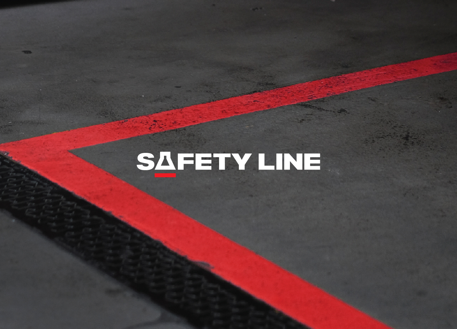
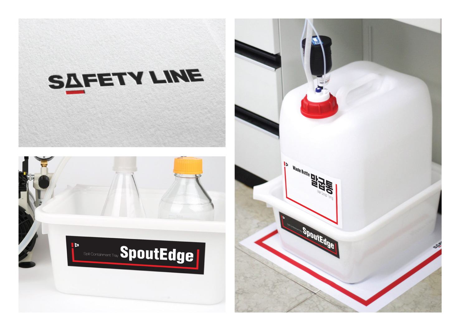
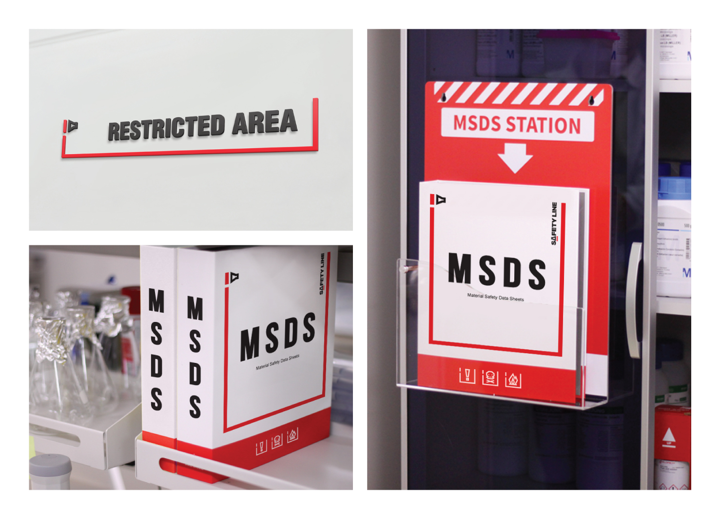
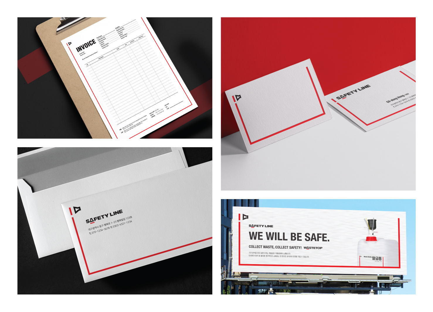
The Safety Line is a brand that offers guidelines for safety and risk prevention in laboratories. The most important keyword in the branding process is 'safety'. As safety is connected with life, the brand graphics need to be intuitive. Consequently, a safety line became the brand motif. Generally, safety line associated with yellow. However, by using 'red line' as a design motif, it can give much more powerful warning to users than yellow.
Country
Korea
Year
2019
Client
Echrom Science
Affiliation
IDEA DO IT
Designer
Yerok Ahn, Juyoun Kwon, Sungeun Jang
[ASIA DESIGN PRIZE]
[www.asiadesignprize.com/]
本作品版权归 ADP 所有,禁止匿名转载及个人使用,任何商业用途均需联系原作者。

新用户?创建账号
登录 重置密码
请输入电子邮件以重置密码。


留言板 (0)
评论为空