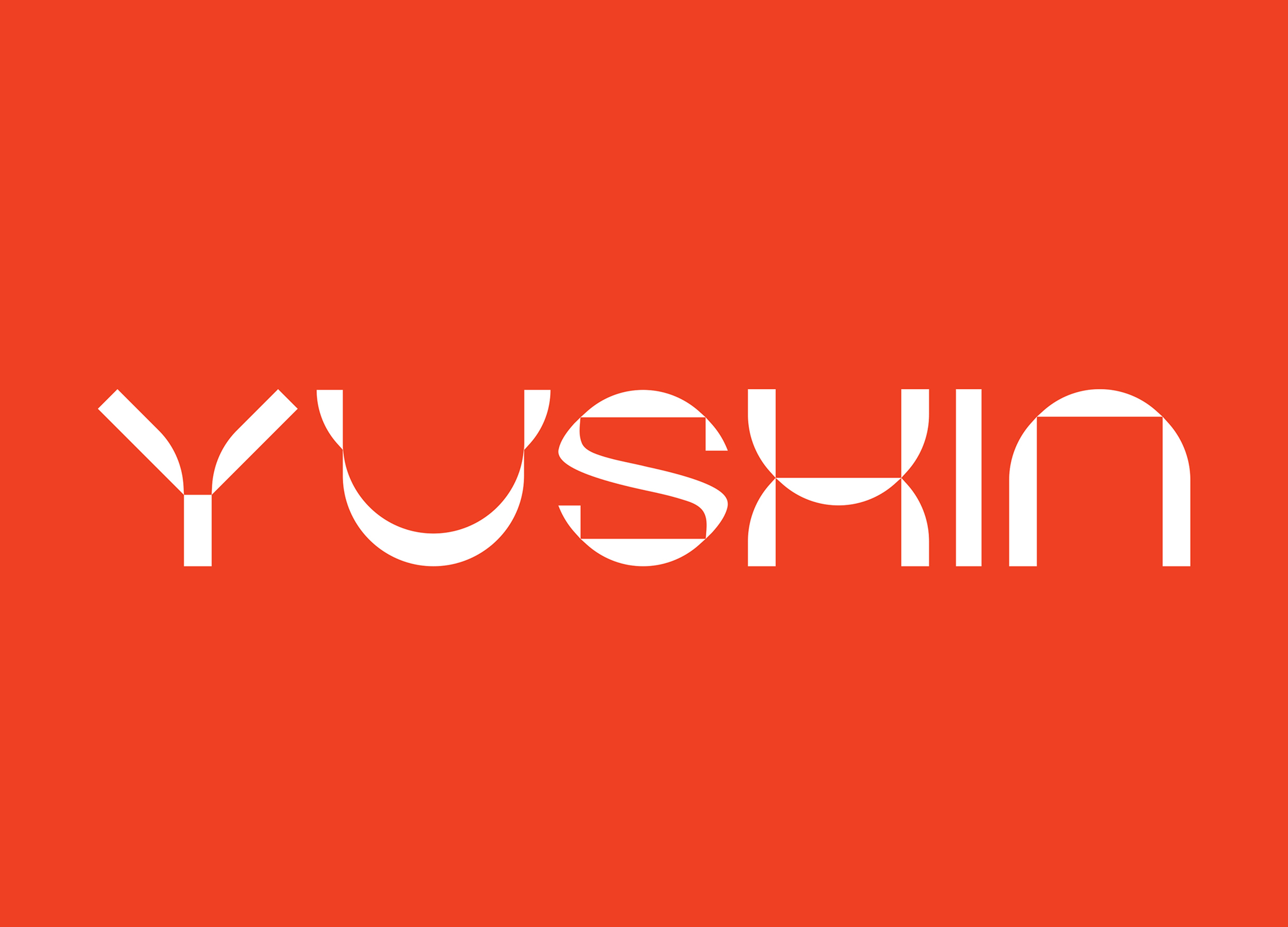
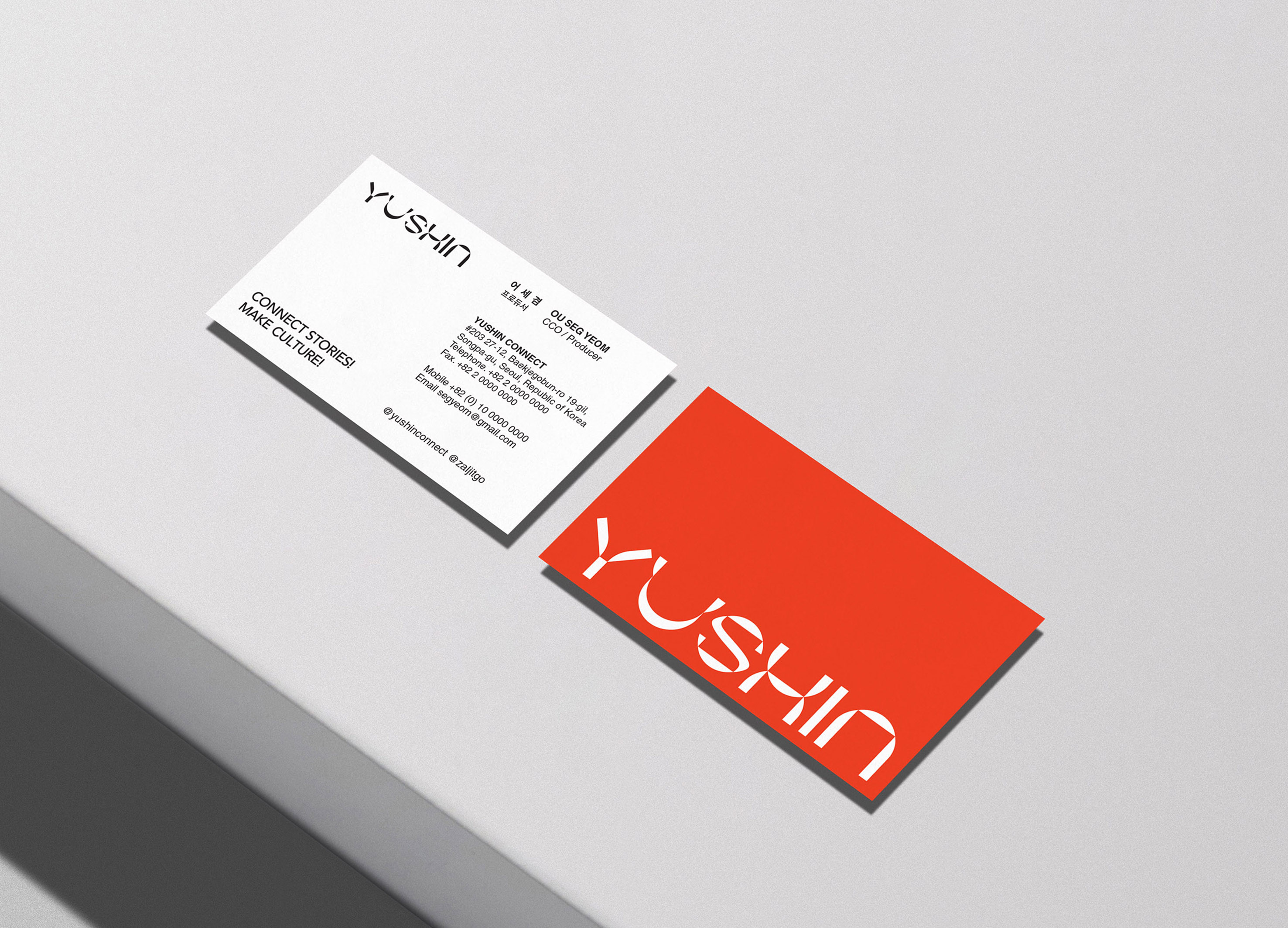
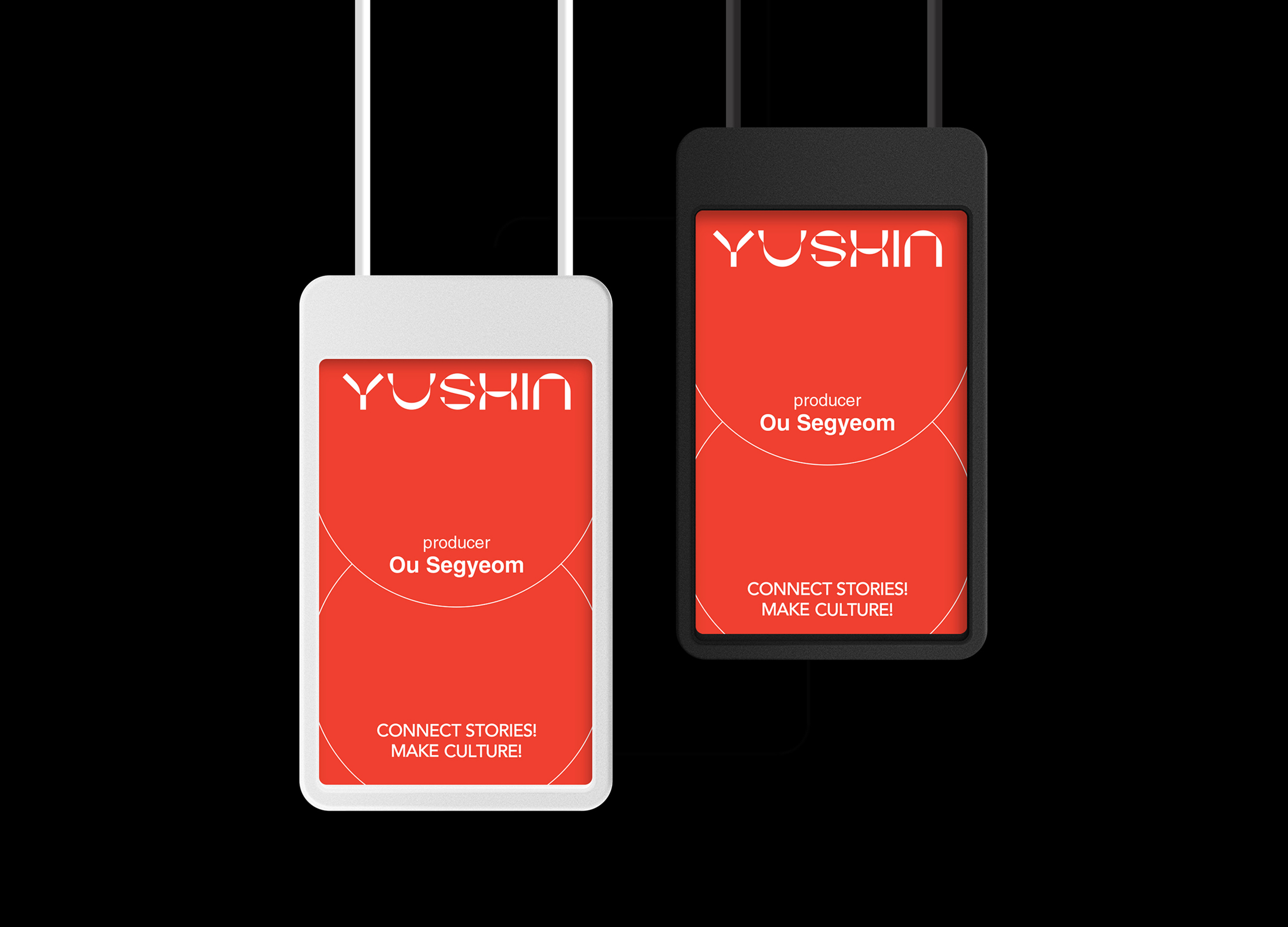
As a storytelling consulting company, YUSHIN's core vision is to provide the best creative space for creators, the best stories for producers, and the creation of a new culture through the connection of stories. In YUSHIN's logo design, it reflects the core values of "connection" and "story" pursued by enterprises ". We use the principle of the three primary colors of light. This principle can be echoed with the core corporate values of creating a new culture when creators, producers, and stories converge and connect. In the logo design, we restructured the letter to symbolize the meaning of "connection" and "story. The meaning of "connection" is emphasized by overlapping letter patterns, and the details show the meaning of "story" in a square shape. In addition, in order for the logo to be applied as a graphic element, we styled the logo itself. By using the logo as a graphic element, the company's identity can be visually and clearly conveyed, while also being easy to use within the company. Traditional corporate logo design is usually expressed through symbols or graphics, while we directly reflect the core value of the enterprise in the text, making it a unique form, thus highlighting the identity of YUSHIN.
Korea
Award : WINNER
Client : YUSHIN CONNECT Corp.
Affiliation : Owhyworks Corp.
Designer : Yeon Cheolmin, Hwang Changho, Na Hyejin
https://asiadesignprize.com/exhibition/160321
本作品版权归 ADP 所有,禁止匿名转载及个人使用,任何商业用途均需联系原作者。

新用户?创建账号
登录 重置密码
请输入电子邮件以重置密码。


not bad