Starting from the demand point of packaging design, we upgraded the new packaging of this Kaixin thick soybean milk.
01 to establish a brand first to establish a super symbol
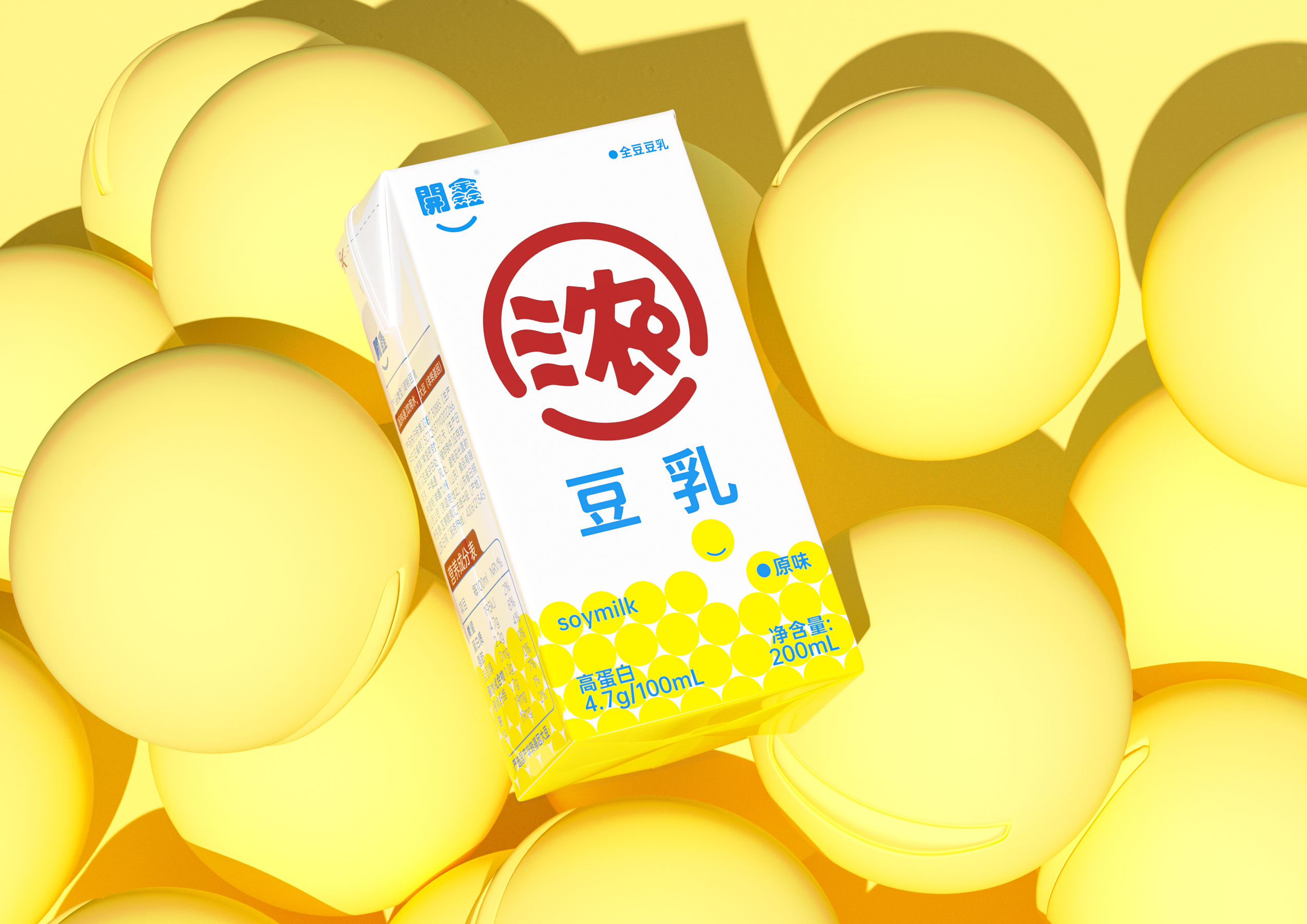
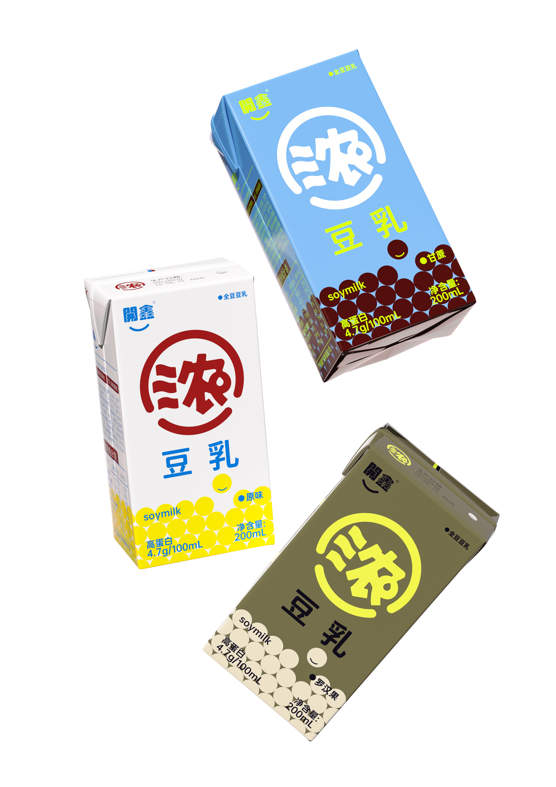
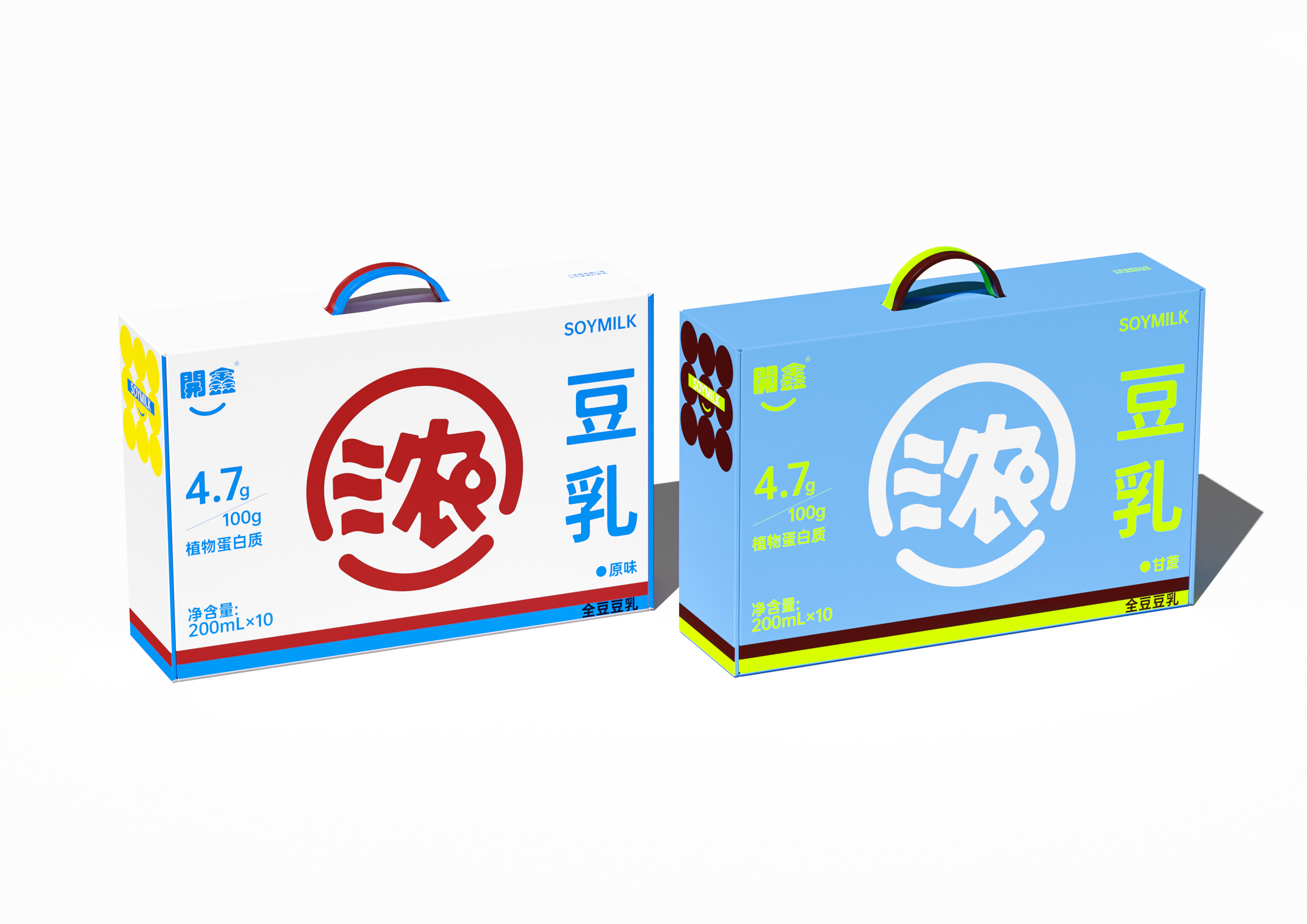
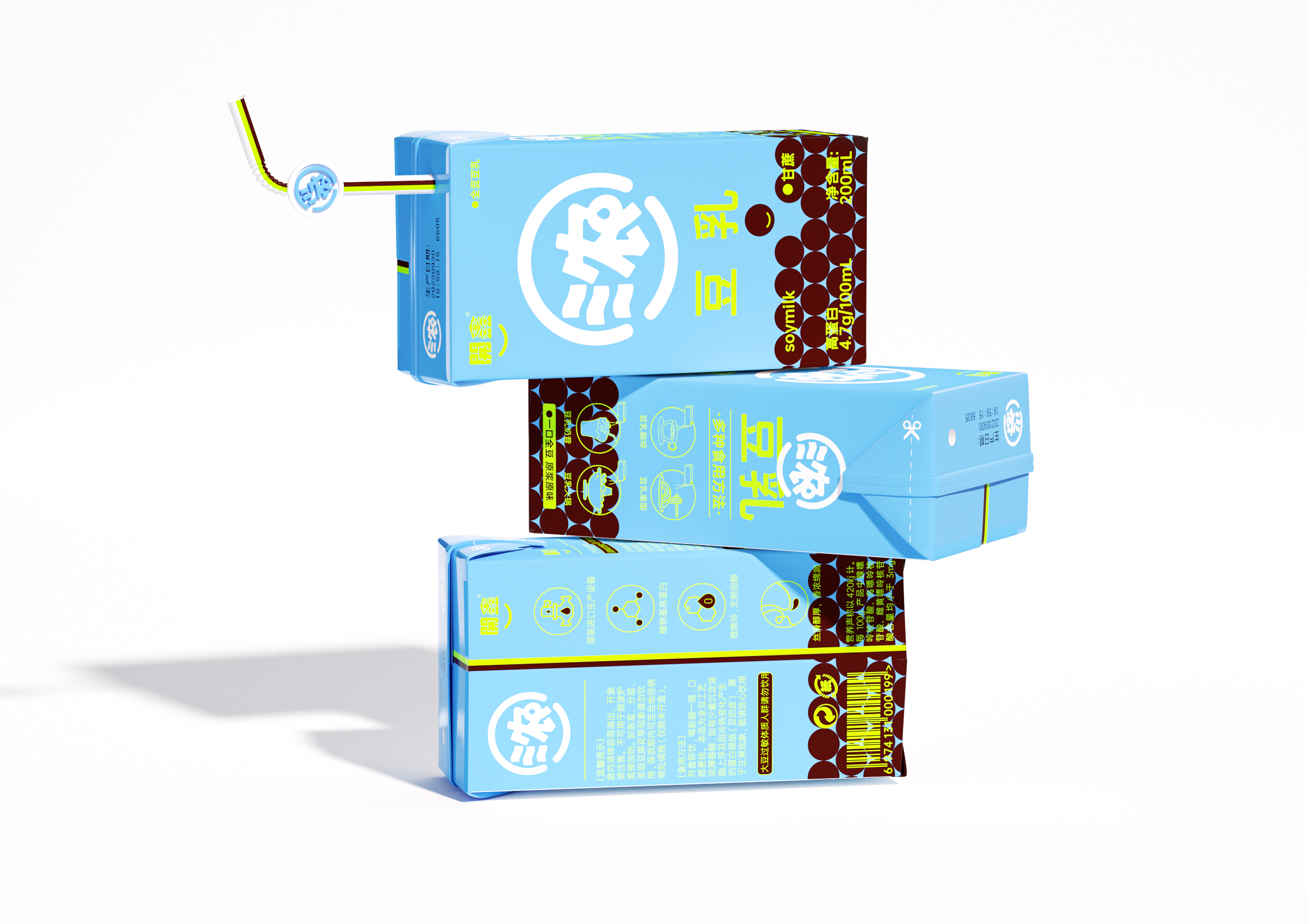
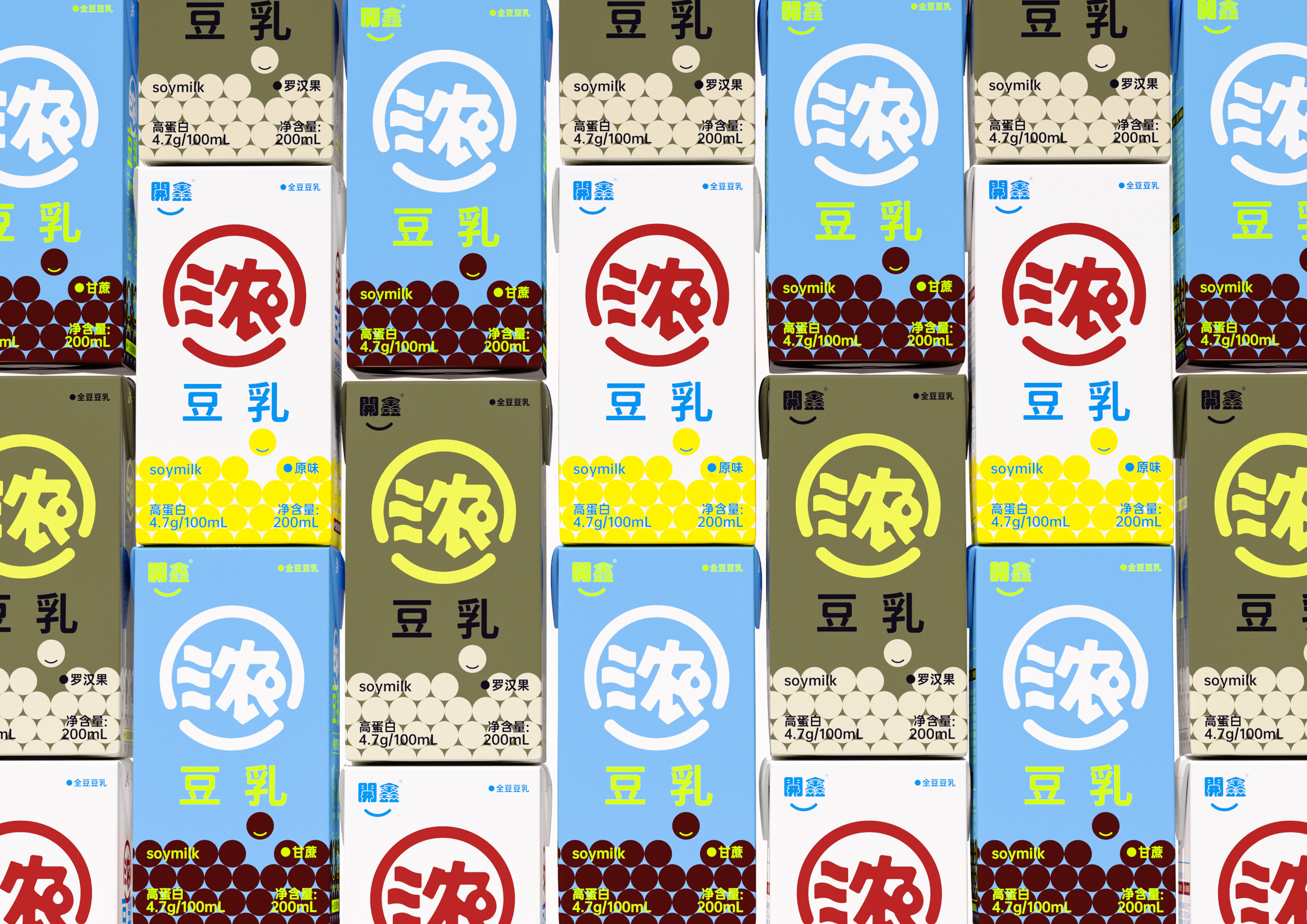
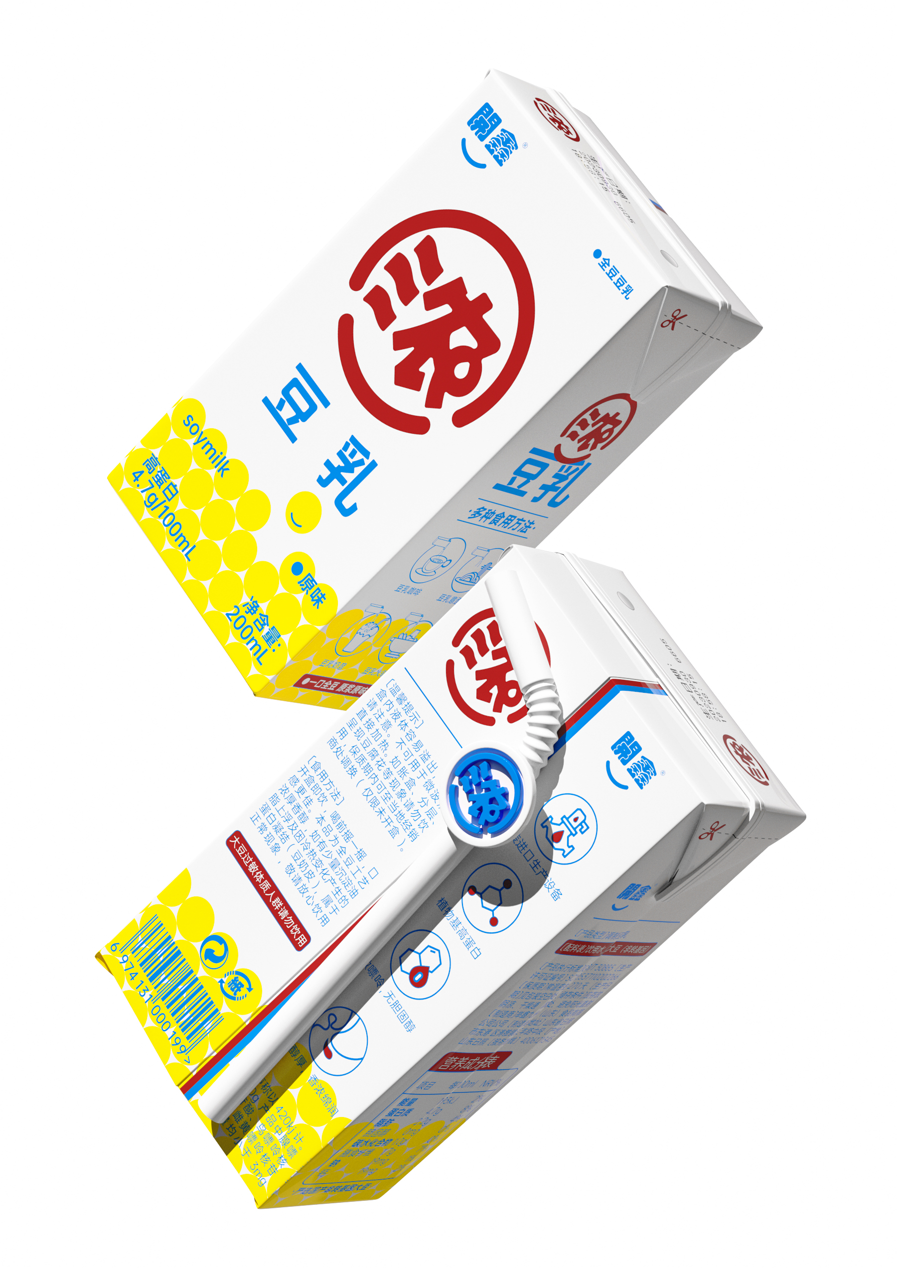
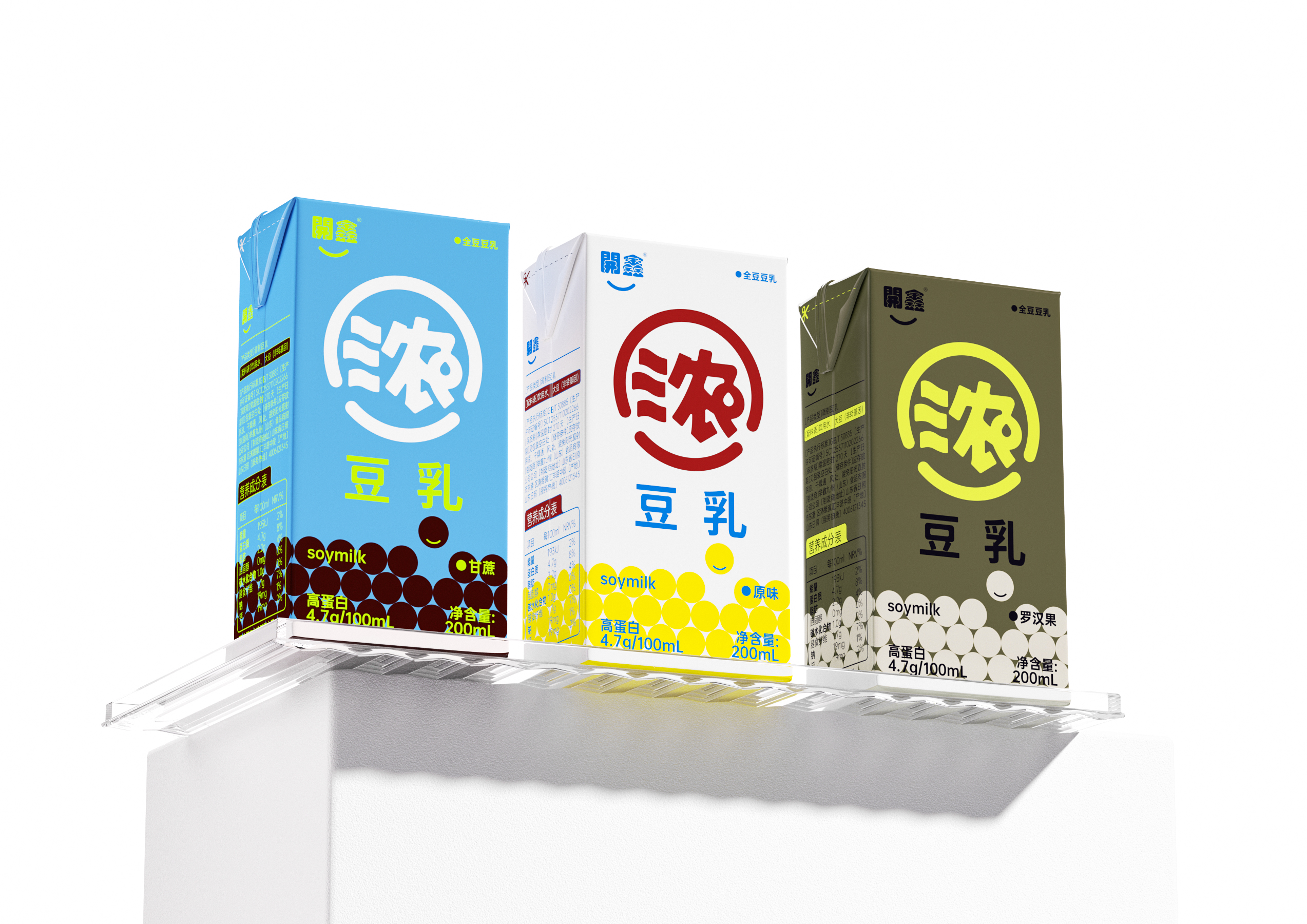
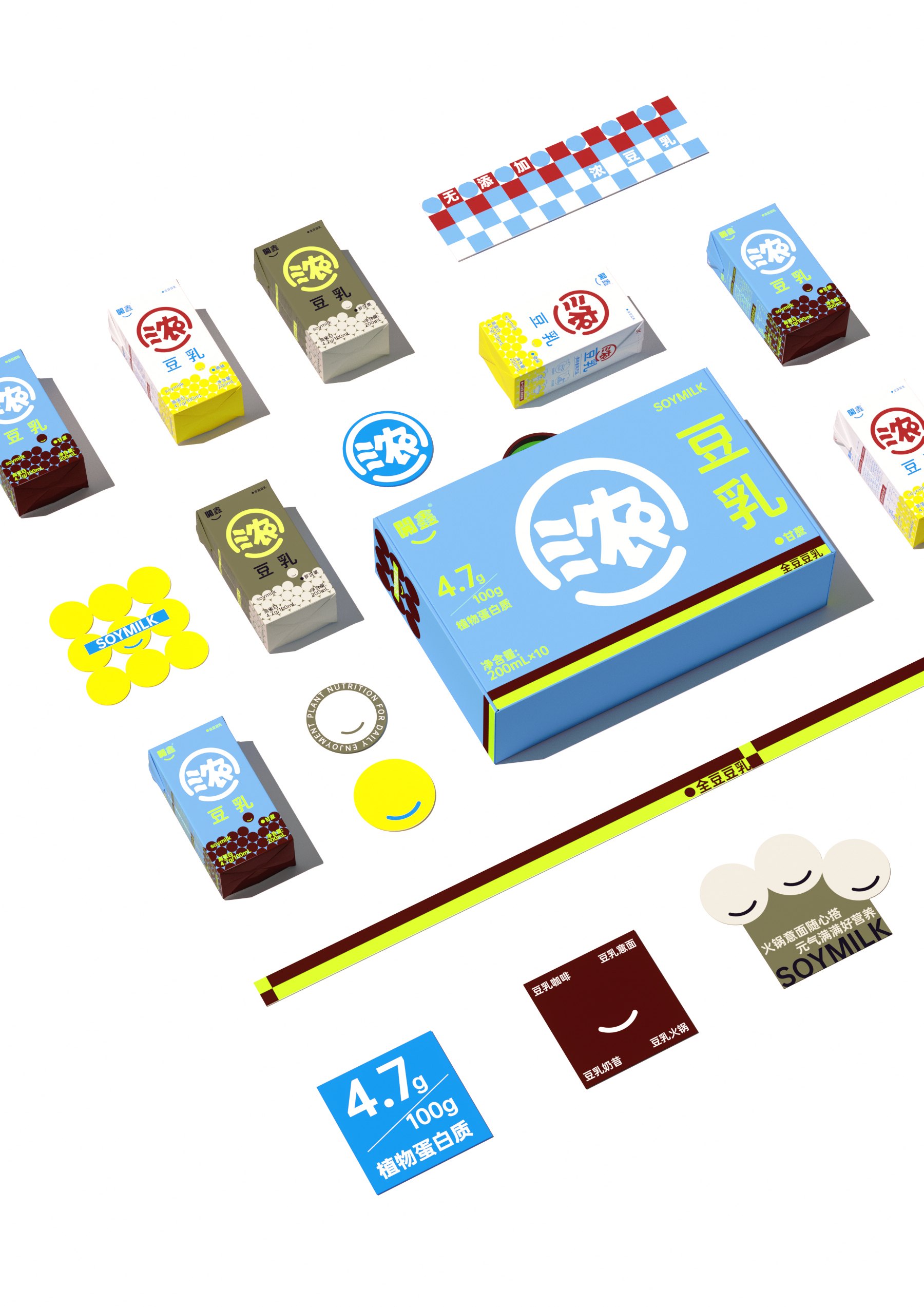
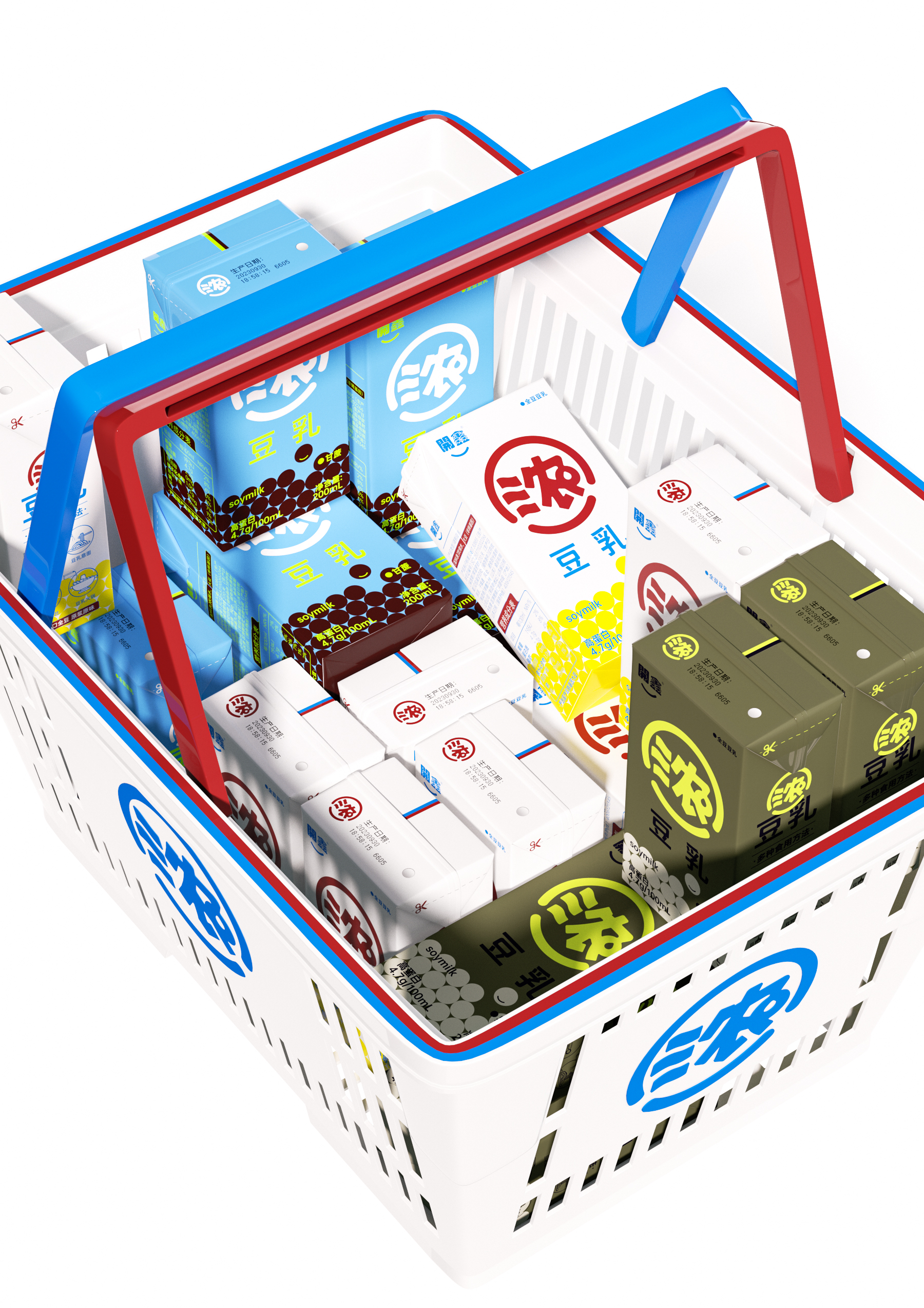
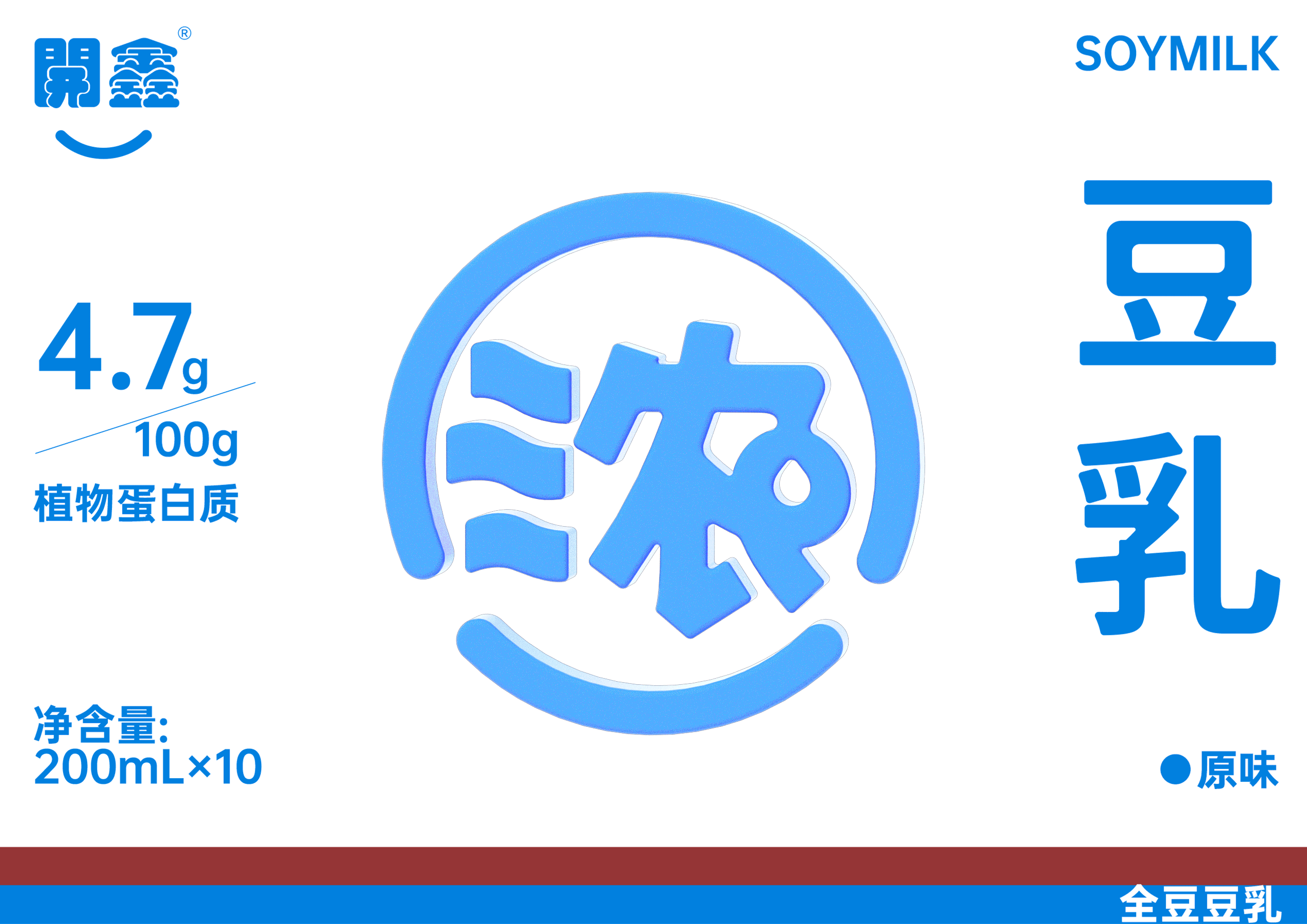
The meaning of the product is flowing water, and the symbol is the eternal super symbol lies in the image expression of the brand value. The coverage of soy milk in the daily ready-to-drink consumer market is not rare, but the selling points are "low sugar", "0 sugar" and "plant milk". When the selling points are consistent, it is necessary to reshape the category cognition. Kaixin thick soybean milk itself has a unique product selling point, what we need to do is to enlarge its selling point indefinitely. Establish the category cognition of Kaixin "thick" soybean milk. Refining the core selling point of the brand "thick" to create super symbols is the core design point of this brand expression. The "thick" figure is extracted from the smiling face symbol of the brand logo "Kaixin" and is isomorphic with the pictographic water droplets of thick soy milk. Both retain the brand at the same time with pictographic recognition. The super symbol is maximized on the front of the package and the brand selling point is maximized, which improves the shelf advantage and array sense of the product and makes a significant distinction from similar products. Both offline terminal shelves and new media can be found at a glance, allowing the package to complete its own sales.
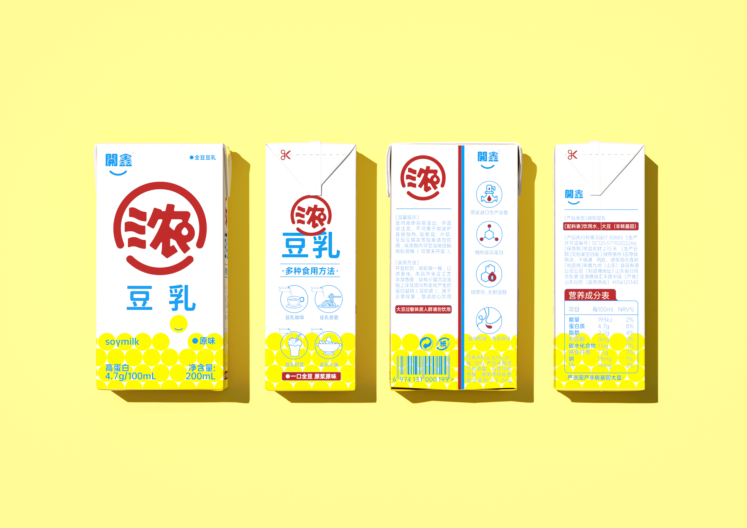
02 packing logic primary and secondary clearly:
The first visual association brand and selling point super symbol, the second visual category and taste distinguish the third visual brand logo
03 product positioning and tonality:
The target population of thick soybean milk is large-span: people who pay attention to healthy diet, children, pregnant women, middle-aged and young people and the elderly, which requires us to consider the compatibility of the design. We take all the target groups into account, so as to achieve simple and fashionable, compatible and harmonious design tonality to meet the public aesthetic, and do not favor a certain group of people.
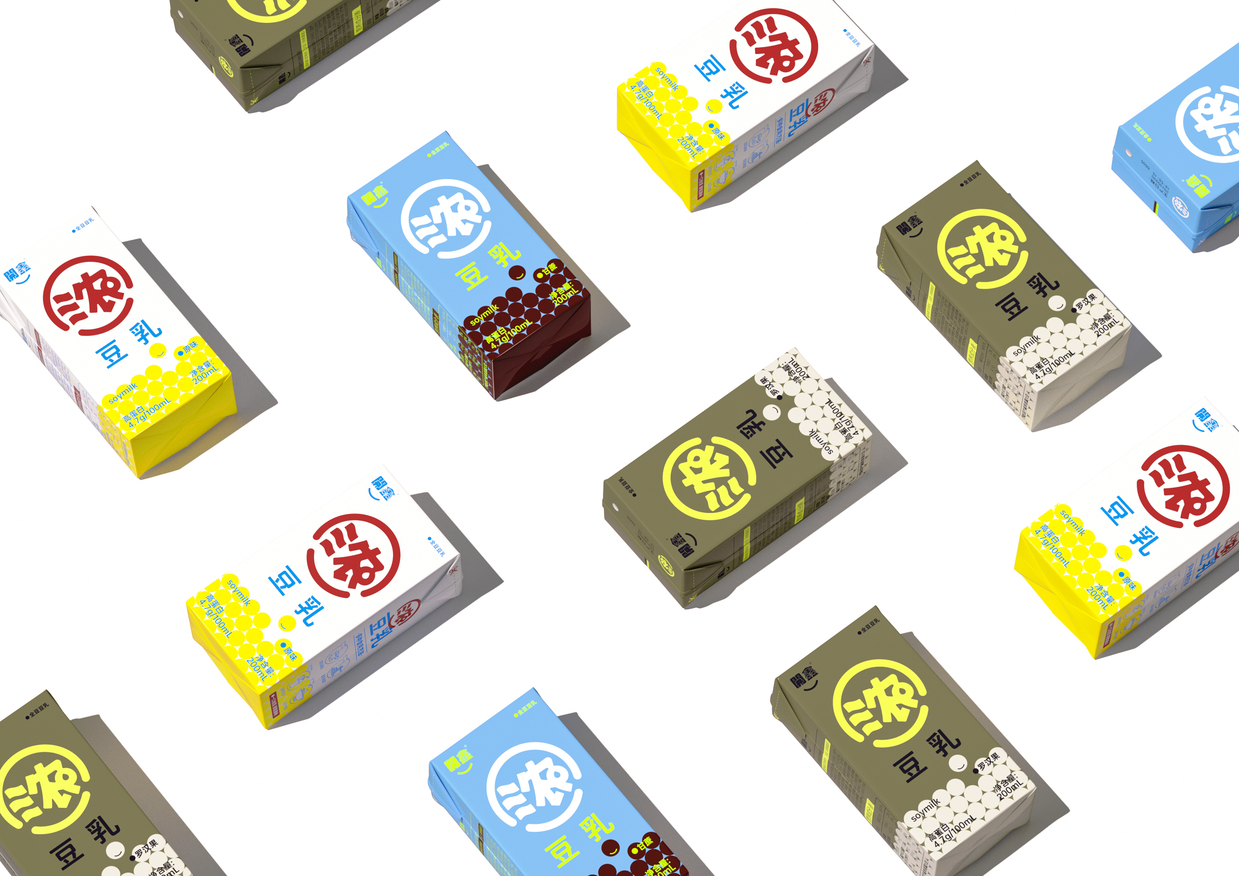
04 Application Packaging System:
We this upgrade from the brand long-term development considerations. A brand new upgrade was made, and the packaging system framework was systematically standardized. Super symbol and plate design can be extended from sku to facilitate the extension and development of new product lines in the later period.
Redefine brand value with super symbols, reduce marketing costs with packaging design, and give greater value to packaging with design.


本作品版权归 造物起异 所有,禁止匿名转载及个人使用,任何商业用途均需联系原作者。

新用户?创建账号
登录 重置密码
请输入电子邮件以重置密码。


Good.
This looks delicious
It feels good to drink.