Name of work: Wuliangye · crooked mouth
Customer Name: Wuliangye Xianlin Ecological Wine Co., Ltd.
Service content: overall packaging design of crooked mouth light bottle wine
Service team: Guyi Brand Packaging Design Department
Warm Tip: Guyi's original design and copyright certificate have been completed. Please think twice about piracy.
Gu yi's design content: product concept refinement, dew wine bottle type design, dew wine bottle cap design, dew wine outer box design, finished product proofing, product picture rendering.
Project background: With the wave of consumption upgrading, the liqueur category is breaking through the traditional, integrated fashion innovation posture, strong leverage a new generation of mainstream consumers, become the new focus of the wine market attention. Driven by this trend, the head wine companies have laid out the dew wine track. On January 22, Wuliangye Xianlin Ecological Wine Industry officially released its strategic single product for the next ten years-Wai Mouth Simple Luxury Series Large Light Bottle Wine, marking that the brand has entered a new stage of development.
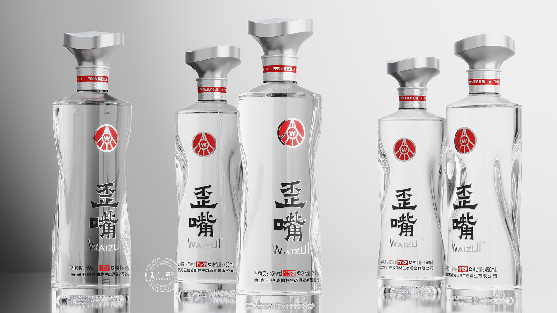
The launch of the big light bottle of the simple luxury series of crooked mouth is not a simple product iteration, but a carefully polished work that integrates quality, culture and channels in multiple dimensions. Looking back on the past products, although they are in the form of large light bottles, they do not fully reflect the "crooked mouth" modeling characteristics, resulting in blurred memory points, brand exclusivity and insufficient sense of value. In this regard, Guyi takes "amplifying the core selling point of the product" as the design origin, and reshapes the high-end style of the crooked mouth brand around the visual tone of "light luxury" and "classic endurance. We are committed to creating a truly reflect the "crooked mouth" characteristics of the big light bottle, in the fierce competition in the light bottle wine market to build a distinct differentiation. At the same time, the joint mouth small wine to form a "small wine big light bottle" combination strategy, comprehensive coverage of the consumption scene, strengthen the brand influence.
Design Ideas: In the upgrade design of the big light bottle wine with a crooked mouth, we have analyzed in depth that its biggest selling point lies in the endorsement of the "Wuliangye" brand. Consumers' high recognition of the Wuliangye brand has become a key focus in the design strategy.
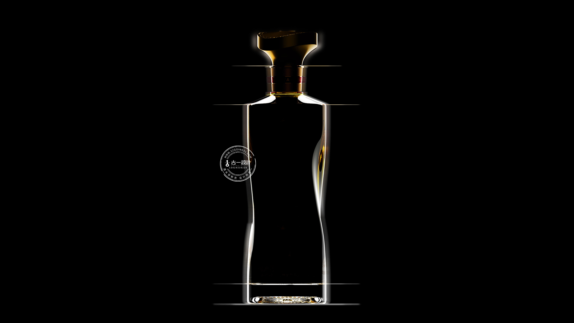
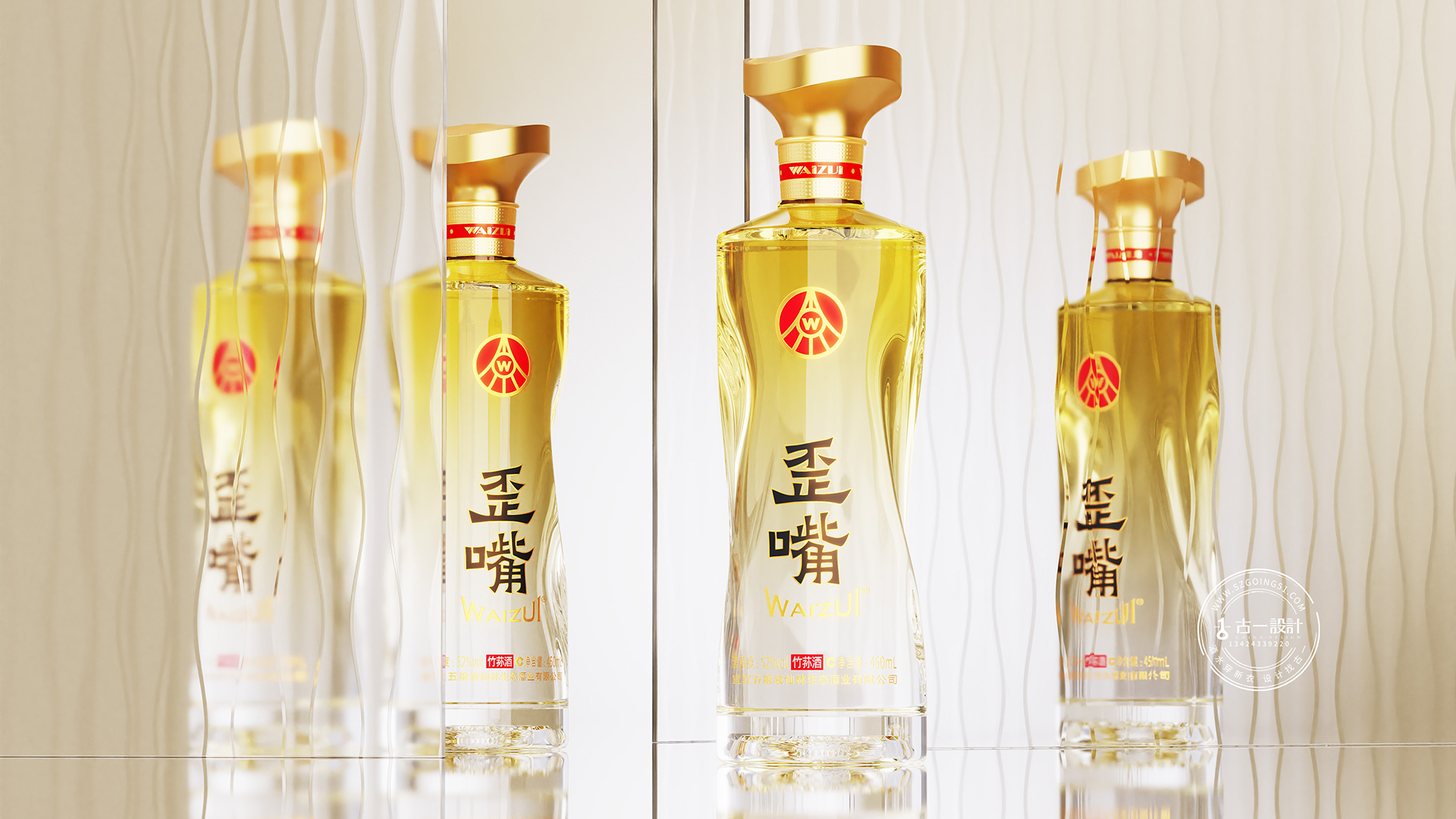
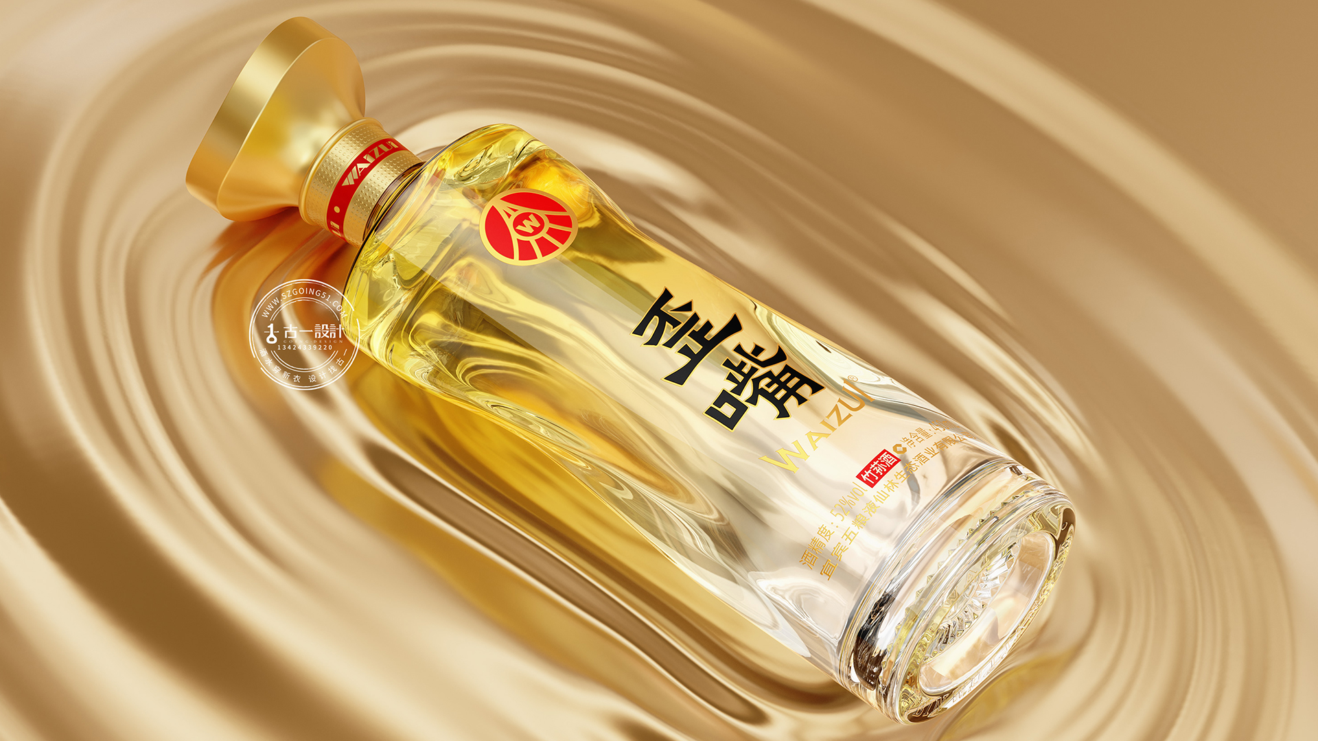
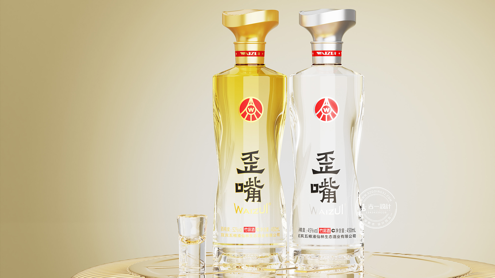
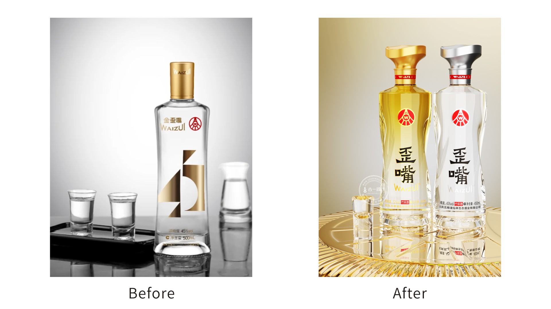
Bottle Design Creative Description: On the basis of retaining the original bottle, we have strengthened the "crooked" modeling language to make the bottle body present an elegant and distorted form. Distorting shape changes, breaking the traditional symmetrical structure, simulating the gurgling rhythm of the water of Minjiang River with flowing lines, without losing the texture in the silky, creating a natural beauty of life. Twisting the bottle body not only builds a unique visual symbol of the crooked mouth, improves product recognition, but also fits the ergonomic design and enhances the comfort and stability of the grip.
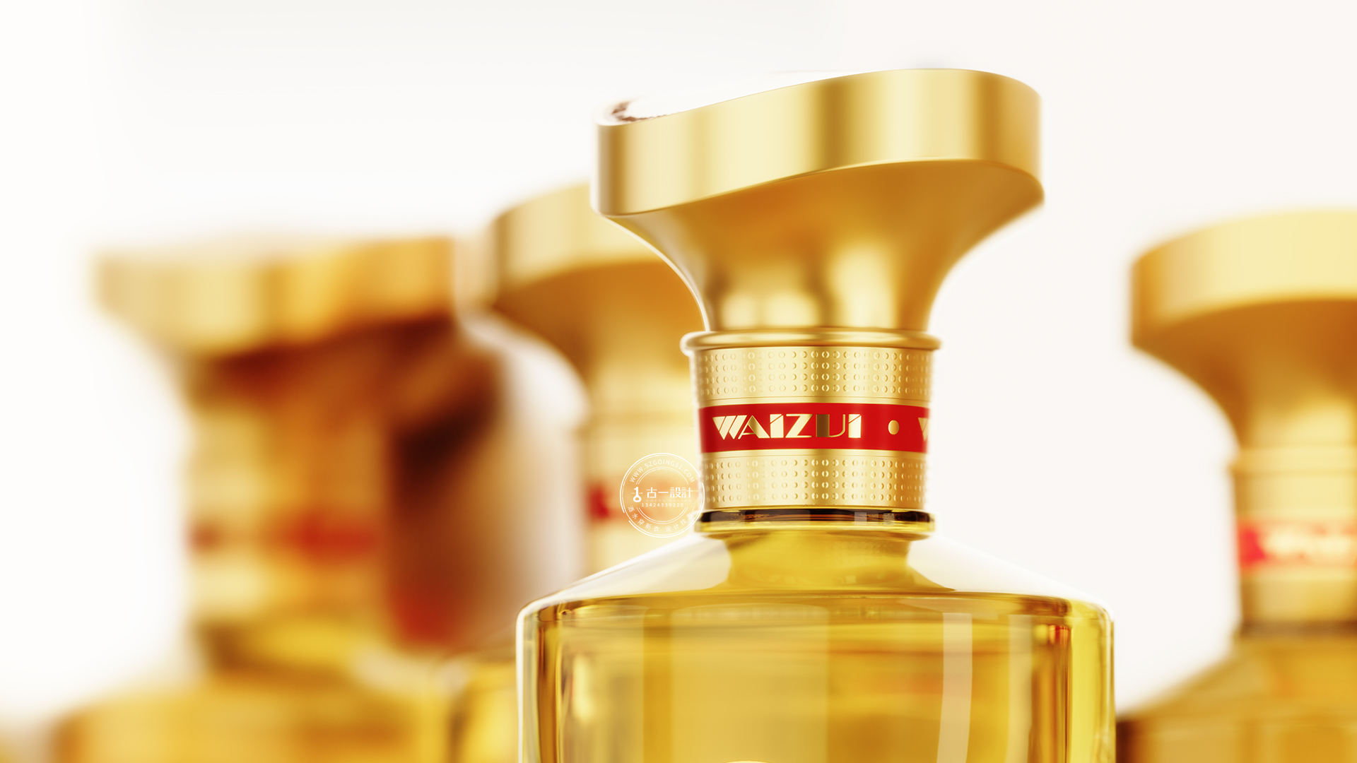
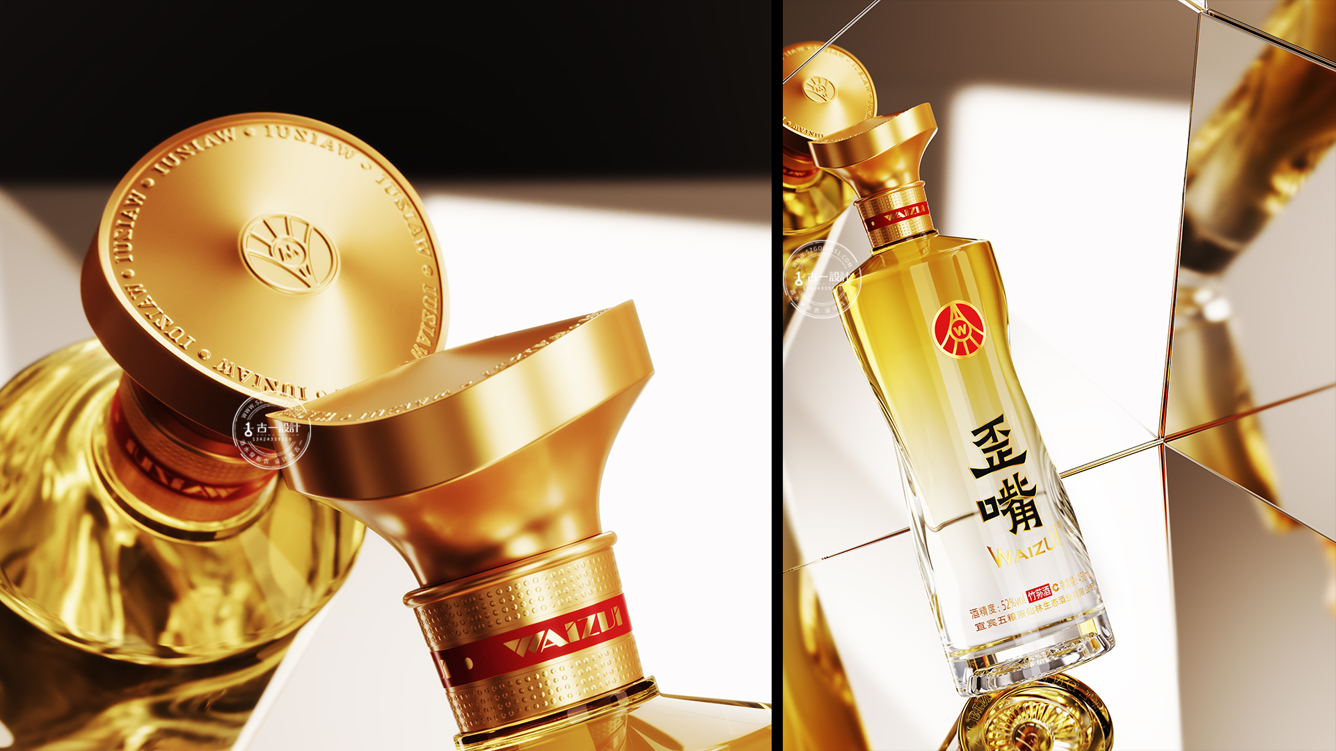
The bottle cap design echoes the overall shape, with a wavy twist round cap to create a visual asymmetry aesthetic. Cover the top seal cutting Wuliangye brand logo, low-key to show the rhythm and vitality. We deliberately let the bottle cap "every face is not straight" to strengthen the "crooked" interest and memory points. In the actual drinking scene, when the bottle cap is twisted, it presents a beautiful arc movement, and there is no need to worry about "returning to the right". Viewed from any angle, the bottle cap always presents the beauty of skew, truly "every side is crooked, every side is beautiful".
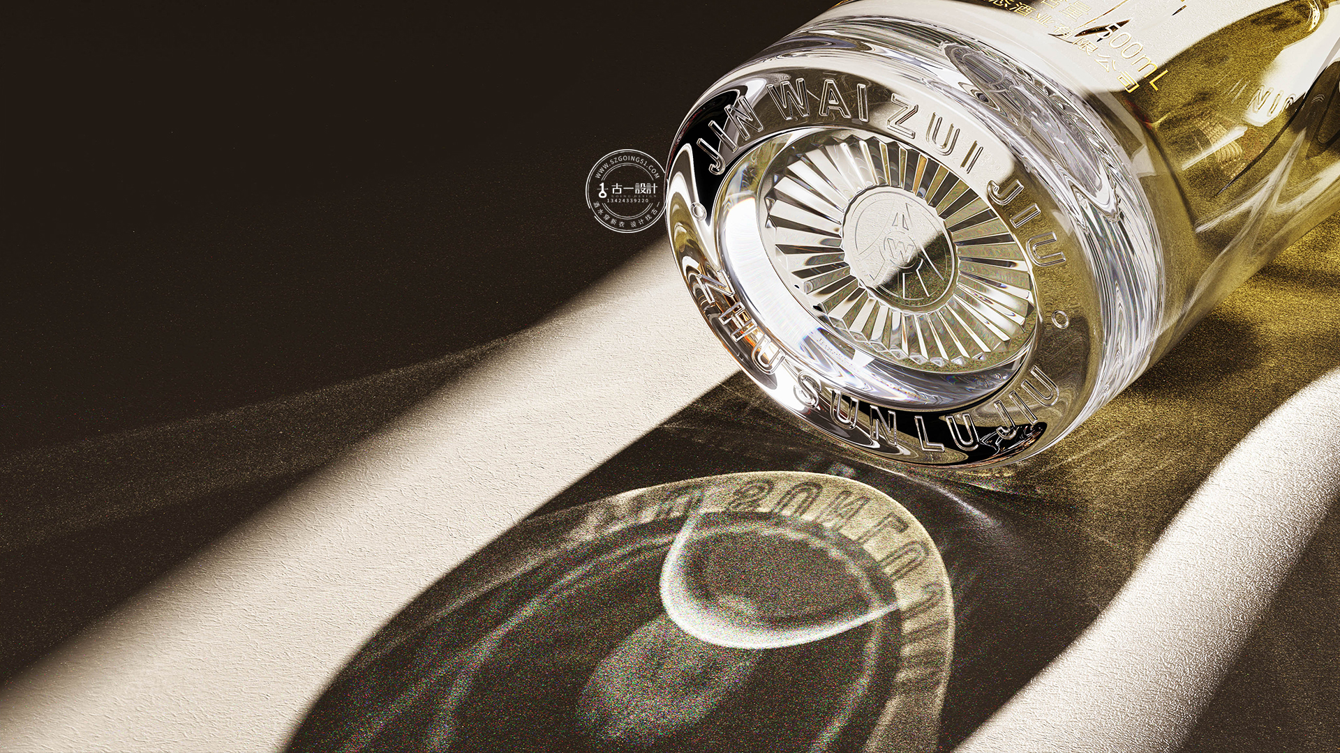
The design of the bottom of the bottle is another important thought we have injected. We have innovatively adopted "diamond texture cutting", and the precision carved star awns shading embraces the Wuliangye brand logo. When the light passes by, the bottom of the bottle presents a criss-cross light and shadow effect, bright and dazzling, just like the release of light. Maximize the exclusive sense and value of the product brand, and the more simple overall shape adds a rich level of detail and a surprise moment when opening.
We choose gold and silver as the main color of the product. Gold, a symbol of luxury, noble and classic; silver represents modern, refined and technological sense. Gold and silver collocation not only strengthens the visual tonality of high-end products, but also forms a continuous association with the old product "golden crooked mouth" to awaken consumers' brand memory.
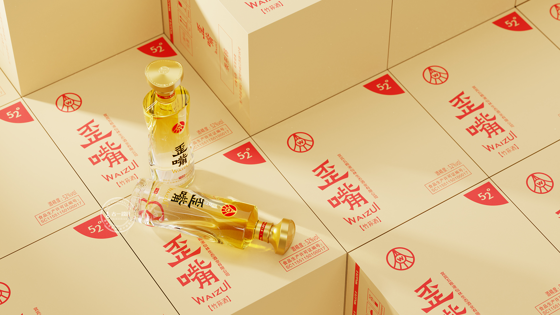
The above is the introduction of "Wuliangye crooked mouth simple luxury big light bottle" dew wine packaging design. Special Note: The work has been put into the market and the copyright has been protected. Please do not plagiarize or embezzle it. The copyright belongs to the original ancient design. The editorial department of the ancient design brand was reorganized, the drinks were dressed in new clothes, and the design was found in ancient one. If there is any reprint, please indicate that it is from ancient one. Thank you! Key words in this paper: wine packaging design, wine packaging design, Shenzhen wine packaging design company.
本作品版权归 古一设计 所有,禁止匿名转载及个人使用,任何商业用途均需联系原作者。

新用户?创建账号
登录 重置密码

请输入电子邮件以重置密码。
Invincible
Big brand
It's kind of interesting, huh