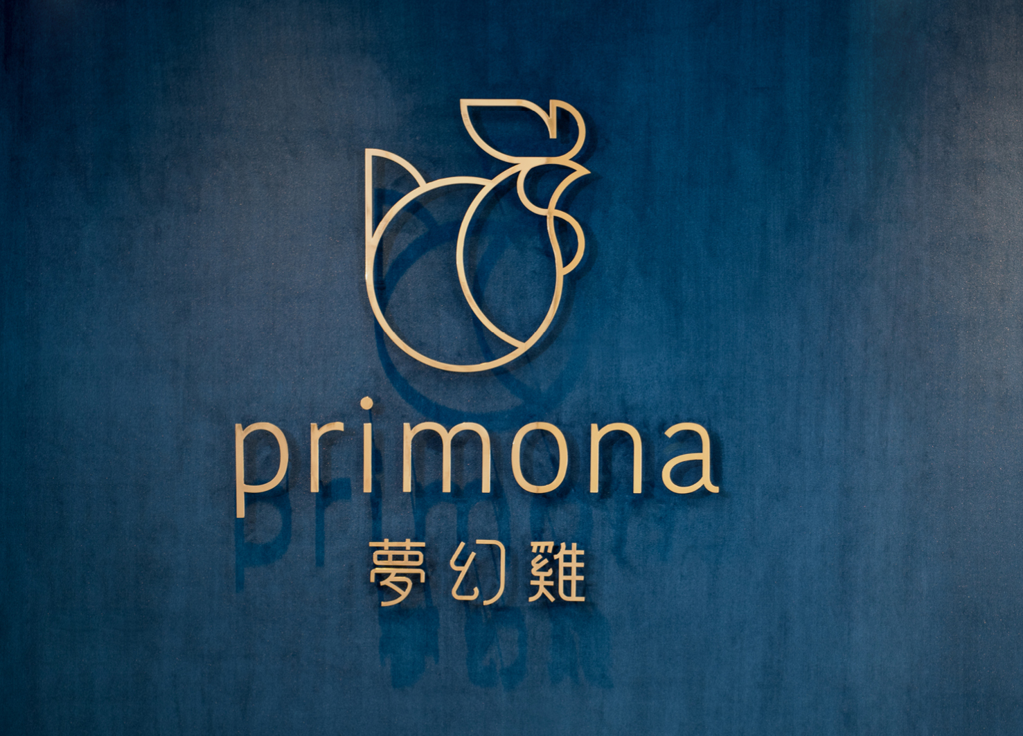
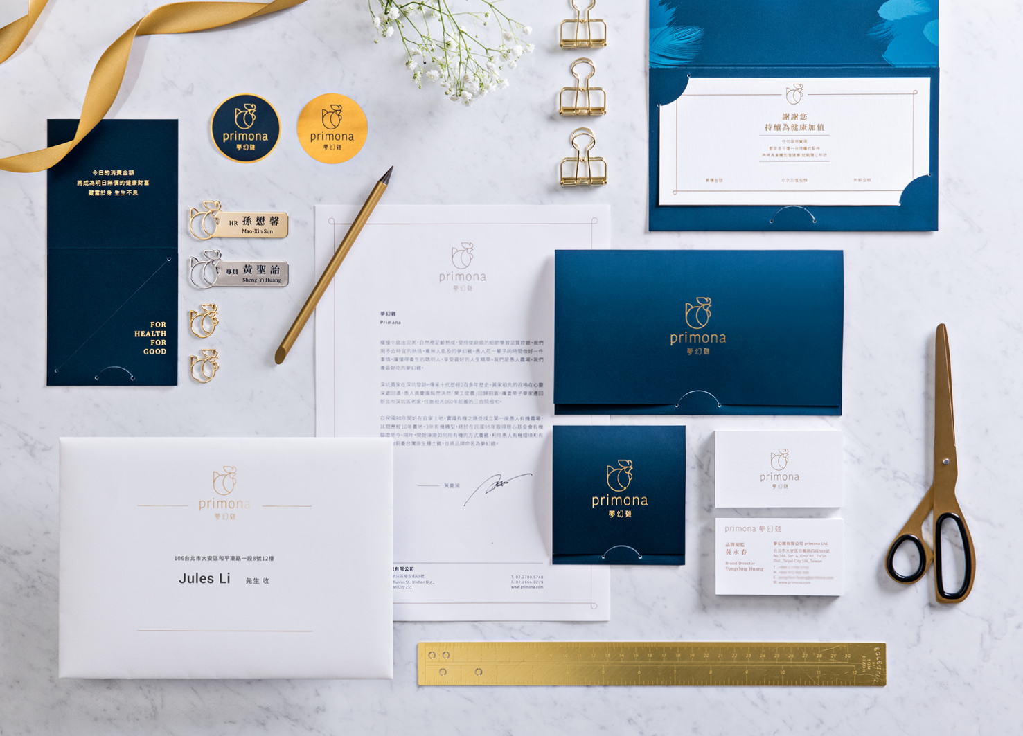
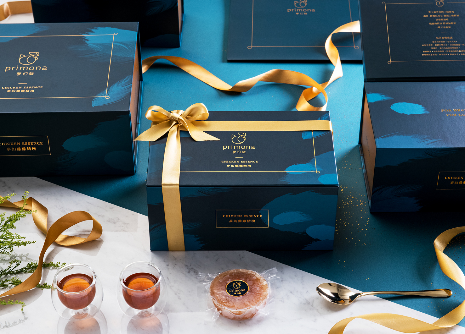
In Taiwan, the identification of chicken essence brands is usually more traditional or oriental, which also makes it difficult to expand to the international market, primona it was originally in this group. This brand reengineering project aims to enter the international market and distinguishes primona from such groups. primona use a "circular" design language to strengthen the connection between brand identification and products, and make consumers more impressed through the brand communication process. The primona brand reengineering project is centered on "providing customers with the most extreme service experience". The store space design adopts a bright, warm and white style to highlight the appearance of "chicken essence" and other foods in the store environment. Behind the exquisite packaging design, we create the best placement environment for frozen food, and at the same time provide a simple packaging method, making the packaging and carrying process smoother and more flexible than in the past. "Fluency and comfort" is the overall awareness we expect to build in primona brand, and also represents the vision of the new era of chicken essence brand.

Country
Taiwan
Year
2019
Client
Primona
Affiliation
Process Group
Designer
Xinhong Yeh, Eting Liao, Jules Li, Kaiching Liu Estela Lin, Angel Yang dot dot design
[ASIA DESIGN PRIZE]
[www.asiadesignprize.com/]
本作品版权归 ADP 所有,禁止匿名转载及个人使用,任何商业用途均需联系原作者。

新用户?创建账号
登录 重置密码
请输入电子邮件以重置密码。


留言板 (0)
评论为空