Place a logo across nine design eras, then animate them.
When creating logo animations, I’ve encountered a very practical issue: if the starting and ending frames are just two randomly generated images, they often lack any shared structural elements. Video models can only perform hard cuts; in the end, either there’s a sudden dissolve, or the text and graphics get muddled together.
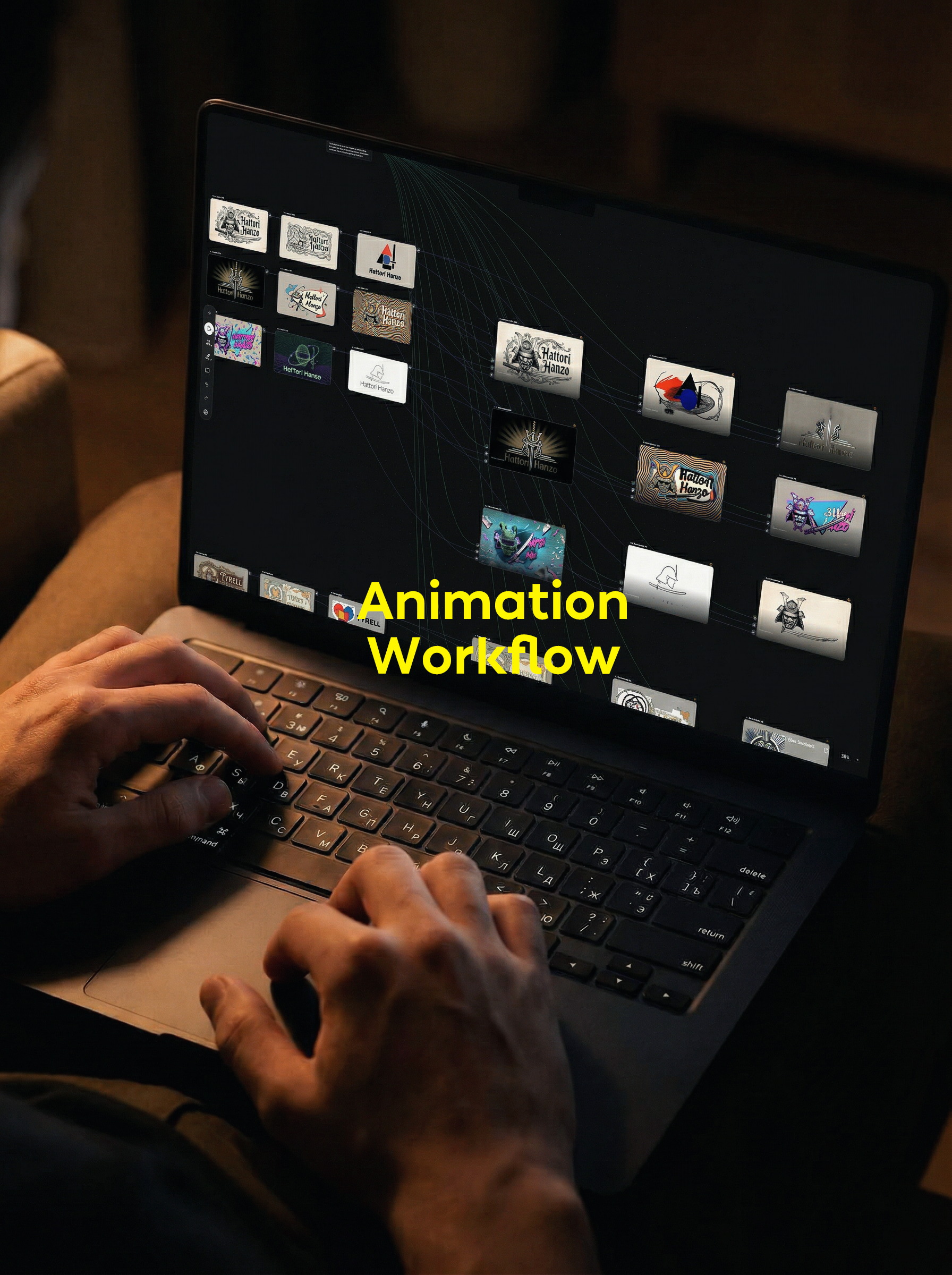
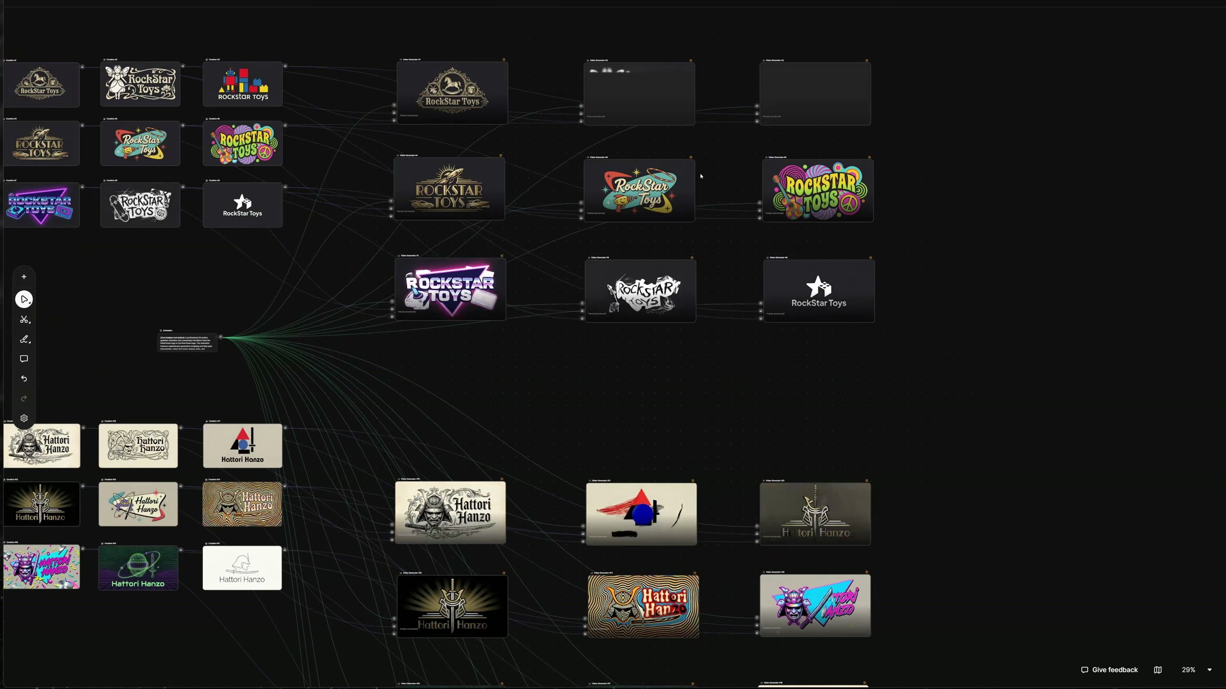
This time, I changed the order. First, trace the evolution of a single brand across nine design eras within a 3x3 grid to explore different directions; then, break down each version into individual images and select two—those with distinct structural relationships yet sufficiently noticeable differences—to serve as the animation’s opening and closing frames. The entire canvas is thus divided into three sections: reference markers, period-style variations, and 2D animation.
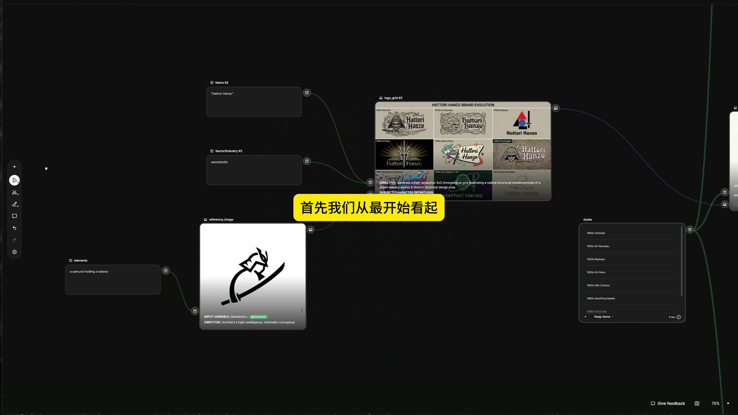
1. First, identify the semantic anchor; don't rush to choose a style.
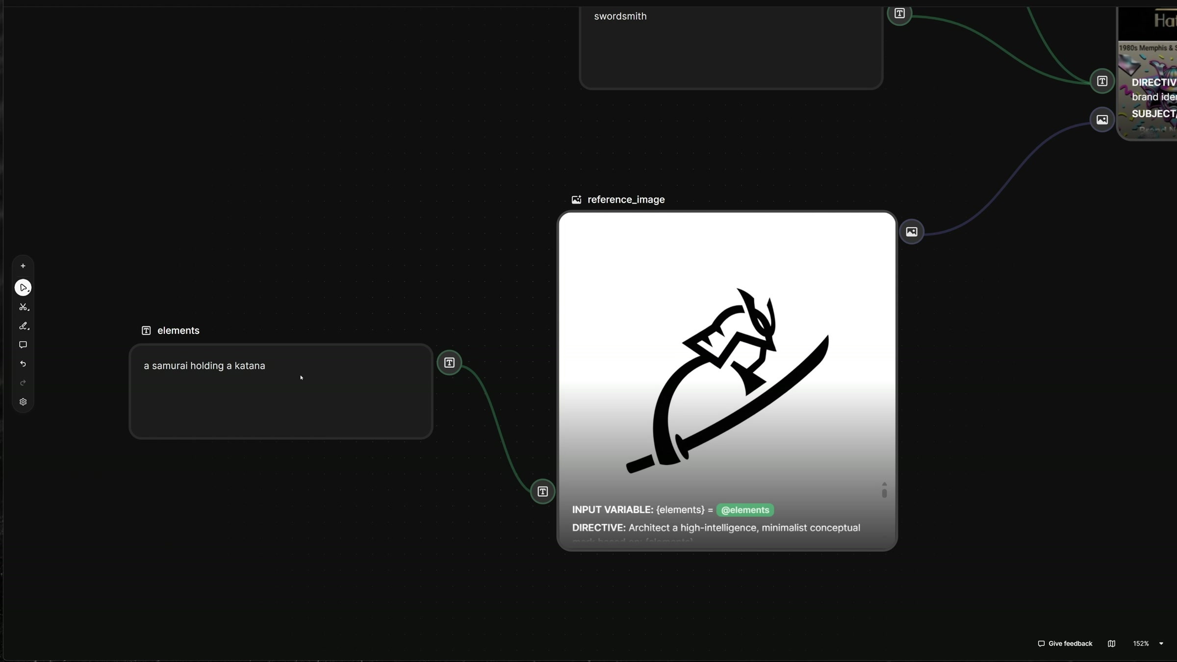
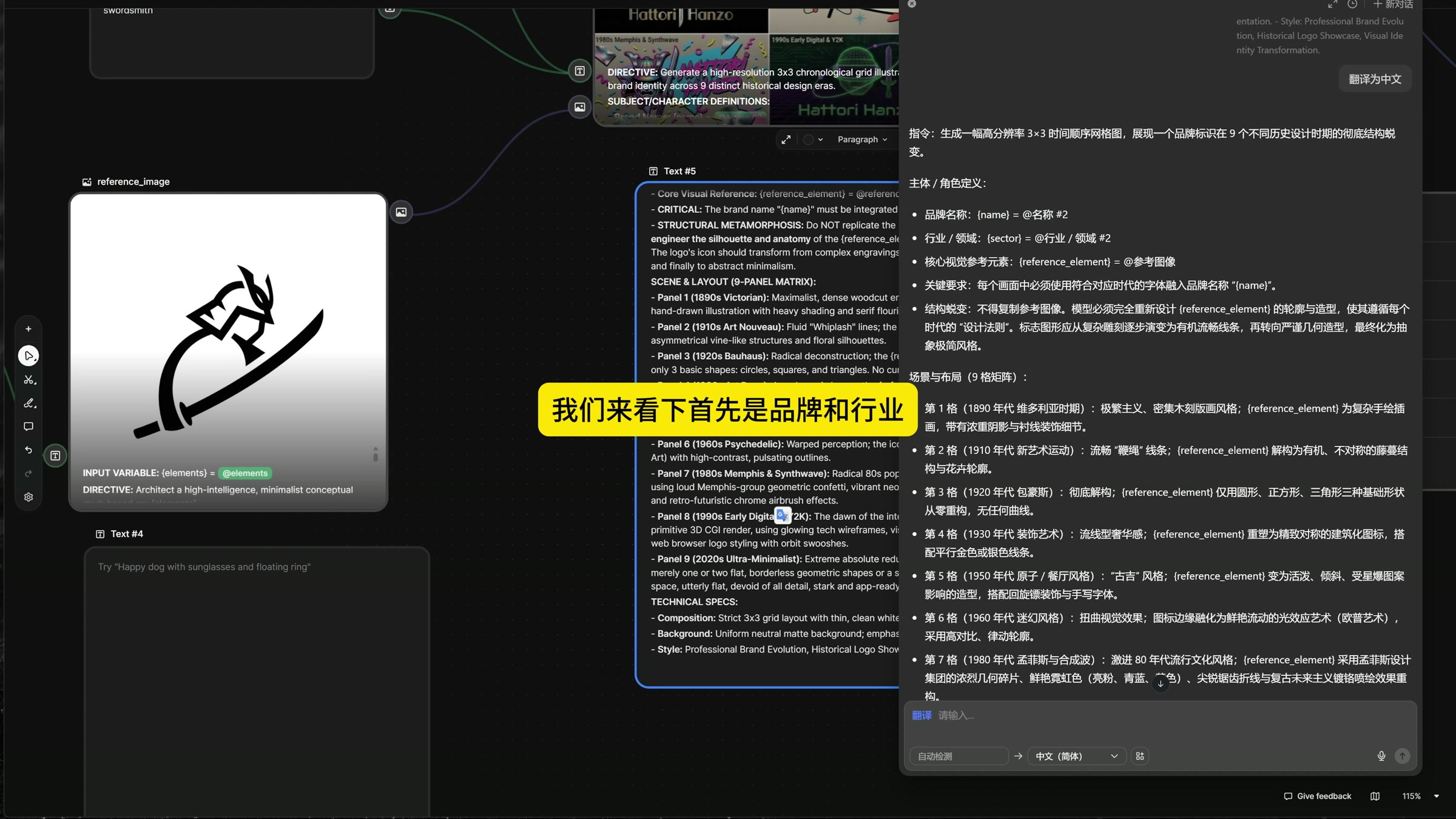
In the case study, the brand name is Hattori Hanzo, the industry is listed as swordsmithing, and the core element is described as “a samurai holding a katana.” The reference logo retains the relationship among the samurai helmet, the human silhouette, and the katana, with a very minimalist design. No matter whether you later delve into Art Deco, psychedelic styles, or minimalism, this set of semantics must not be abandoned.
I treat it as a fixed formula: the brand name handles identification, the industry defines the context, and the samurai and sword serve as the memorable visual cues. The era, the style of the typeface, the density of ornamentation, and the color palette are the variables. Although the generated results span a wide range, viewers can still recognize that they belong to the same brand.
2. First, understand the prompt words, then begin replacing the variables.
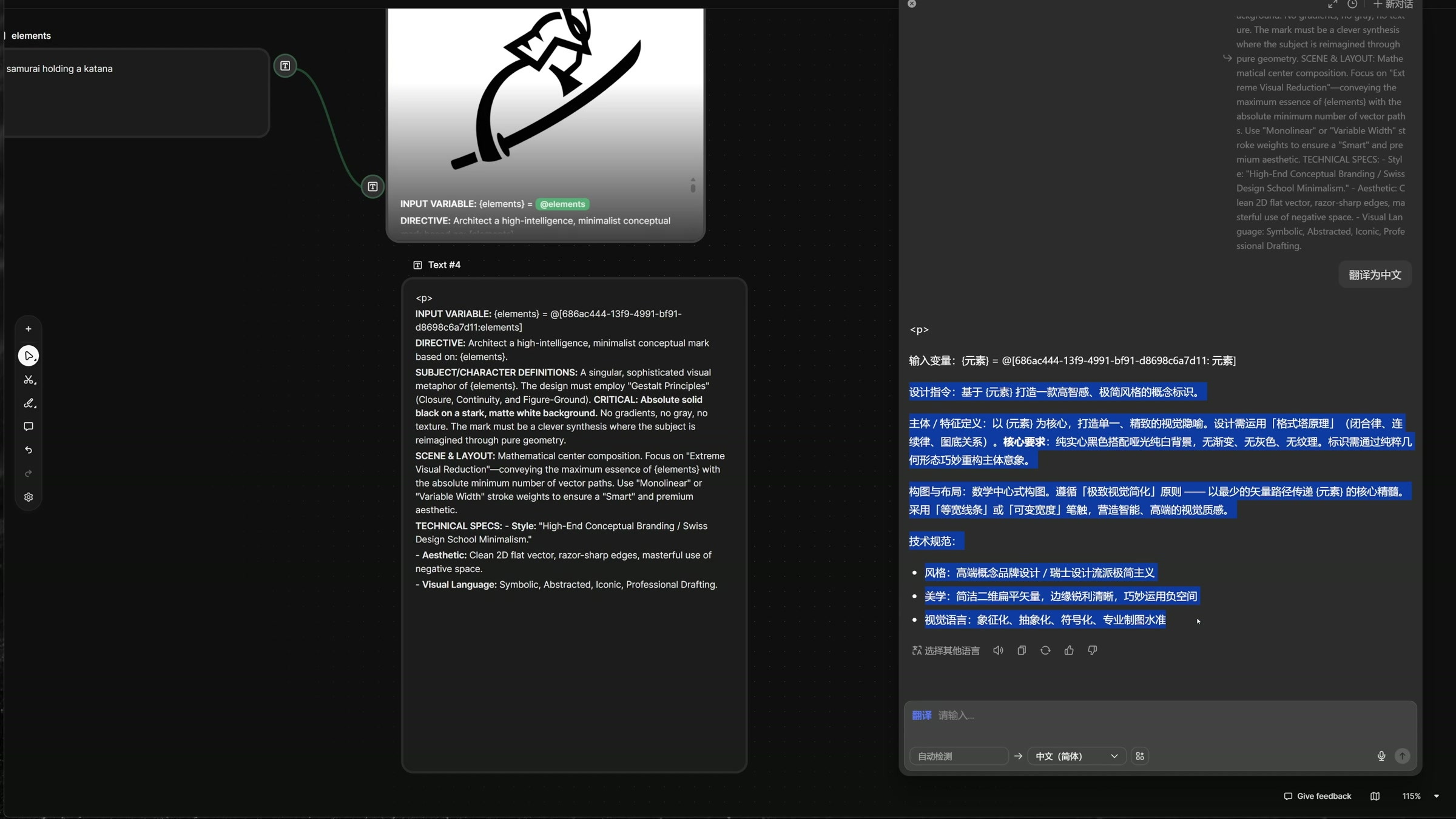
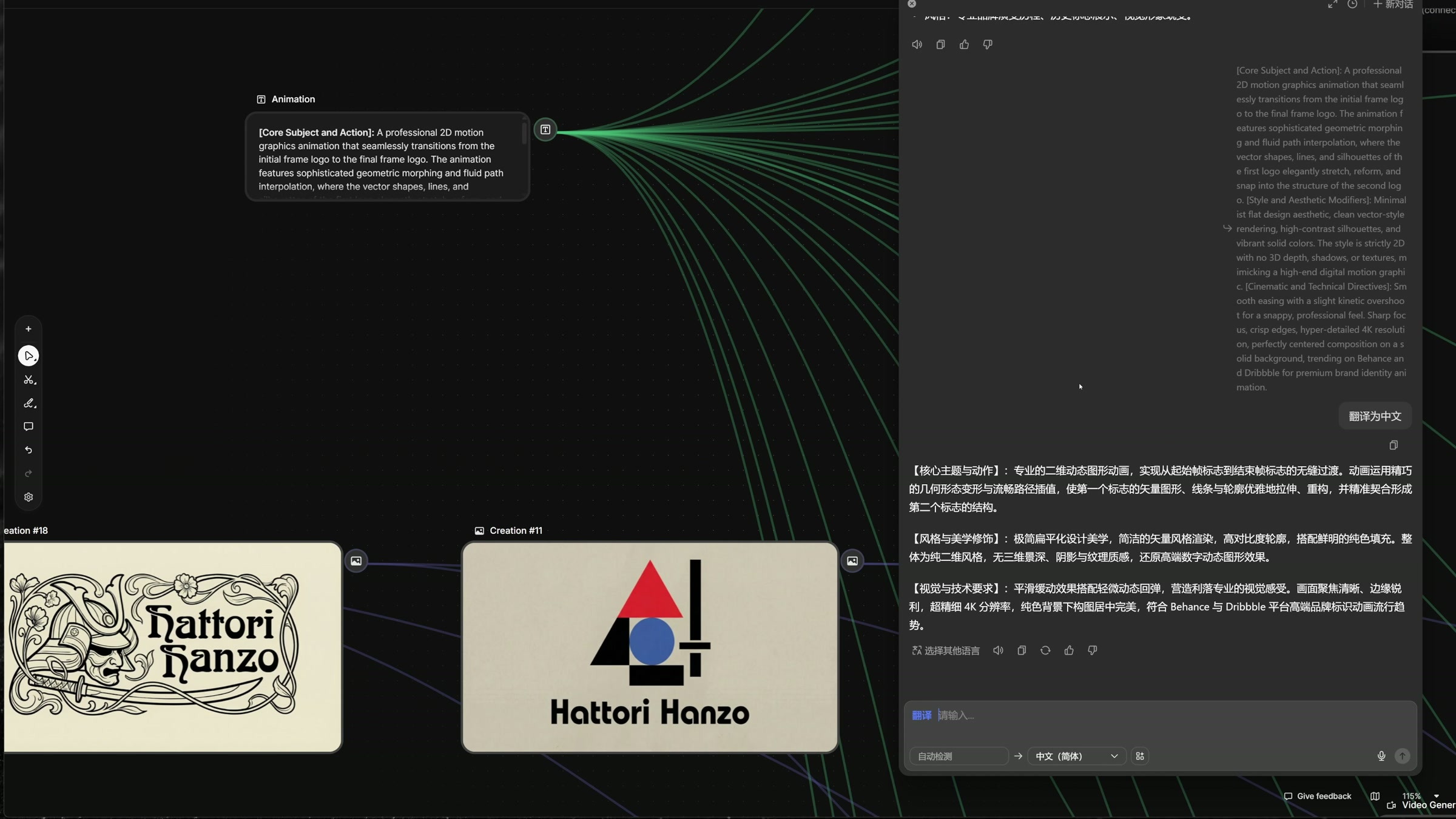
First, I copied the English prompts from the reference image’s node, then used a translation tool to analyze their structure. This action is very necessary. If you only ever paste the entire long prompt, it becomes difficult to identify what needs to be adjusted when switching to a new project, and you’re also likely to accidentally delete sentences responsible for composition, negative space, or line control.
After unpacking, the contents are broadly categorized into the following: input elements, design objectives, main body definitions, composition requirements, and technical specifications. What truly needs to be replaced are the project variables; descriptions regarding 2D vectors, solid-color backgrounds, crisp outlines, and the reduction of irrelevant details can be retained as stable output constraints.
3. Use a nine-square grid to instantly highlight stylistic differences.
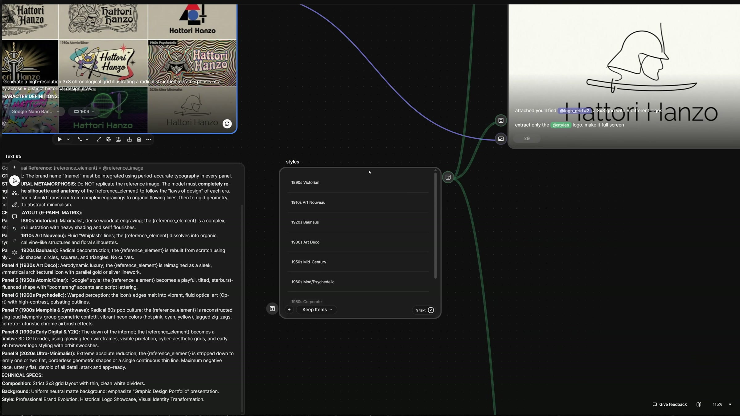
The second prompt requires generating a 3x3 grid illustrating the evolution of a brand. The nine grids correspond to Victorian style in the 1890 s, Art Nouveau in the 1910 s, Bauhaus in the 1920 s, Art Deco in the 1930 s, Medieval Modern in the 1950 s, Psychedelic in the 1960 s, Memphis and Synthetic Wave in the 1980 s, Digital and Y2K in the early 1990 s, and Minimalism in the 1920 s.
Placing the nine directions on a single diagram makes it easier to compare them than generating nine separate images. I can directly see how the decorative density decreases, how the glyphs change, and what structural arrangements the samurai and swords are reorganized into across different eras. The period designations used here are creative constraints and do not constitute rigorous historical research; for official projects, it remains essential to verify whether each direction truly aligns with the brand’s context.
4. The nine-square grid is used to select directions, and the single result is used to continue production.
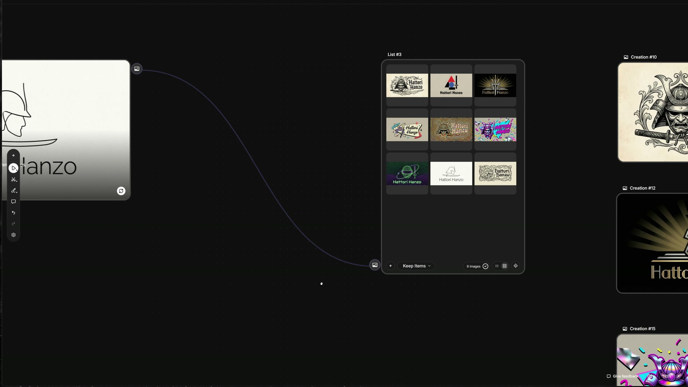
The nine-square grid is suitable for quick comparisons, but not ideal for directly creating animations. Use a list to store nine style names, then have subsequent nodes process the list item by item: extract the logo corresponding to each style from the grid and scale it up to fill the entire screen. After a single configuration, the node will run separately for each of the nine list items.
This step separates “assessing the direction” from “preparing the materials.” The previous image is responsible for controlling the overall variations, while the subsequent individual outputs ensure dimensions, composition, and seamless integration in the next steps. In the future, if you want to add a new era or remove a particular style, you only need to adjust the list—there’s no need to rebuild the entire workflow.
After splitting, the nine versions are placed into a single result set. At this point, I perform the first round of manual screening: checking for spelling errors in the brand name, ensuring that the samurai and sword are still recognizable, verifying that there are no extraneous borders in the image, and confirming that each individual composition is complete. When using AI to create a logo, text is particularly prone to issues; you shouldn’t proceed to the next step just because the overall style looks right.
5. The first and last frames should differ, but also retain a common skeletal structure.
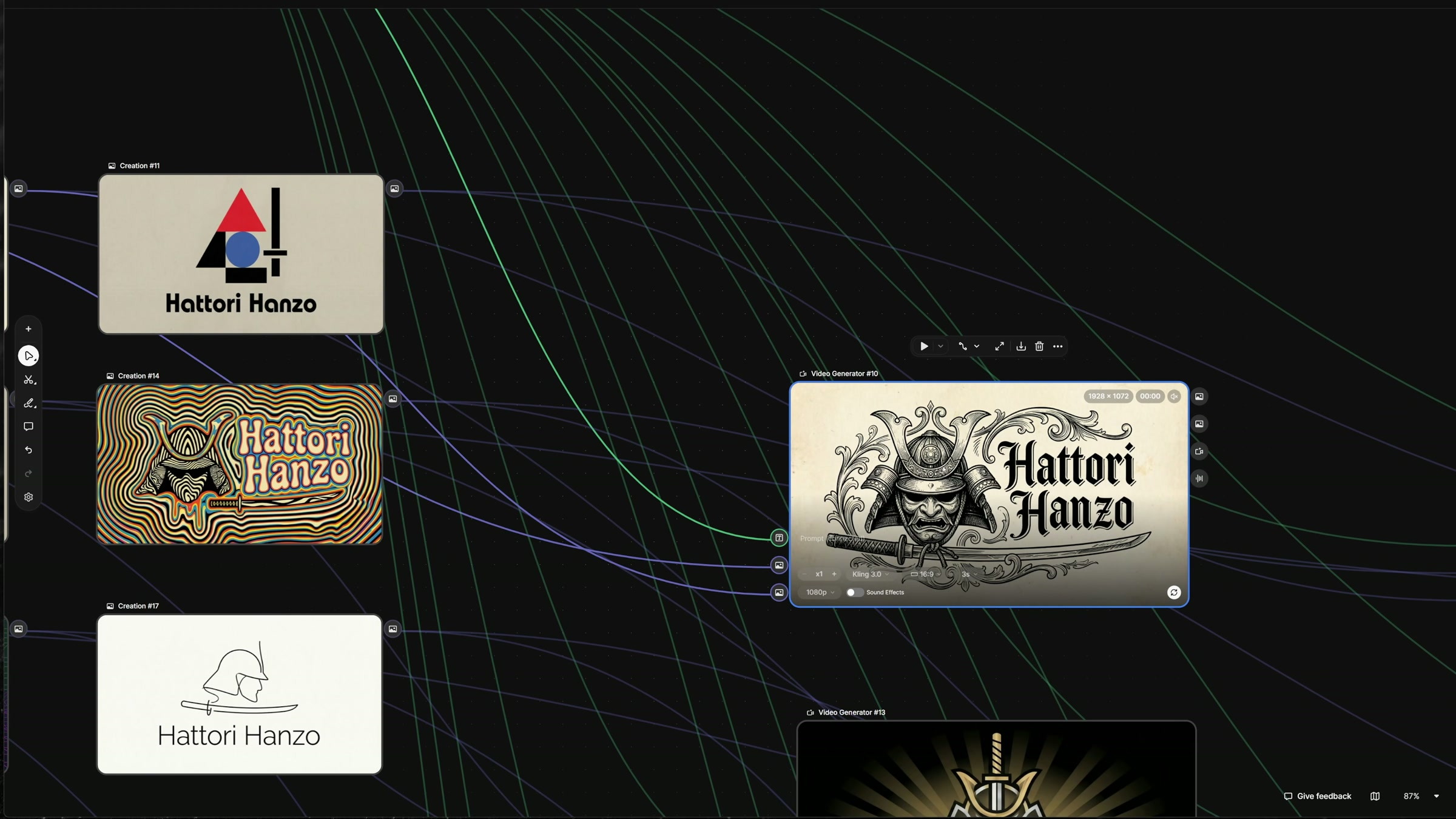
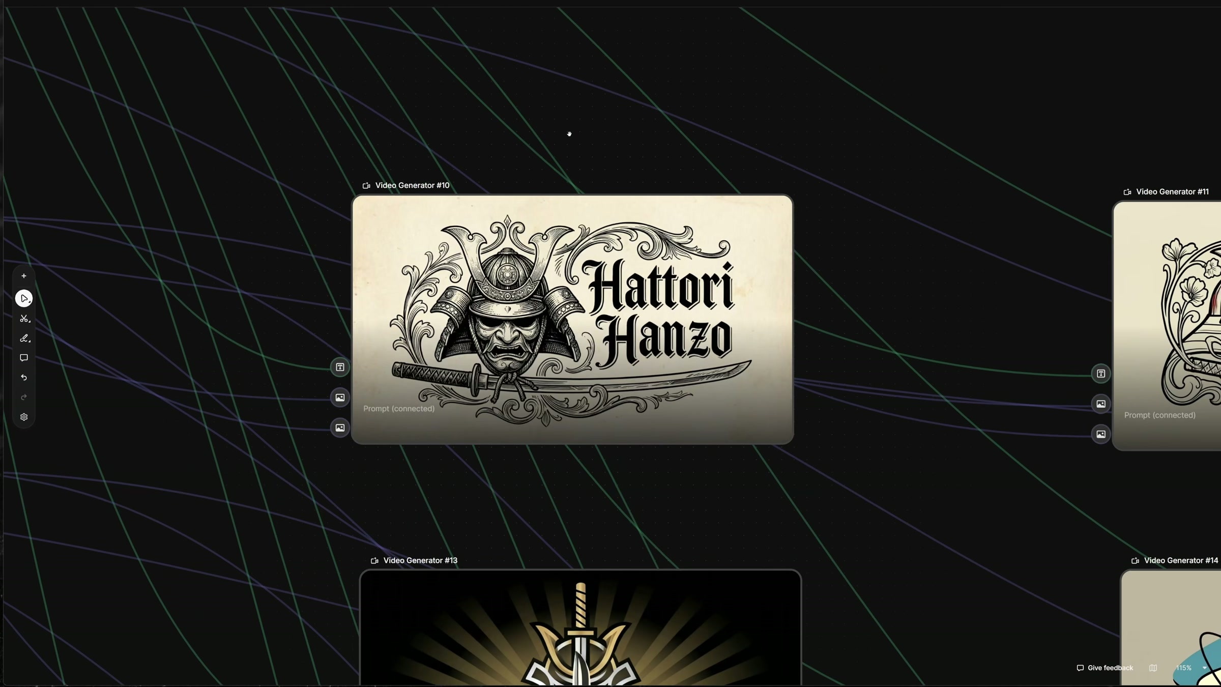
Next, select two images from the independent results and connect them to the first and last frames of the Video Generator, respectively. The selection criterion is not “the more different, the better.” It is best if the two images share the same main subject and roughly the same outline, while featuring distinct differences in lines, ornamentation, or color; this will provide a solid basis for the transitional form in between.
The video clip is displayed as Kling 3.0, 16:9 aspect ratio, 3 seconds long, and 1080p resolution. Three seconds is enough to execute a clean logo transition. If the beginning and end frames differ significantly, even extending the duration may not resolve the jump cut; in such cases, it’s better to start with a more suitable pair of endpoints.
6. Animation prompts only describe "how it changes."
The static logo has already established the main elements and composition, so the animation prompt does not need to reiterate the brand’s story. The description focuses on 2D motion graphics, geometric transformations, and path interpolation, allowing vector shapes, lines, and outlines to smoothly stretch and reconfigure before being composited into a second logo.
The style constraints are also clearly defined: maintain a flat, two-dimensional aesthetic with solid color fills and high-contrast outlines; do not add three-dimensional depth, shadows, or textures; keep the background static, use smooth easing for animations, and allow for slight bouncy effects. For logo animations, these constraints are more effective than vague adjectives like “more impactful,” because they directly address the aspects of the model that are prone to arbitrary modifications.
7. The same set of animation rules can be applied to different styles.
After the first and last frames, along with the animation description, are separated into independent nodes, a single prompt can be linked to multiple sets of logos. Within the canvas, you can see versions in the styles of Victorian, Art Nouveau, Art Deco, psychedelic, and minimalist, each individually fed into the Video Generator. Simply switch the endpoint to test a different transition, without having to rewrite the entire workflow.
During the actual review, I’ll focus on three key aspects: whether the brand text deforms during motion, whether the main subject transitions smoothly and remains near the center of the frame, and whether the final frame accurately stops on the target logo. Occasional creativity in the intermediate stages is not a bad thing, but the beginning and end must be reliably identified.
8. Switch the template to another brand, first modify the fixed items.
Finally, the results from Tyrell Corporation and RockStar Toys were also presented. When switching projects, you need to update the brand name, industry, and core elements, and then decide whether to retain the same set of eras based on the brand positioning. List splitting and animated prompts can continue to be reused, but they should not replace judgment of the brand itself.
This approach is more suitable for early-stage direction exploration and dynamic prototyping. The nine‑grid layout helps me quickly grasp the stylistic range, while splitting each image allows the assets to be reused; the first and last frames transform static comparisons into a visualized sequence of changes. Before formal delivery, the logo must still be redrawn as a reliable vector file, and the typography, spacing, curves, and small‑size legibility must be reworked.

本作品版权归 Aqun 所有,禁止匿名转载及个人使用,任何商业用途均需联系原作者。
新用户?创建账号
登录 重置密码
请输入电子邮件以重置密码。


留言板 (0)
评论为空