When doing product vision, I often encounter a fault: the pictures have been sorted out in the material library, and the next step is to make a web page, but I have to download, name, upload, and then copy the brand specification to another tool. The original material hasn’t changed; the repurposing work has been done all over again.
This video tests a different route. First, connect the Magnific as a connector to Claude, then let Claude read the AURENE Brand Guidelines in Space and the four products in the Magnific Library, and finally generate a landing page of the product exhibition hall that can be opened independently.
1. First connect to the media library, then discuss page design.
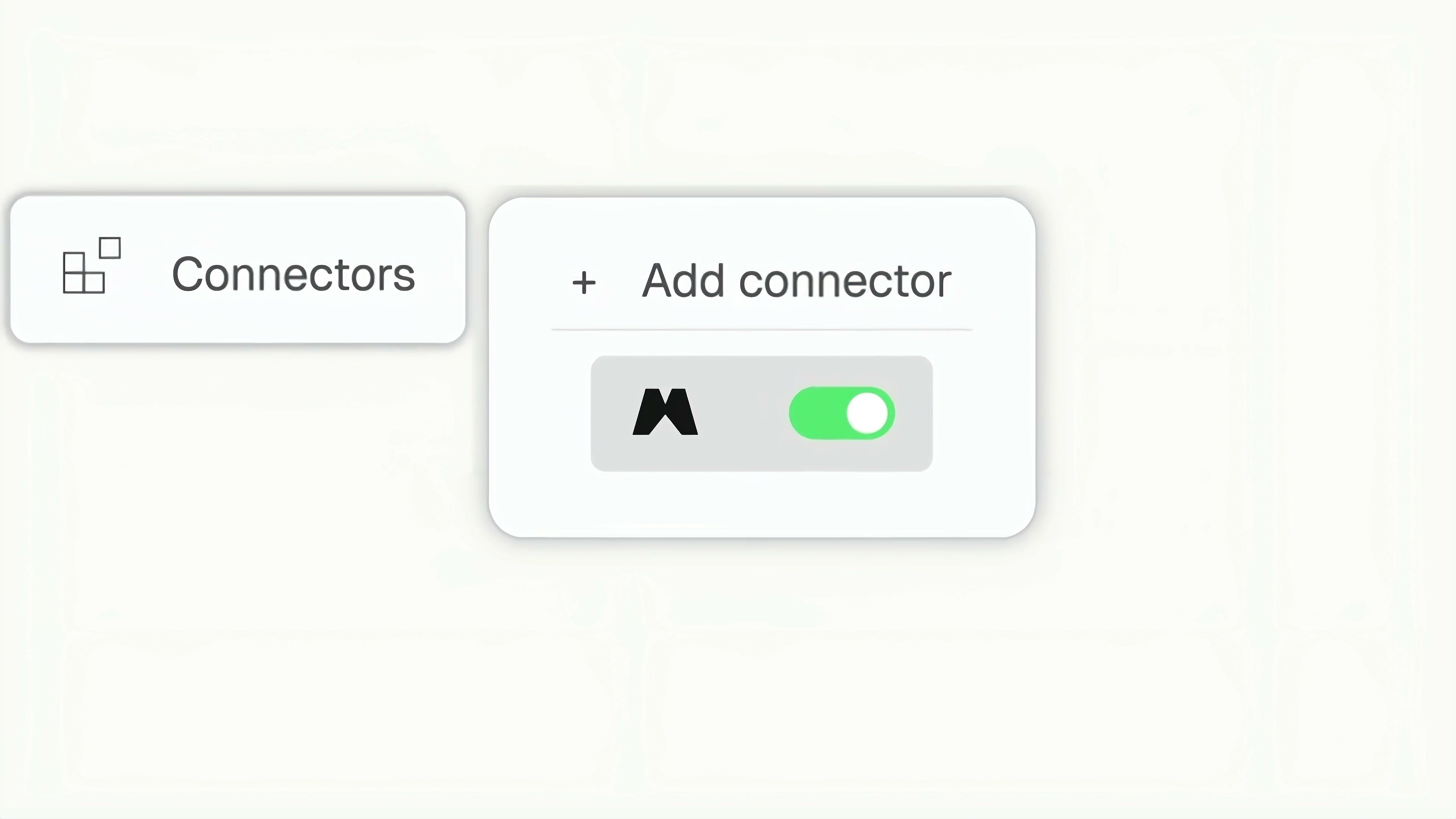
The first step is to enable Magnific in Claude’s Connectors. This action may seem minor, but it actually addresses the fundamental question of where the content comes from. Subsequent pages do not need to rely on temporarily uploaded individual images; instead, they directly reference brand assets that have already been stored in the Magnific Library.
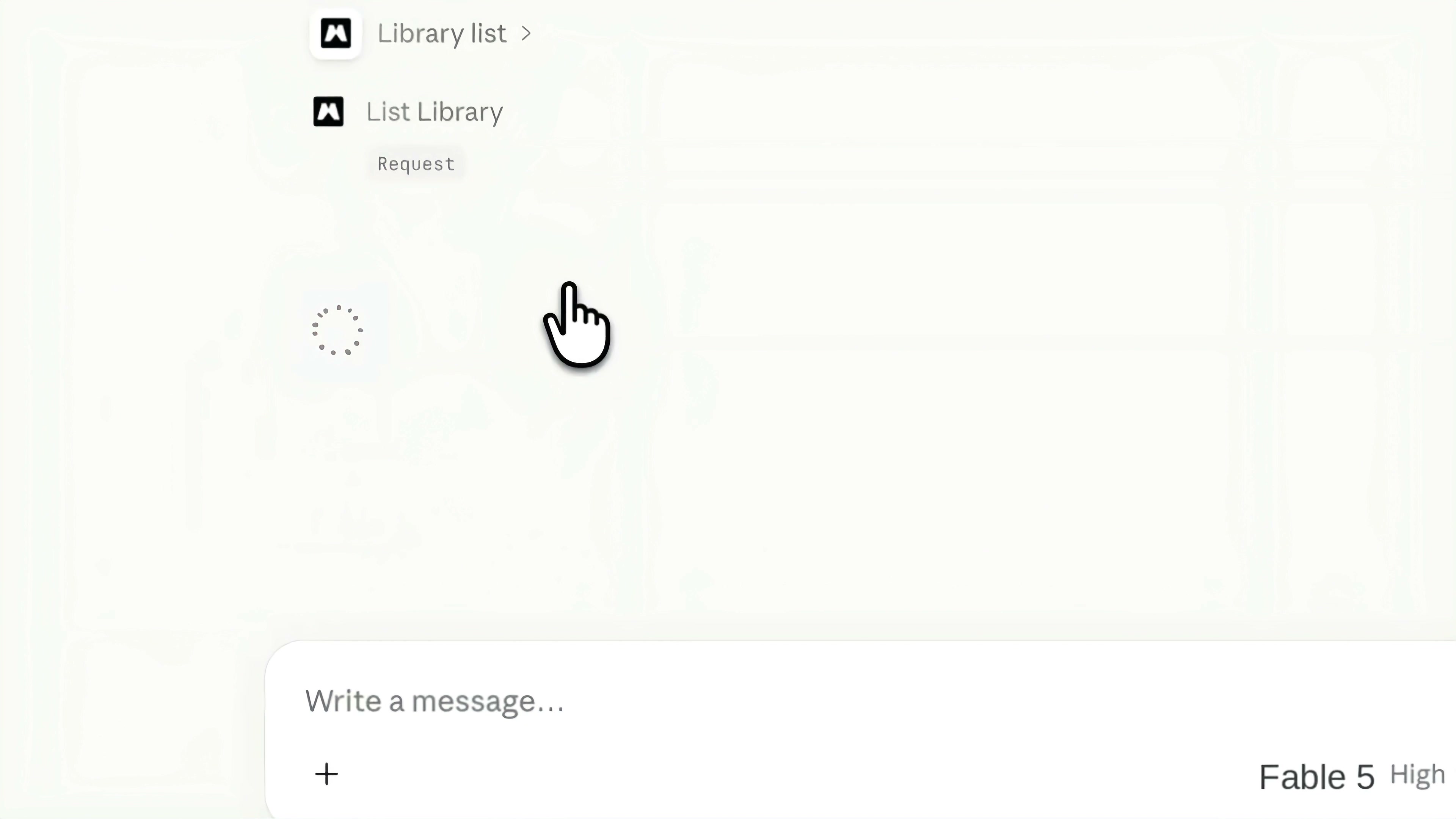
After the connector is enabled, Claude will request the List Library permission when accessing the material library. In the video, the user selected to allow reading, and the system then began retrieving the corresponding product. This authorization only indicates that the user can access the asset list; it does not mean the page automatically meets brand guidelines. Brand specifications must still be clearly specified in the task.
2. The prompt only mentions three concrete facts.
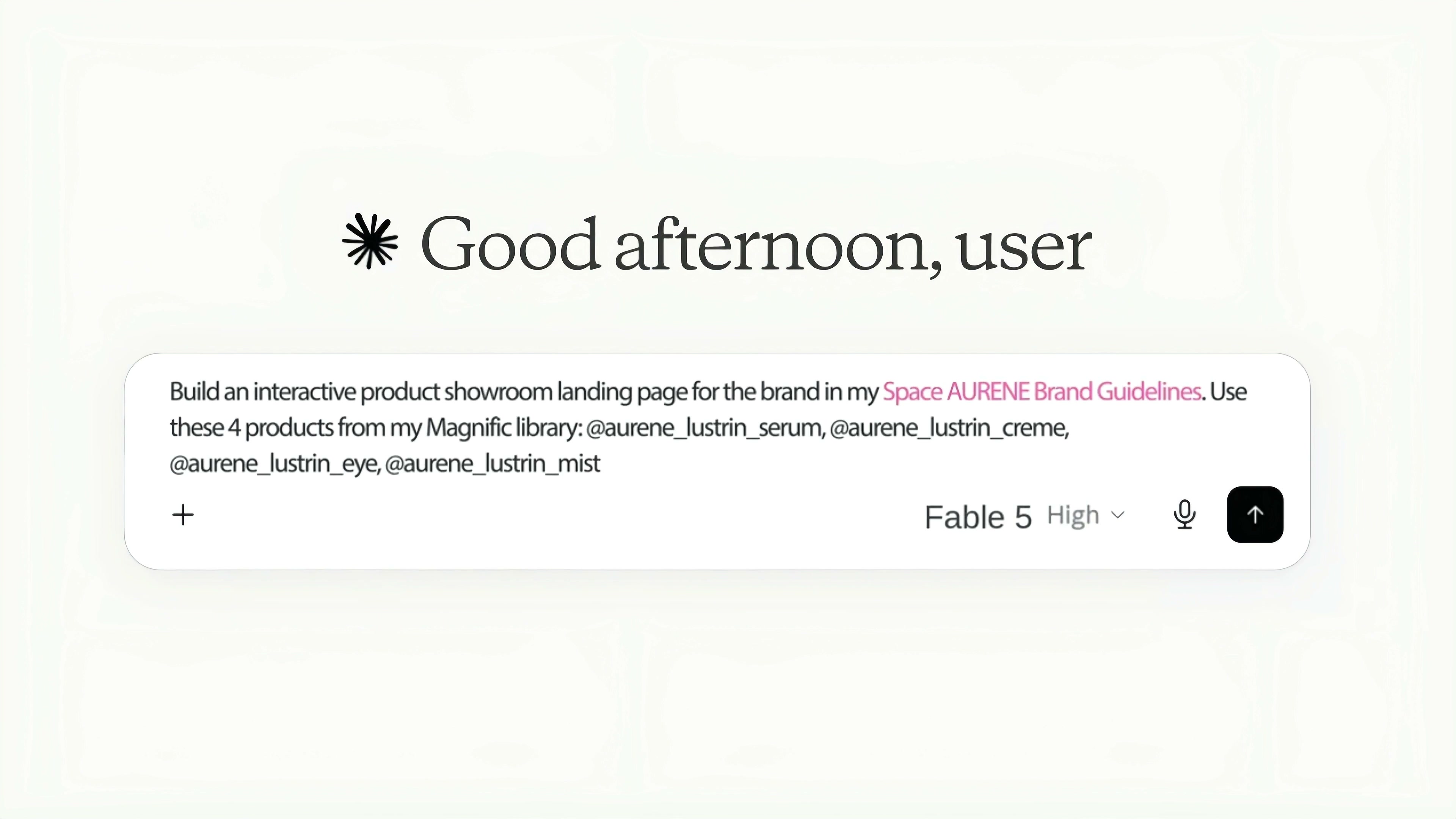
The task itself is very short: make an interactive product exhibition hall landing page for AURENE brand, refer to AURENE Brand Guidelines in Space, and use four Lustrin products in Magnific Library, namely serum, crème, eye and mist.
I don’t think it’s necessary to cram web-related jargon into this kind of task. The three key pieces of information to be finalized are: which brand guidelines to use, which products to integrate, and the final deliverable format. The video explicitly calls for an interactive product showroom landing page, so the deliverable is not a static webpage mockup but rather a fully navigable page.
Brand guidelines and product images are fixed components. Claude can organize the page hierarchy, module order, copy length, white space, and image-to-text ratio. Separating these two parts will make the build process much more stable and also make it easier to determine later which areas can be modified and which should remain untouched.
3. From asset invocation to self-contained HTML
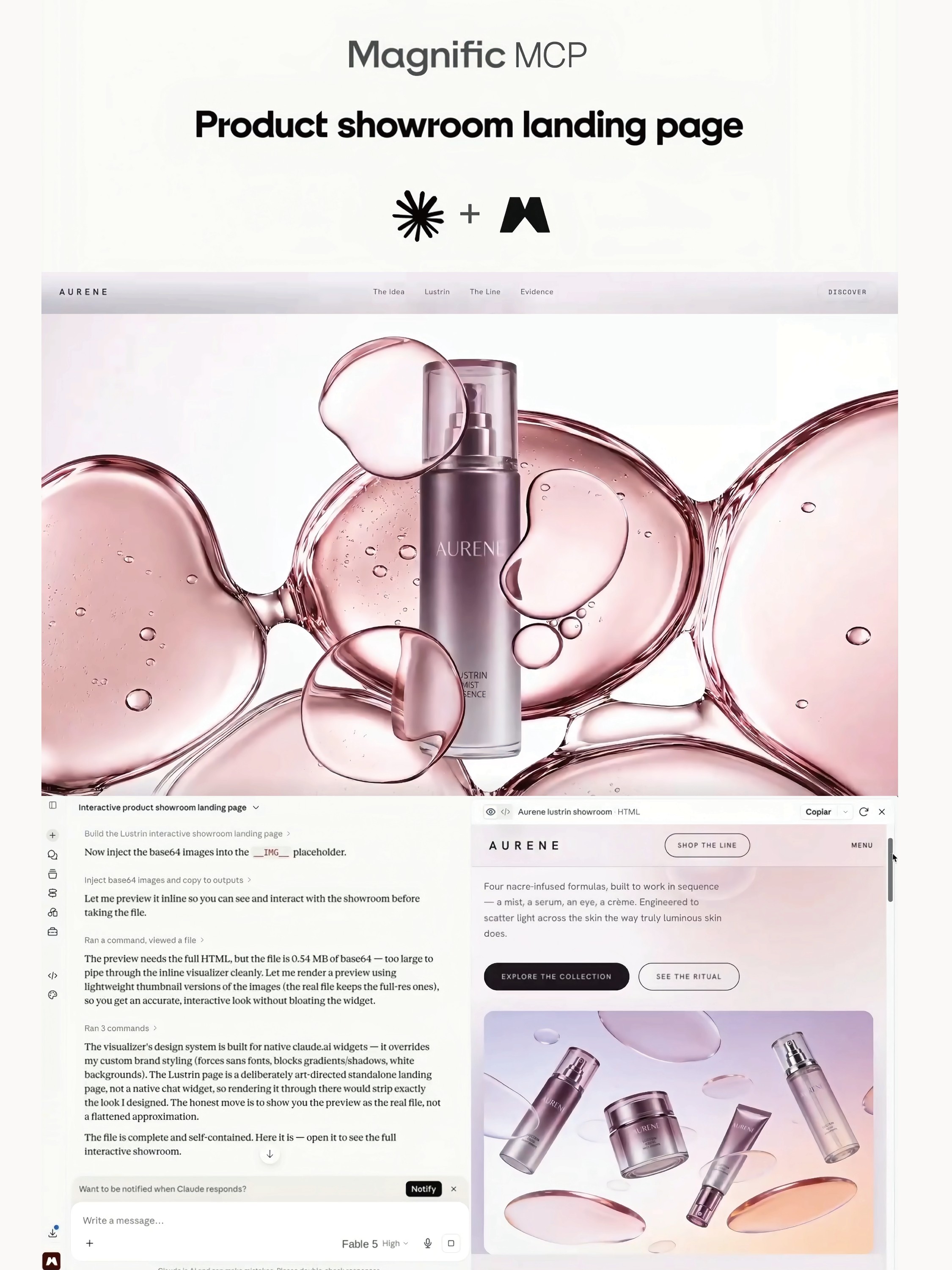
After loading the assets, Claude began building the page and inserting the product images into the HTML. The description in the video mentions that the full file contains larger ba-se64 images, and it is not ideal to tuck directly into the inline preview, so lighter thumbnails are used in the preview stage. The real exported self-contained file still retains the full resources.
This approach is very practical. The task of the preview is to quickly check the structure and interaction, and there is no need to slow down the page with high-resolution pictures. Official documents retain clear material. The two have different purposes, so there’s no need to force them to use the same set of image sizes.
Claude also explained that native visualization components may override custom fonts, gradients, shadows, and backgrounds, so it makes the AURENE page a standalone HTML instead of a generic chat component. The video then displays an inline preview, and you can also open the full page to continue reviewing.
4. First, address the browsing order of the page.
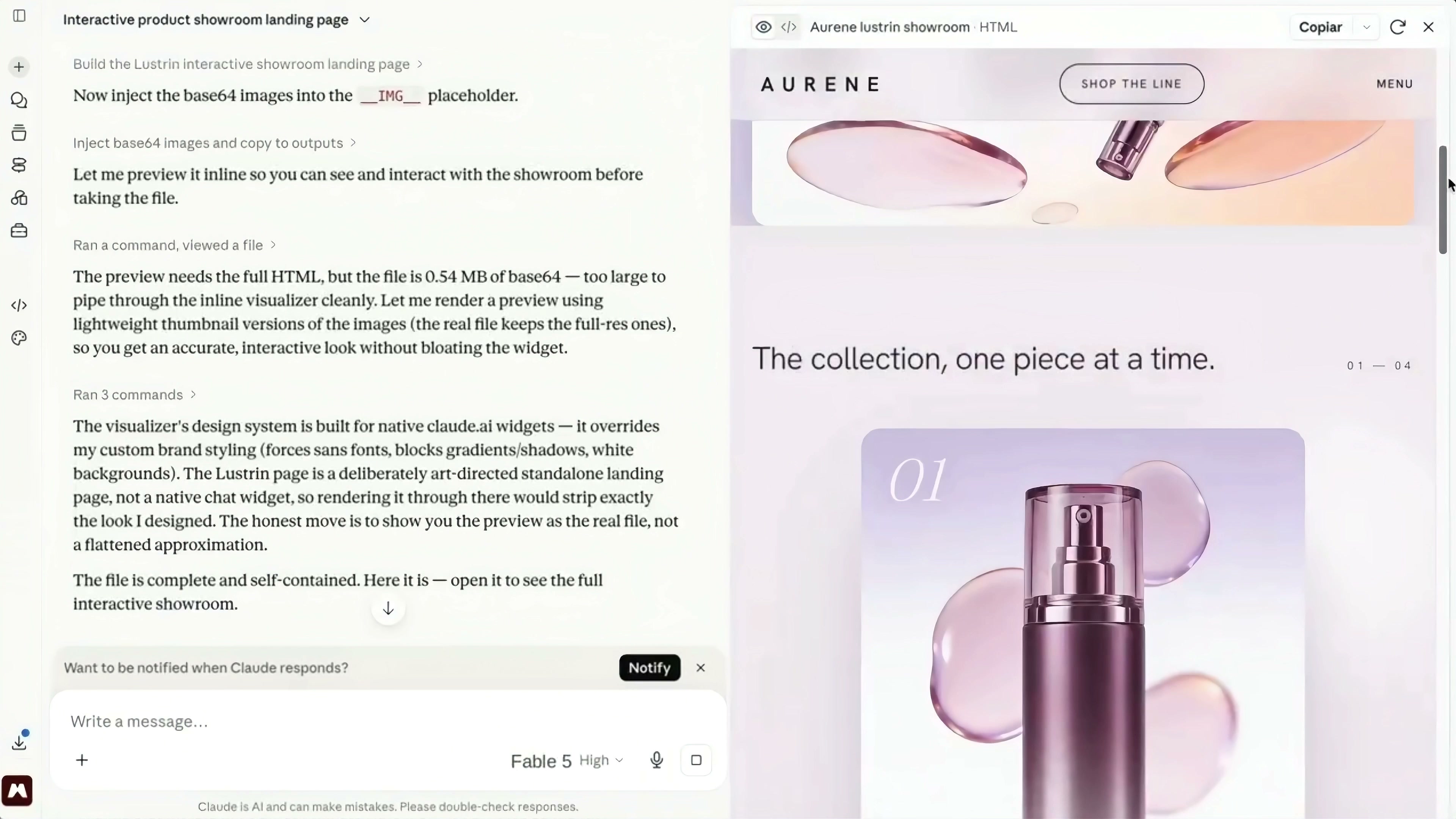
The home page in the inline preview doesn’t have a lot of explanations. At the top, there are only AURENE brand name, Shop the line and Menu. At the bottom, a large area of pink and purple product vision is used to establish the first impression, and then users are brought to the product collection.
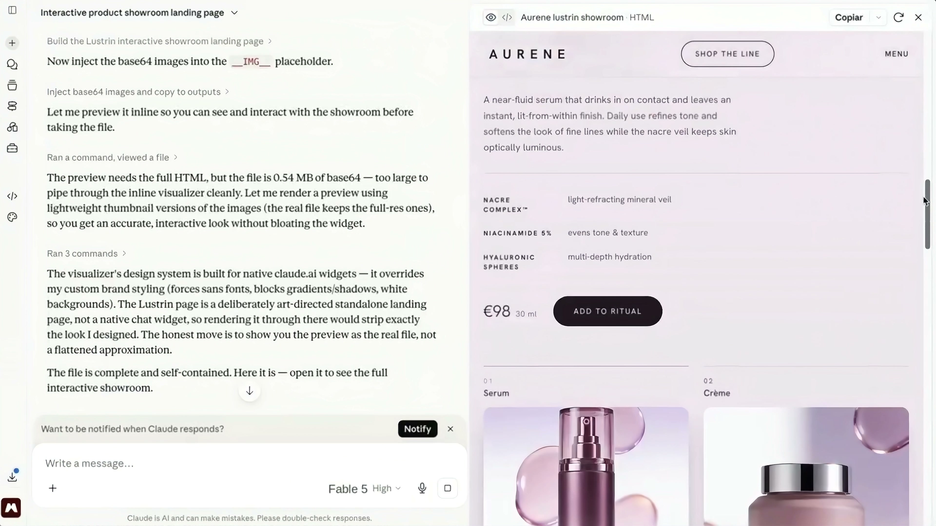
Continue scrolling down, and the page will load the product details. Take The Light Serum as an example. The left side retains the product description and ingredient information, and the right side arranges the product map. Price, capacity and Add to ritual buttons are placed in the same area. Readers don’t have to search through long blocks of text for purchase information.
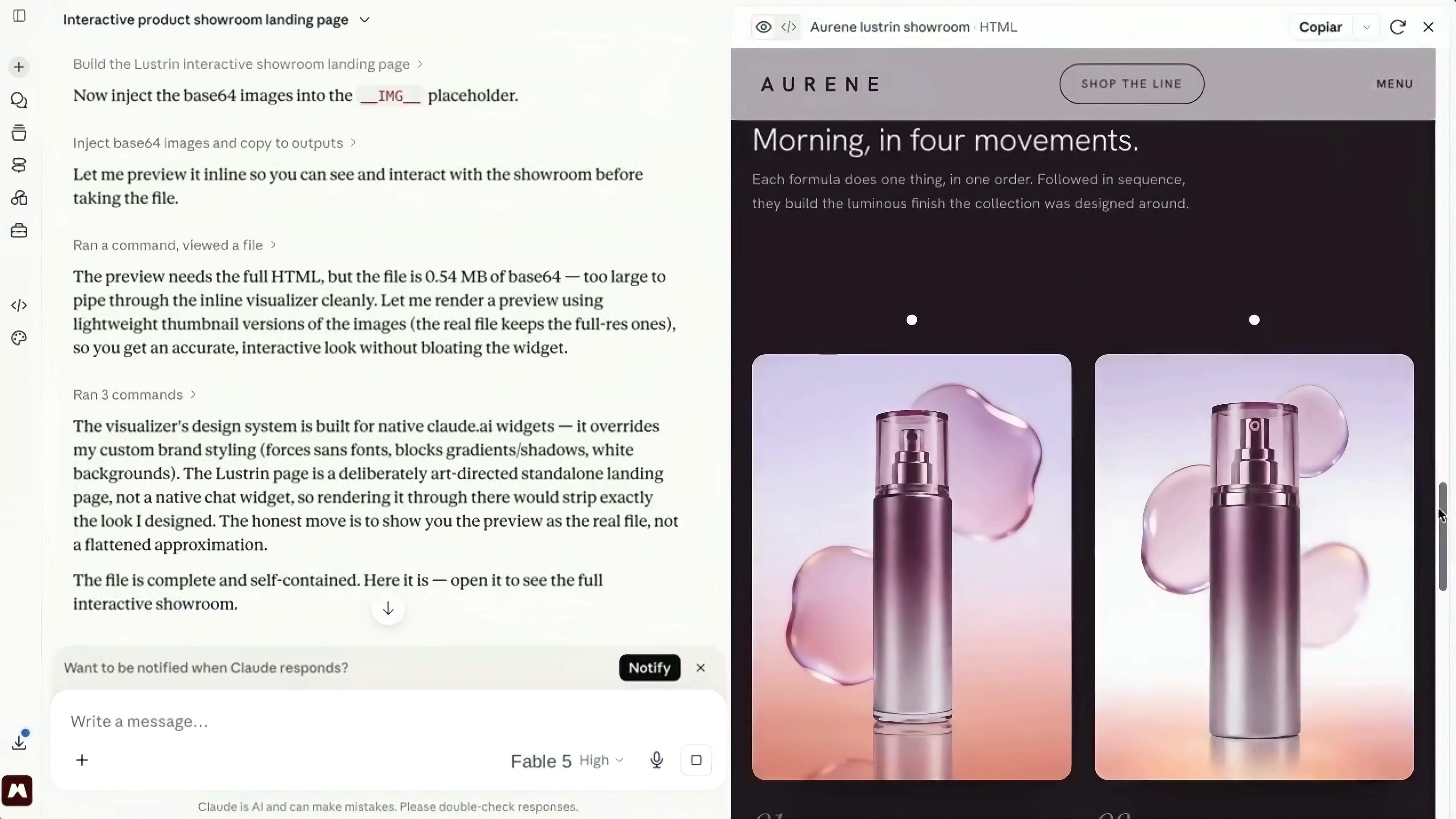
The “Morning, in four movements” module organizes the serum, cream, eye treatment, and mist into a specific order of application. The four products are no longer just displayed side by side; they now form a complete morning skincare routine. For a set of products, this organizational approach is easier to understand than simply listing four cards.
5. The visual system relies on repetition rather than changing things up on every screen.
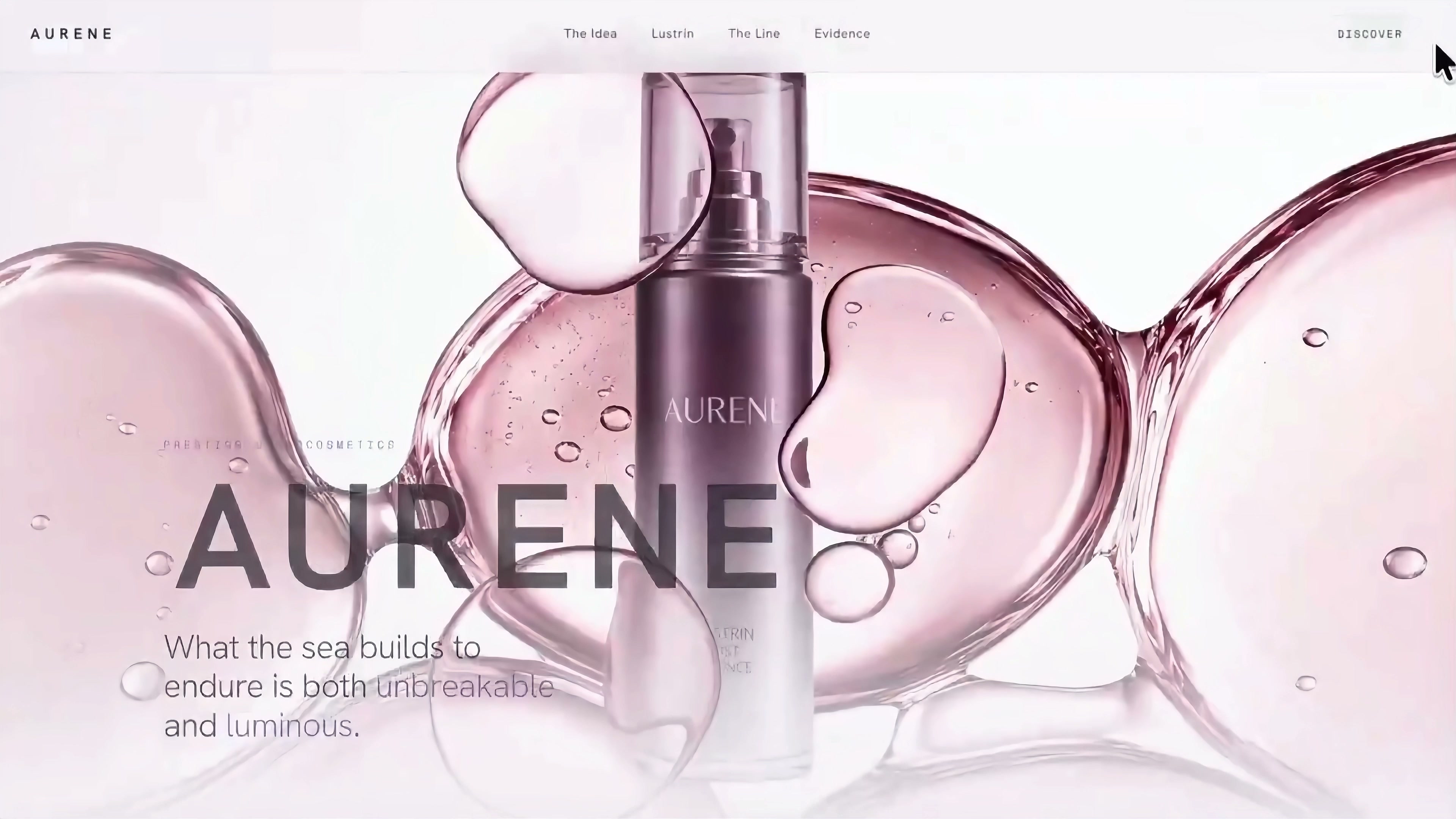
After the full page is opened, the first screen continues to use translucent pink droplets, metal purple product bottles and a large white background. The weights of the navigation, headings, and body text are kept very restrained; the visual hierarchy is primarily established through materials and proportions.
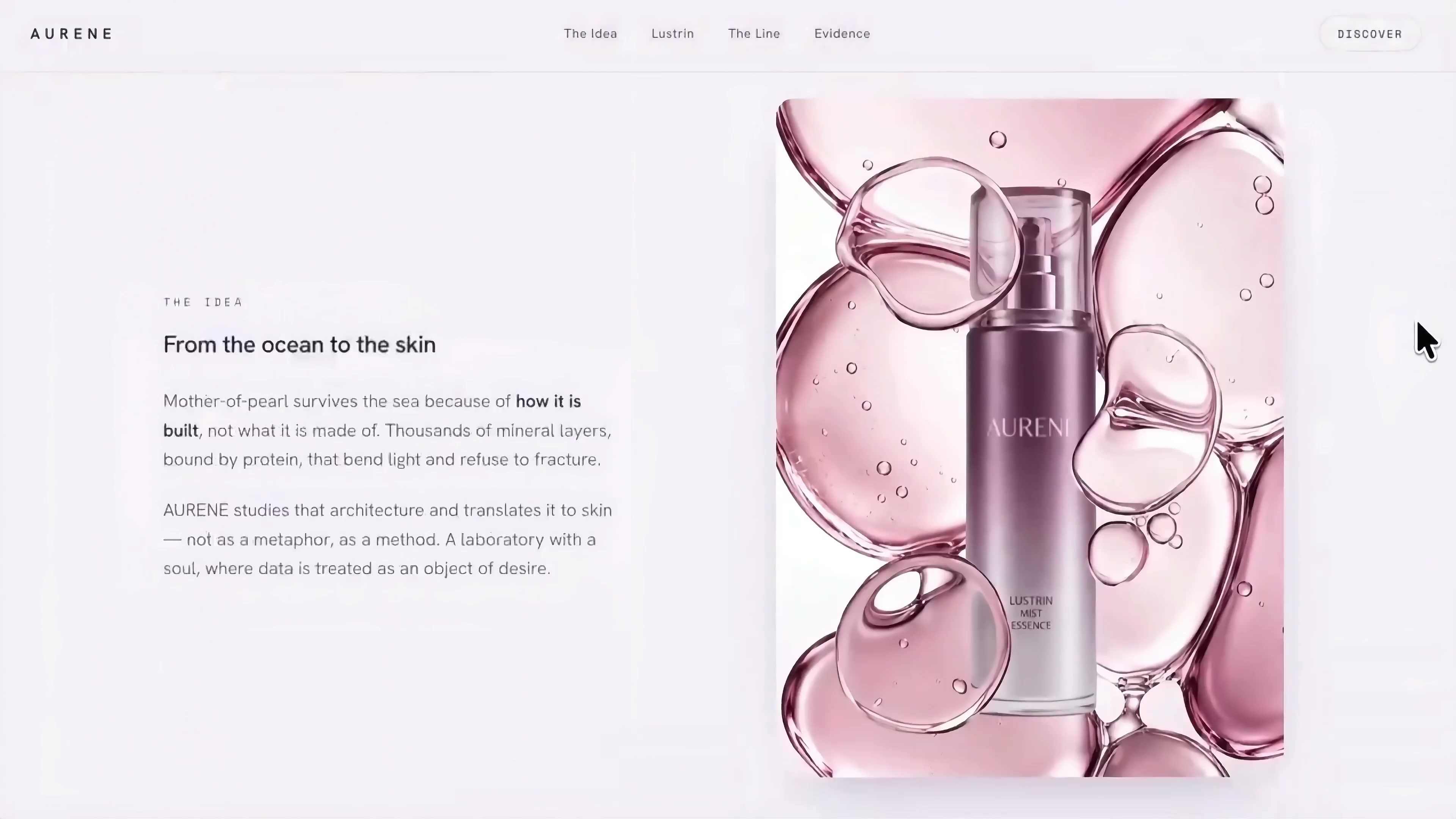
The brand philosophy section has been redesigned with text on the left and images on the right, but the visual language remains unchanged. The pearly, translucent structure still appears, but it has shifted from the home-screen background to a smaller narrative image. As a result, the page has changed, but it hasn’t suddenly adopted an entirely different style.
The ingredient descriptions, product line banners, and individual item banners that follow also continue to use the same pink-purple gradient, soft transparent textures, and ample white space. What is most worth learning here is not a certain special effect, but the reuse of the same set of visual elements in different information modules.
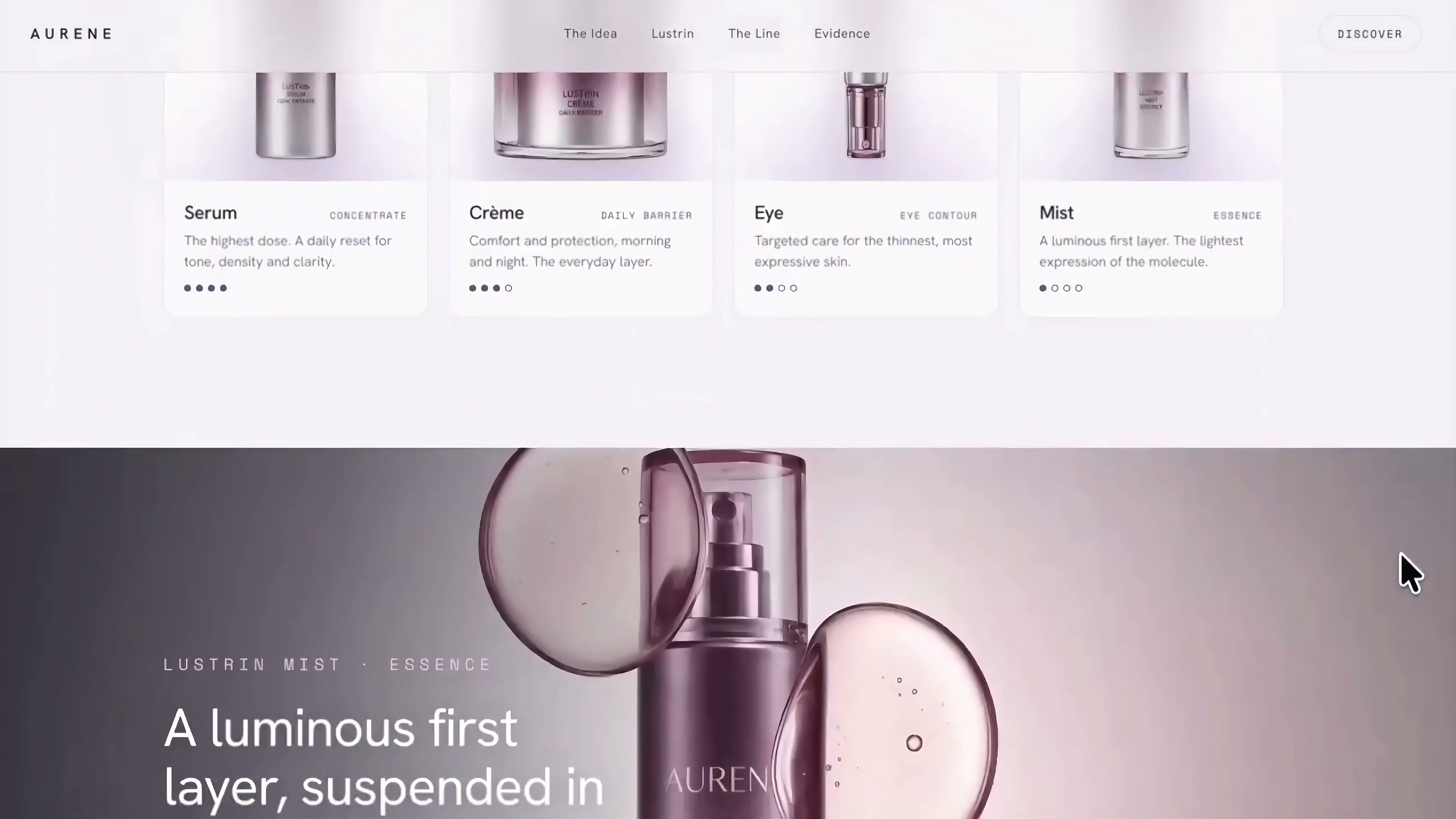
The four-product lineup is responsible for horizontal comparison. Serum, crème, eye and mist each have a product map, name and a description of purpose. Users can quickly see the division of labor in the entire product line. Next, use a dark-colored banner to highlight a specific product; this will prevent the pacing from being uniform throughout.
6. The data module must be verified separately.
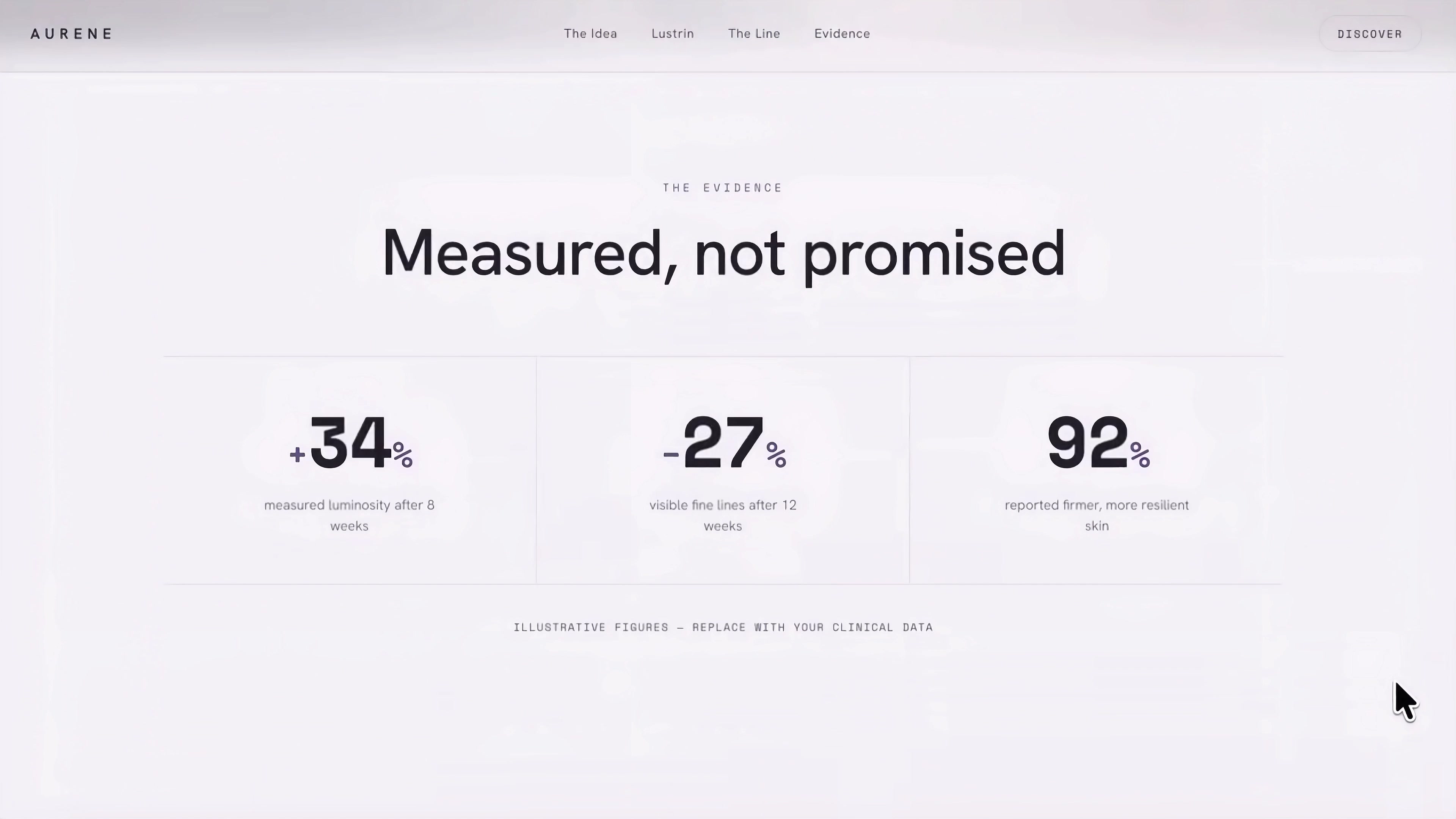
At the end of the page, the "Measured, not promised" data area appears, which lists three groups of numbers: + 34%,-27% and 92%. Below, it also states that these are illustrative data and must be replaced with actual clinical data.
This sentence cannot be ignored. AI can first create the structure, font size, and hierarchy of the data module, but it cannot publish placeholder numbers as brand facts. Before the official launch, the brand needs to provide the source, test cycle, sample size and compliance statement, and then replace the sample content on the page.
7. What kind of projects is this method suitable for?
If the brand specifications and product materials have been organized into Magnific, this process can save the time of uploading and repeatedly explaining the materials. Claude can organize existing assets into a browsable page prototype by connecting the material library and specifying brand specifications, product scope and delivery form with a clear task.
Designers still need to verify the information architecture, product names, image‑text correspondence, button destinations, and data accuracy. MCP addresses the transfer of assets between tools; whether a page is trustworthy still depends on these specific judgments. For projects that require rapid validation of product landing pages, release pages, or proposal prototypes, this division of labor is well-suited.

新用户?创建账号
登录 重置密码
请输入电子邮件以重置密码。



留言板 (0)
评论为空