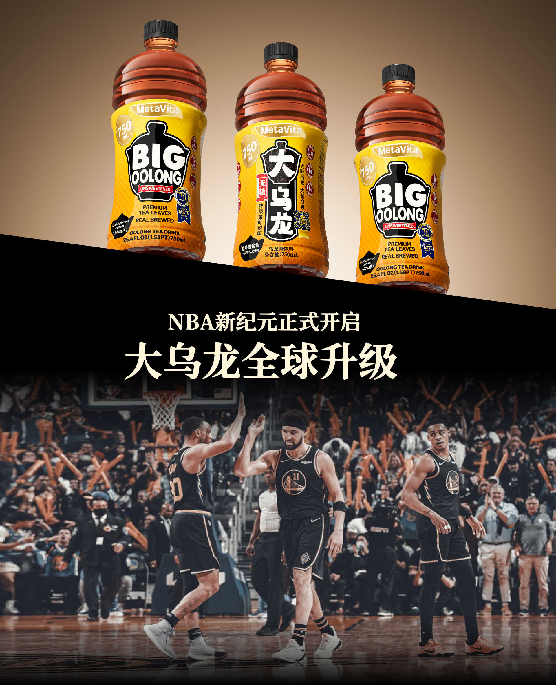
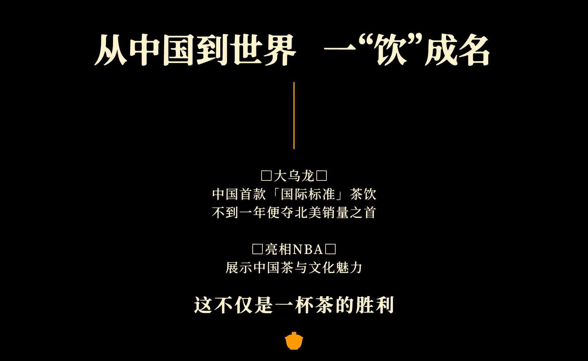
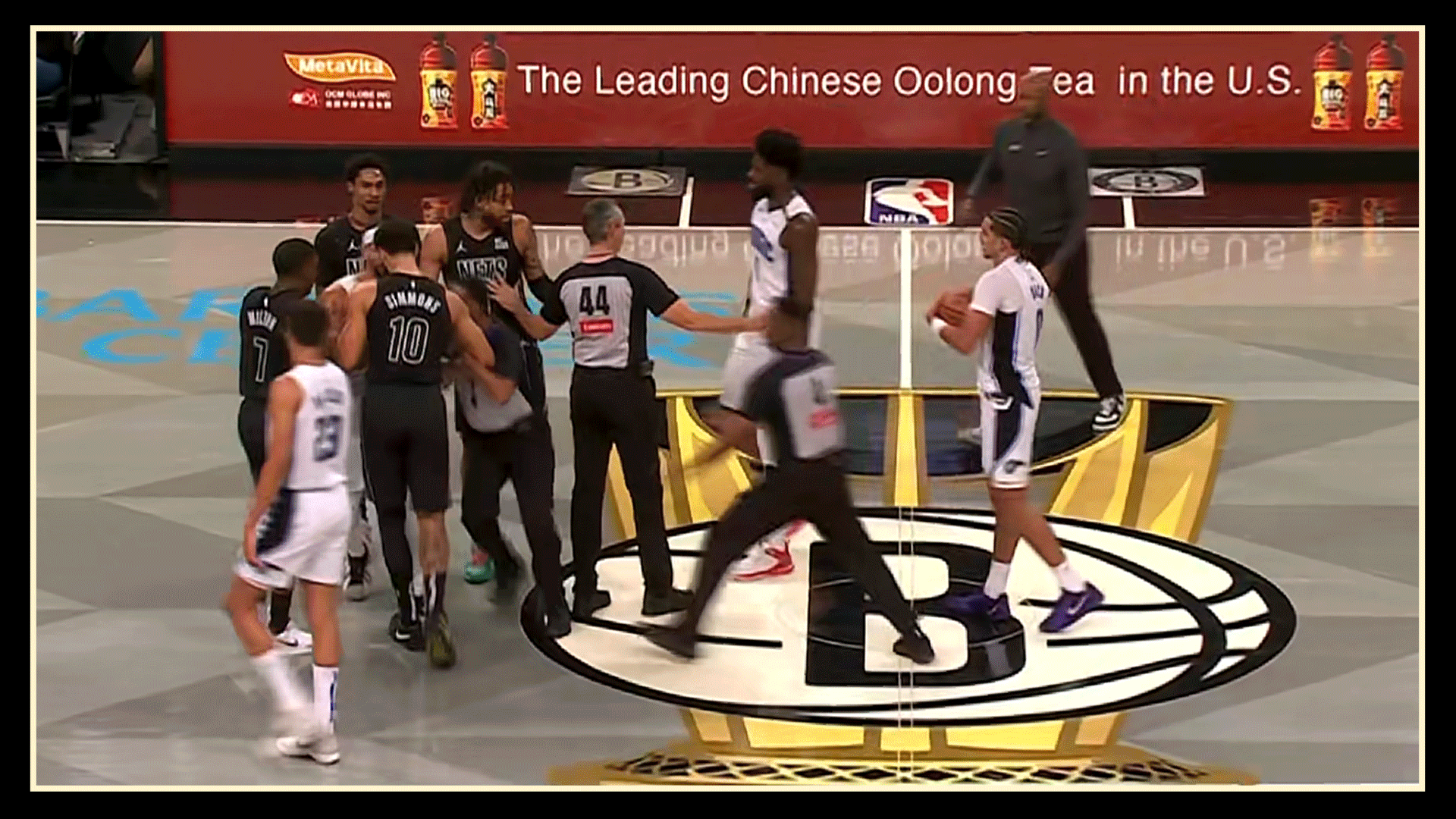
The Super Open Product of Extract: The Big Oolong in the NBA in the United States
2024-12-10
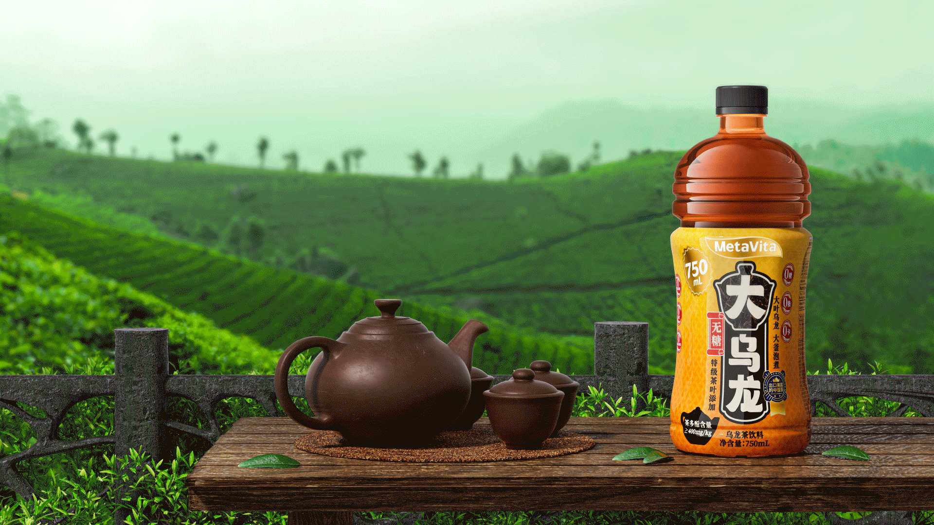
Packaging
2376
3
14
关注
私信


nice packaging
Drink oolong tea to lose weight
It tastes good when you look at it